drawing, mixed-media, paper, pen
#
drawing
#
mixed-media
#
hand-lettering
#
old engraving style
#
hand drawn type
#
hand lettering
#
paper
#
personal sketchbook
#
hand-drawn typeface
#
pen-ink sketch
#
pen work
#
sketchbook drawing
#
pen
#
post-impressionism
#
sketchbook art
Copyright: Rijks Museum: Open Domain
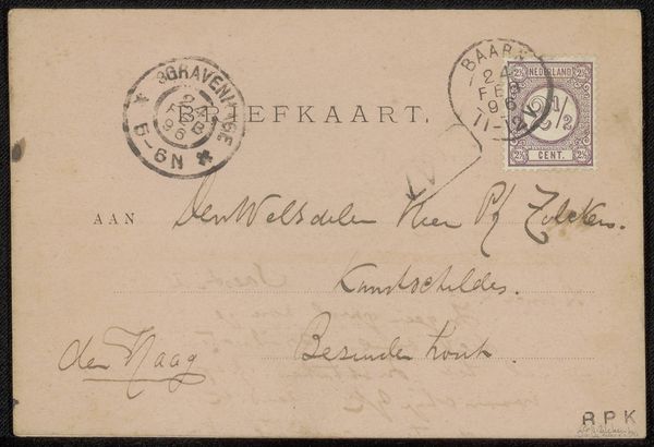
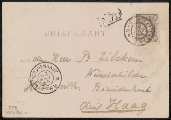
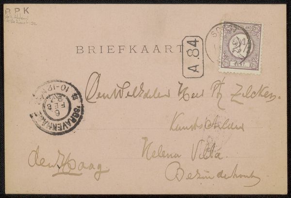
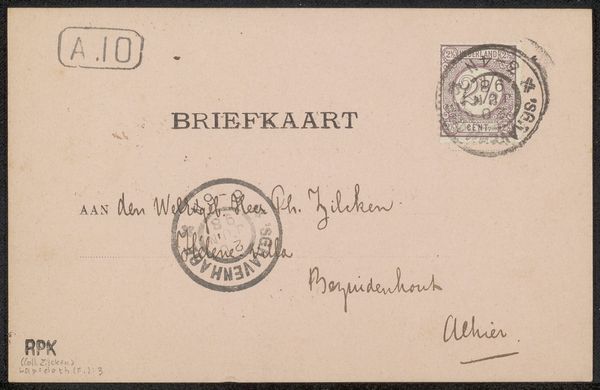
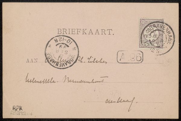
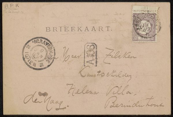
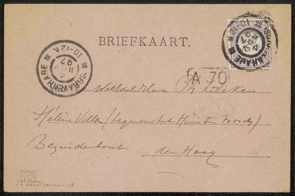
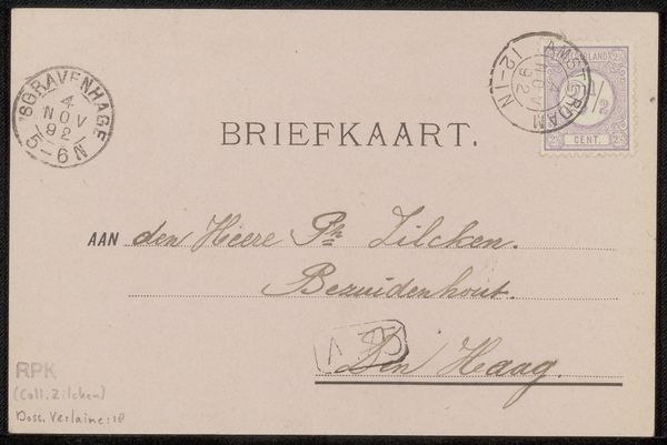
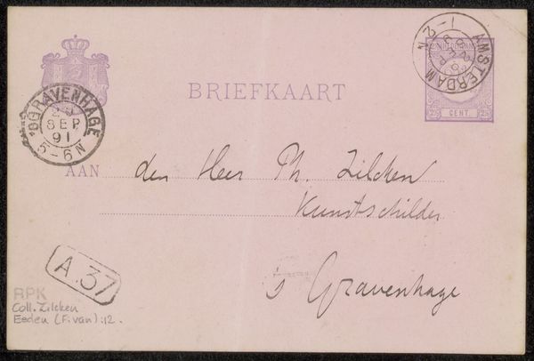
Curator: Before us we have “Briefkaart aan Philip Zilcken” a mixed-media piece including pen, ink and paper, by Maurits van der Valk, circa the late 1890s. It’s held in the Rijksmuseum collection. Editor: My first impression is one of intimate formality. The meticulous penmanship suggests a thoughtful exchange, yet the postcard format hints at a casual familiarity. The colour palette is muted, dominated by aged paper and faded ink. Curator: Note how van der Valk employs contrasting script styles. The capitalized "BRIEFKAART" versus the flowing, almost calligraphic, address details creates an interesting tension. There’s also the matter of composition: how the postal stamp and the handwriting create a dynamic relationship. Editor: That postal stamp screams social history! It marks not just a moment in time, January 27th, 1896, but the very mechanisms of communication within Dutch society. The intended audience—artists and those of elevated social status--was actively involved in constructing a bourgeois national identity, after all. Curator: Precisely! I’d like to draw attention to how Van der Valk utilizes the constraints of the rectangular space to compartmentalize the information while maintaining an aesthetic whole. Each line of script possesses its own weight and visual rhythm, contributing to the work’s balance. Note how this creates an intriguing interplay. Editor: Looking beyond just formal structures and considering art in this period, wouldn't it be valuable to determine what kind of discourse it represents between the two people involved? As historians, we must question how such a piece shapes ideas about social relationships during this period. Curator: Indeed, the physical object itself communicates a dialogue across time. The fading ink tells of temporal transformation. The economy of lines illustrates Van der Valk's control of the pen, conveying intention, reflecting not merely documentation but a thoughtful application of textual construction as form. Editor: So, this ordinary card, by using what may at first seem quite common, we see in its form and transmission a micro-history, a social-artifact. Its meaning has transcended the practical considerations of just communicating a message from point A to B. Curator: Precisely! It reminds us to explore form not merely for beauty’s sake, but for deeper truths. Editor: And in turn reminds me that art continues its legacy by embodying stories far exceeding purely aesthetic qualities.
Comments
No comments
Be the first to comment and join the conversation on the ultimate creative platform.
More like this