About this artwork
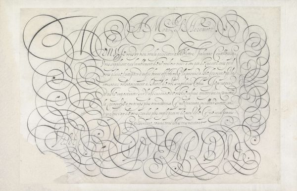
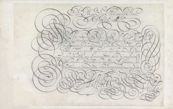
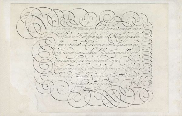
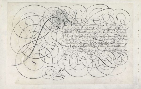
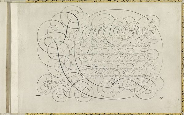
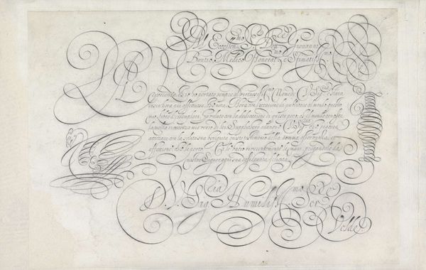
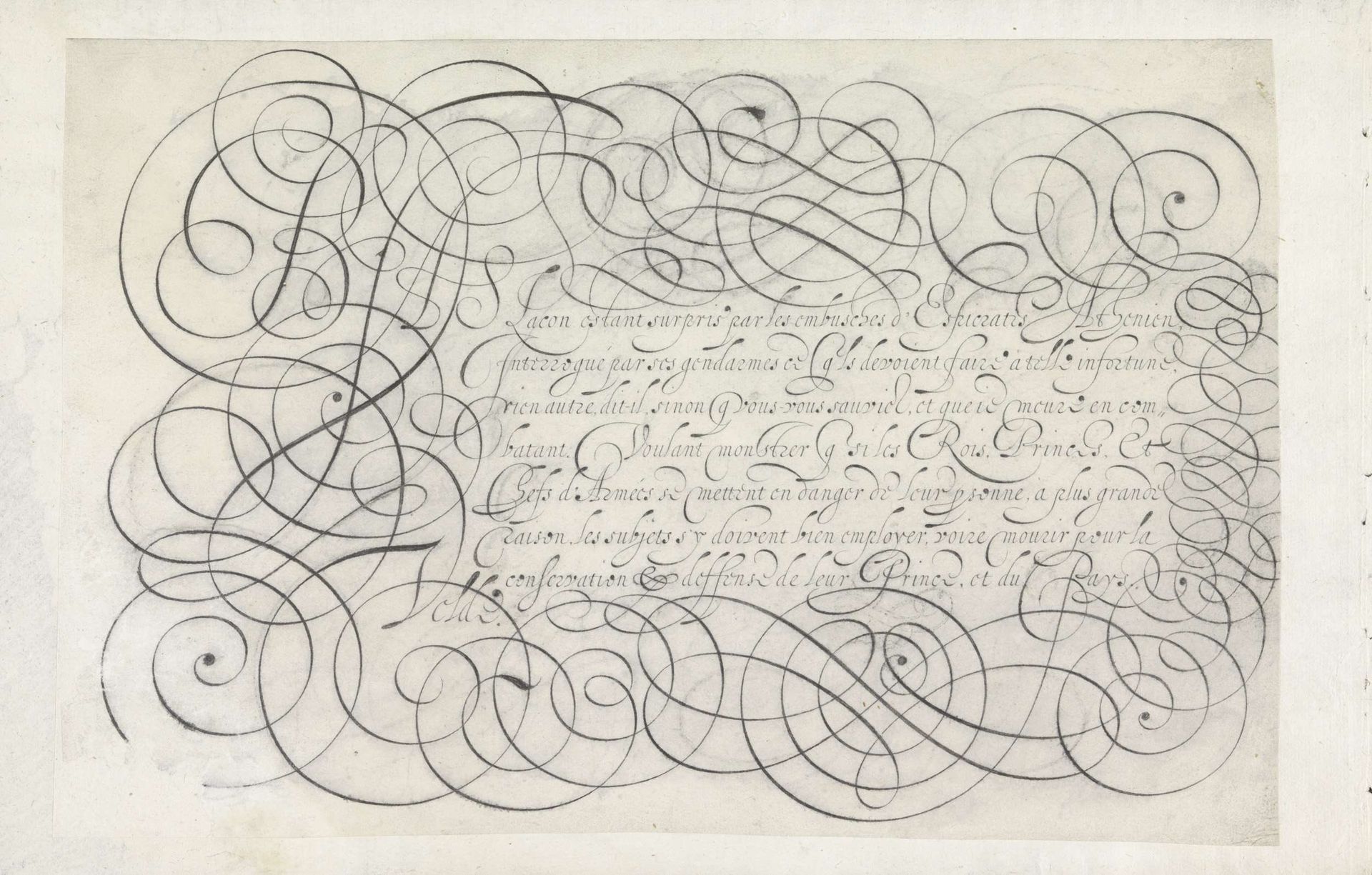
Curator: Welcome! Let's discuss this intriguing piece from 1605, currently held at the Rijksmuseum. It's titled "Ontwerp van een schrijfvoorbeeld: Bias Lacon estant surpris (...)," by Jan van de Velde I, executed in pen and ink. Editor: My first impression? A dizzying, baroque dance of lines. It's as though the words themselves are trying to escape the page through sheer exuberance. The density of the calligraphic elements creates an interesting visual tension. Curator: Indeed. Note how the penmanship becomes both the subject and the medium. Van de Velde's design manipulates negative space, playing with notions of figure and ground in remarkable ways. The dense network of looping lines forms the visual field, creating depth from only tonal variation. Editor: Looking at it through a contemporary lens, this piece evokes the complex relationships between power and knowledge. The elite status of literacy and education during the Baroque era can be read here as a literal representation of control through codified language. I find myself wondering who the intended audience was and how the writing sample served their class interests. Curator: Precisely. We can certainly analyze this work in terms of its function, situating it within pedagogical trends of the era, observing the elegance of letterforms, loops, and the precise linework. Editor: Right, and beyond the aesthetics, there is also, undeniably, the latent tension. In what ways might writing – this controlled, crafted expression - serve as an act of rebellion or subversion when used in specific historical moments by people lacking access? Curator: Food for thought! Considering the formal beauty and societal context certainly offers new possibilities in appreciating Jan van de Velde’s artwork. Editor: Yes, and recognizing calligraphy’s intersection with class, power, and even resistance expands our perception of its importance.
Ontwerp van een schrijfvoorbeeld: Bias Lacon estant surpris (...) 1605
Jan van de Velde I
1568 - 1623Location
RijksmuseumArtwork details
- Medium
- drawing, graphic-art, print, ink, pen
- Dimensions
- height 195 mm, width 294 mm
- Location
- Rijksmuseum
- Copyright
- Rijks Museum: Open Domain
Tags
word art style
drawing
graphic-art
hand-lettering
baroque
hand drawn type
hand lettering
word art
ink
hand-drawn typeface
calligraphic
pen work
pen
sketchbook art
doodle art
calligraphy
Comments
No comments
About this artwork
Curator: Welcome! Let's discuss this intriguing piece from 1605, currently held at the Rijksmuseum. It's titled "Ontwerp van een schrijfvoorbeeld: Bias Lacon estant surpris (...)," by Jan van de Velde I, executed in pen and ink. Editor: My first impression? A dizzying, baroque dance of lines. It's as though the words themselves are trying to escape the page through sheer exuberance. The density of the calligraphic elements creates an interesting visual tension. Curator: Indeed. Note how the penmanship becomes both the subject and the medium. Van de Velde's design manipulates negative space, playing with notions of figure and ground in remarkable ways. The dense network of looping lines forms the visual field, creating depth from only tonal variation. Editor: Looking at it through a contemporary lens, this piece evokes the complex relationships between power and knowledge. The elite status of literacy and education during the Baroque era can be read here as a literal representation of control through codified language. I find myself wondering who the intended audience was and how the writing sample served their class interests. Curator: Precisely. We can certainly analyze this work in terms of its function, situating it within pedagogical trends of the era, observing the elegance of letterforms, loops, and the precise linework. Editor: Right, and beyond the aesthetics, there is also, undeniably, the latent tension. In what ways might writing – this controlled, crafted expression - serve as an act of rebellion or subversion when used in specific historical moments by people lacking access? Curator: Food for thought! Considering the formal beauty and societal context certainly offers new possibilities in appreciating Jan van de Velde’s artwork. Editor: Yes, and recognizing calligraphy’s intersection with class, power, and even resistance expands our perception of its importance.
Comments
No comments