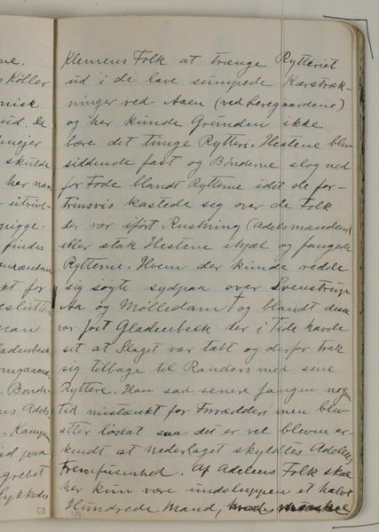
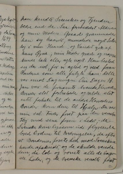
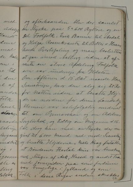
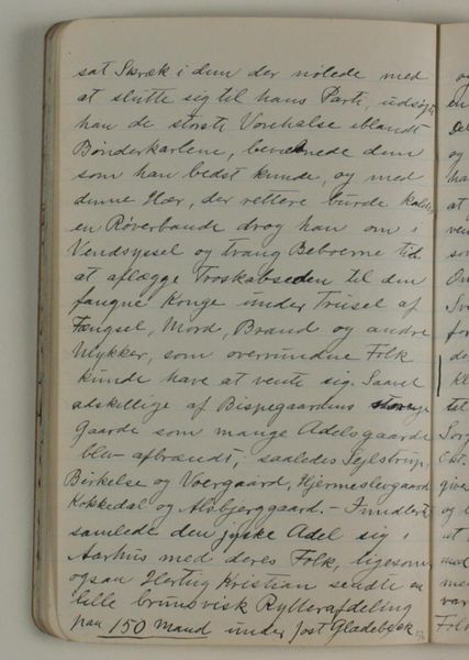
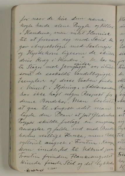
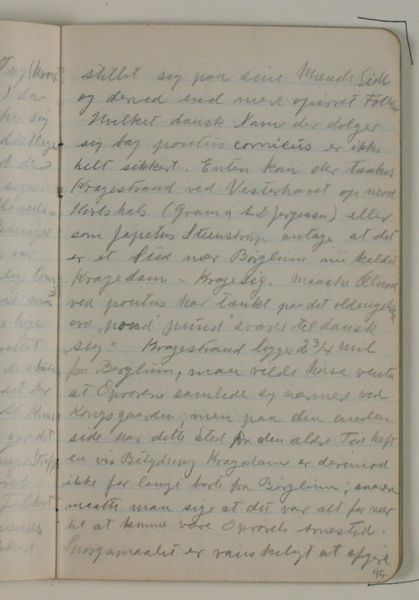
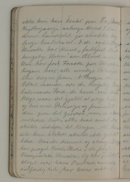
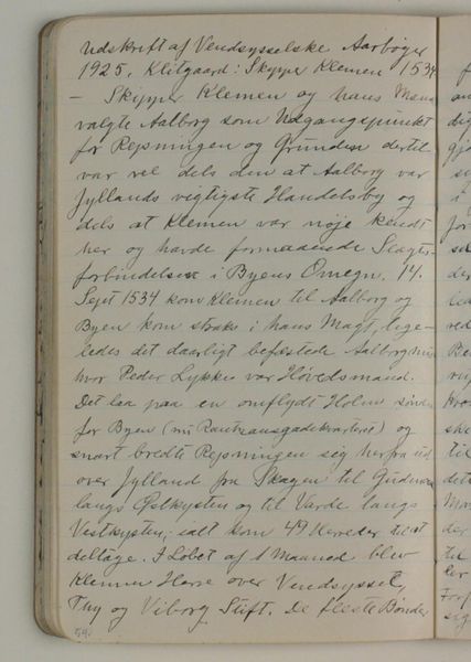
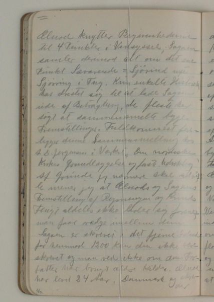
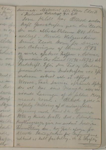
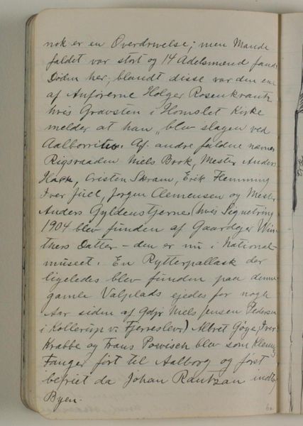
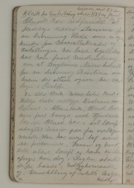
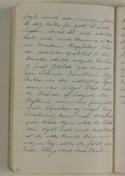
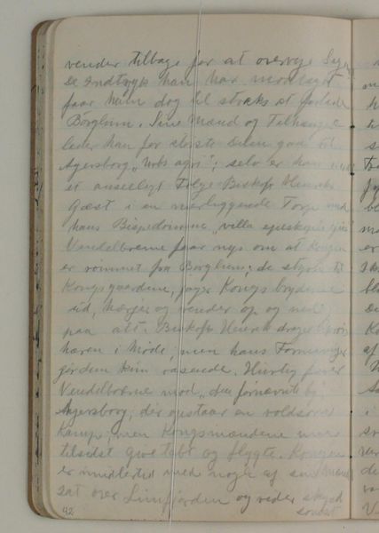
Notater vedrørende Skipper Klementes opstand og slaget ved Svendstrup mose. Afskrift efter Vendsyssel Aarbøger 1925 1933 - 1934
0:00
0:00
drawing, textile, paper, ink, pencil
#
drawing
#
aged paper
#
hand-lettering
#
sketch book
#
hand drawn type
#
hand lettering
#
textile
#
paper
#
personal sketchbook
#
ink
#
hand-drawn typeface
#
pencil
#
sketchbook drawing
#
sketchbook art
#
small lettering
Dimensions: 175 mm (height) x 109 mm (width) (monteringsmaal), 175 mm (height) x 109 mm (width) (bladmaal)
Curator: Let’s consider this piece held at the Statens Museum for Kunst. It is titled "Notater vedrørende Skipper Klementes opstand og slaget ved Svendstrup mose. Afskrift efter Vendsyssel Aarbøger 1925," or, “Notes Concerning Skipper Klement’s Revolt and the Battle of Svendstrup Moor. Transcript from Vendsyssel Yearbooks 1925.” It comes to us from the hand of Niels Larsen Stevns, and dates to around 1933 or 1934. Editor: My immediate impression is one of intimate historical witness. The cramped hand lettering gives it the air of a private document, and yet the scale feels monumental, somehow bearing witness to dramatic events. The effect reminds me of illuminated manuscripts and medieval tomes. Curator: I see it too! I would suggest that we observe the prominence given to particular words—these are highlighted in a way that seems both visually purposeful and laden with significance. They evoke the gravity of historical events and signal turning points in the narrative. The sketch evokes familiar historical symbols as an exercise in national mythmaking. Editor: Yes, the lettering does lend it weight. The artist certainly makes full use of negative space, allowing certain phrases to almost breathe on the page. There is a dynamic push-and-pull here as the eye attempts to prioritize information from a dense collection of text. Do you see the influence of calligraphic art, where line thickness and density guide meaning? Curator: Absolutely. One notices how certain phrases seem strategically placed—almost as beacons guiding us through the textual landscape, creating visual anchors, perhaps echoing key figures and conflicts in Skipper Clement's Revolt. But what do you make of the drawing's incompleteness, the sense it is one fragment of a larger whole? Editor: That incomplete feeling might be exactly the point. It lends a kind of immediacy to the artwork, giving it an almost archaeological, discovered-fragment character, heightening our awareness of what the visual image doesn't include as much as what it shows. It becomes its own artifact of a prior text, which adds yet another layer of encoding to our contemporary encounter. Curator: Precisely. It's as if Stevns wants to create a tangible link to the past, so the revolt itself is given not merely representation, but reincarnation, rendered through ink and our active visual perception. Editor: In this way, by calling attention to textual marks and material features of design, it prompts us to remember that all historical interpretation remains partial, constructed.
Comments
No comments
Be the first to comment and join the conversation on the ultimate creative platform.
More like this