Copyright: Modern Artists: Artvee
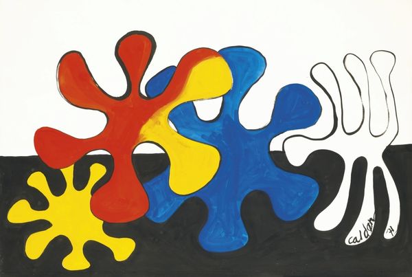
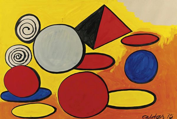
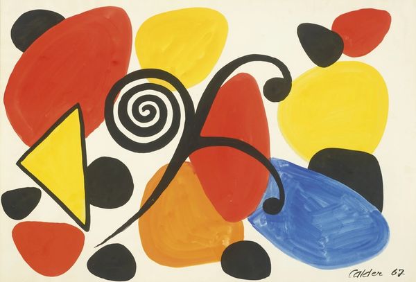
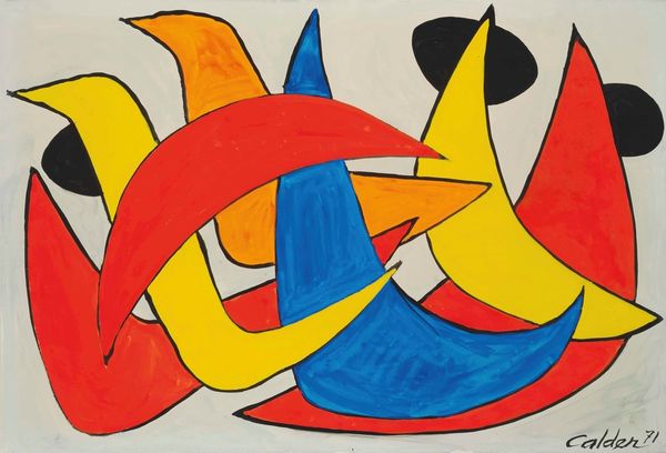
Curator: Welcome! Today we're looking at Alexander Calder’s “Pajamarino,” created in 1971 with acrylic paint. Editor: Well, right away it strikes me as joyously simple. Like Matisse let loose with some Play-Doh, only the shapes are dancing! Curator: I find it captivating how Calder captures such exuberant movement with minimal lines. There's a childlike quality to the shapes, a red, a blue, and a yellow figure intertwining on the white background. Editor: True, and those flat acrylics...no pretense. What fascinates me is the tension between “high” art and the kind of cheerful imagery you might find screen-printed on, say, a child’s t-shirt back in the '70s. How does Calder negotiate that? Is he elevating the mundane or democratizing fine art? Curator: Perhaps both. Calder, even with his mobiles, consistently played with balance and space, almost turning sculpture into a dance. This piece echoes that feeling of equilibrium, those bold shapes holding their own within the composition. It's abstraction meeting pure play. Editor: Absolutely, and I see how his exploration of space goes hand-in-hand with challenging our notions of craft. The execution is straightforward. Acrylics were, and often still are, dismissed in favor of oil paints or other supposedly more refined materials. And it suggests a very immediate, almost off-the-cuff approach to art-making. A playful dismissal of the seriousness surrounding creative processes. Curator: That's astute. It mirrors the unpretentious whimsy found in his sculptures. He embraced industrial materials, rejecting art world dogma of that time. The shapes here echo his famous circus figures, each vibrantly painted body suggesting a character—weightless, whimsical, caught in perpetual motion. Editor: Exactly! And when we consider how mass-produced, commercially available acrylics influenced visual culture... Calder anticipated something, didn't he? Before art was easily reproduced, bought, and sold. He gives us this intriguing peek at that coming shift. Curator: Well said. "Pajamarino" encapsulates a unique lightness, a blend of formal elegance with art’s more accessible side. Editor: For me, it throws into sharp relief questions around materials and access.
Comments
No comments
Be the first to comment and join the conversation on the ultimate creative platform.
More like this