acrylic-paint, mobile
#
pop art-esque
#
popart
#
caricature
#
pop art
#
acrylic-paint
#
abstract
#
geometric
#
mobile
#
pop art-influence
#
modernism
Copyright: Modern Artists: Artvee
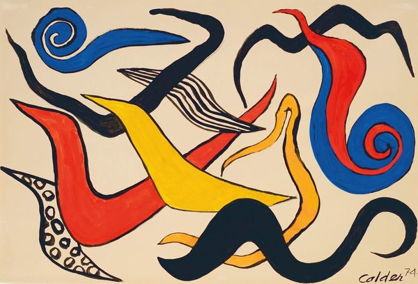
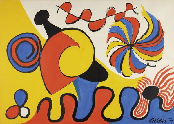
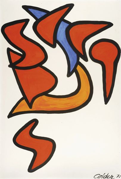
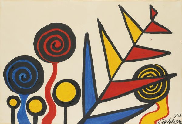
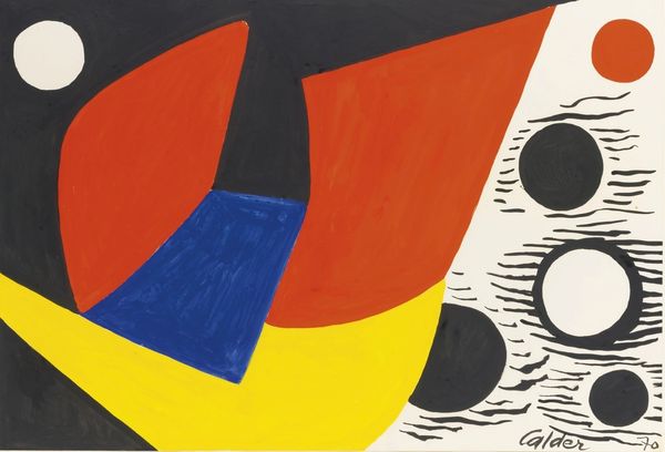
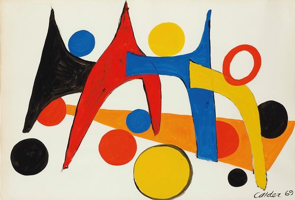
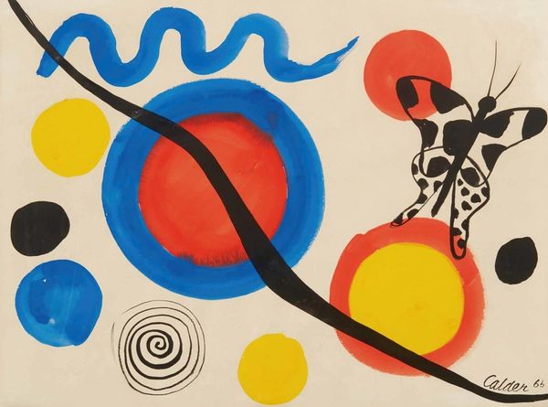
Curator: It practically leaps off the canvas! It’s so vibrant and playful. Editor: Indeed. Here we have Alexander Calder's "Ducks and Seals," completed in 1971, utilizing acrylic paint. One immediately senses a bold application of form and colour, a departure from conventional representation. Curator: I'm struck by the almost cartoonish simplicity. There's a directness here that reminds me of the shift towards consumer culture and mass production of imagery—a democratization of art, in a sense. He embraced accessible materials like industrial paint and challenged high art ideals by referencing familiar aquatic life. What do you make of his choices, formally? Editor: Well, note how the basic geometric shapes dominate, articulated with black outlines and filled in with these saturated primary colors. There’s almost no gradation; he’s distilled forms down to their most elemental essence. The composition presents these overlapping figures against an open background—a strategy to avoid the heaviness of mass. Curator: Precisely, and this flattening could be seen as a conscious move against illusionistic painting techniques. This isn't about creating an alternate reality but about acknowledging the painting as an object, an interplay of colours on a flat plane, produced for widespread viewing. Editor: I concede that the interplay of the curvilinear forms and their sharp angles creates dynamism, guiding your eye through a calculated sequence. However, one must address the lack of depth. Does it successfully translate Calder's mastery of movement in his mobiles? Here, it feels... static. Curator: Perhaps not directly kinetic, but there’s movement implied—the abstracted forms evoke the suggestion of shifting underwater creatures and water itself. Further, consider his involvement with theatrical set designs at the time. Editor: A connection to performative space and movement is an intriguing element, considering the material’s stability on canvas—the inherent irony, if you will. Curator: It's true. He took elements of his spatial art and froze it here in paint to great effect. A great testament to his style across the different art movements and trends. Editor: Absolutely, it invites a new way of understanding the potential locked inside fundamental forms and colours—it does feel distinctively Calder.
Comments
No comments
Be the first to comment and join the conversation on the ultimate creative platform.
More like this