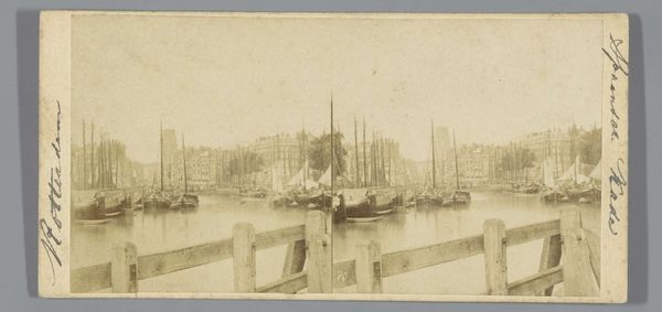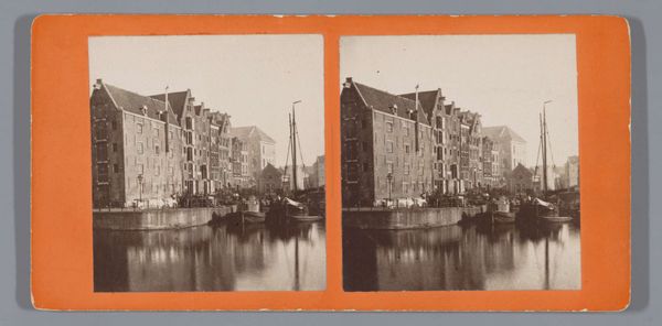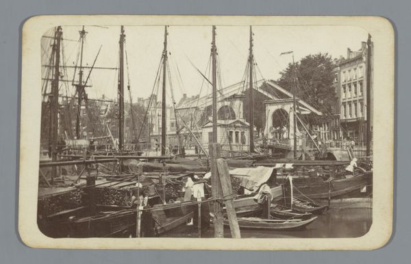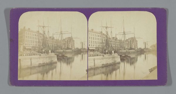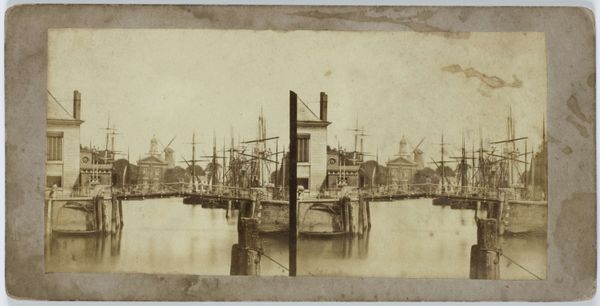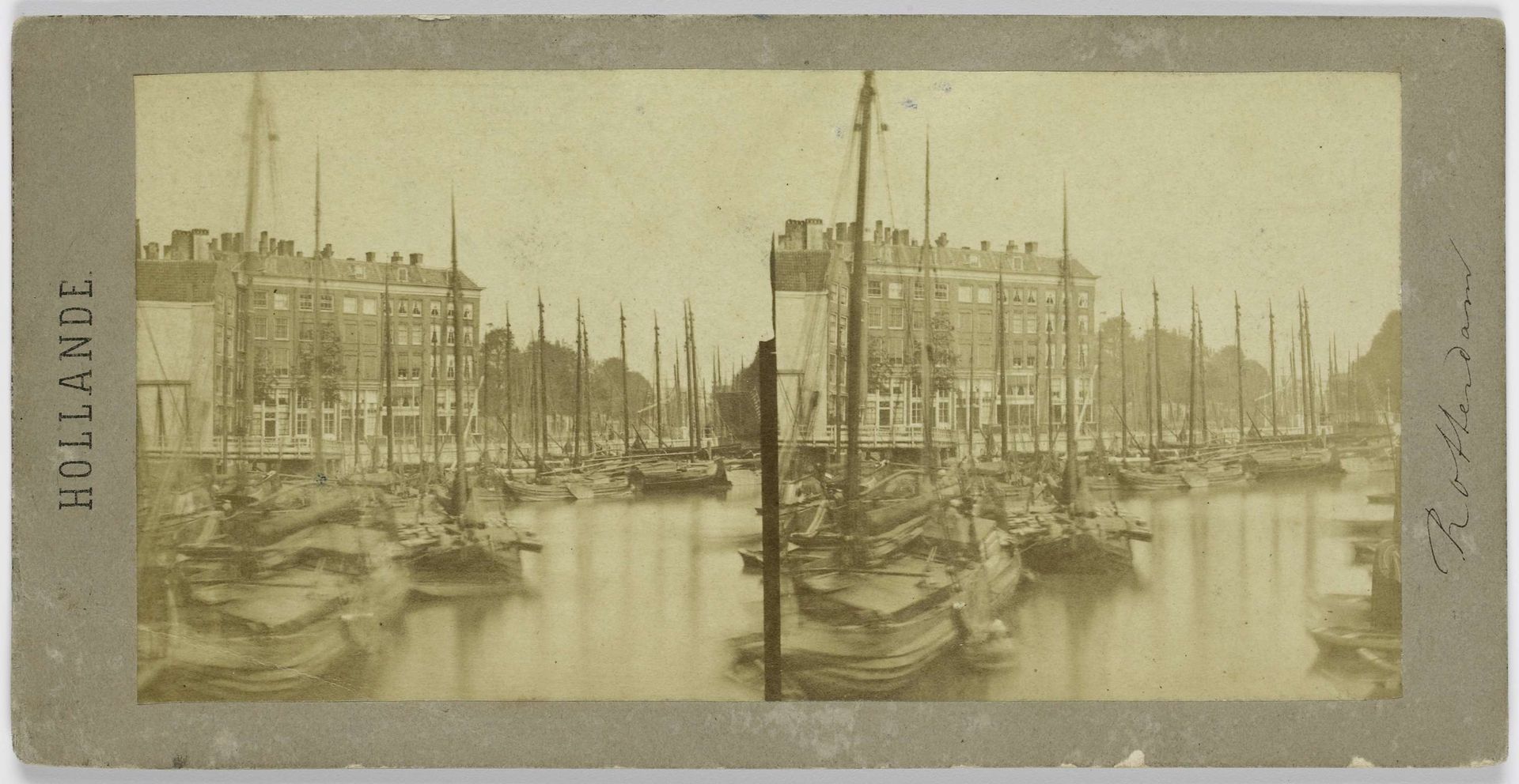
1858
Gezicht op de Nieuwehaven in Rotterdam
Listen to curator's interpretation
Curatorial notes
Curator: Ah, another beautiful albumen print to contemplate! This one is Charles-Henri Plaut's "Gezicht op de Nieuwehaven in Rotterdam," created in 1858. What's your immediate impression? Editor: Well, it feels like looking into a sepia dream. The masts of the ships create this incredible forest of verticals, a stillness, and there is just this hazy calm over everything. Curator: Hazy calm, yes! That's the atmospheric perspective working its magic, absolutely aided by the subtle tonal range. Notice how Plaut has skillfully used the depth of field to suggest the expansive space of the harbor. The dark foreground, with its detailed ships, draws you in, doesn't it? Editor: Definitely. There is a powerful contrast too: those dense buildings, emblems of Rotterdam's prosperity, against the delicate rigging. It is almost architectural. It looks almost like a deliberate contrast. I’d love to hear about the compositional intention there. Curator: Precisely. It's not just a record of a place, it's a carefully constructed image. Consider the repetition of the masts, that almost mathematical arrangement; this reinforces the formal grid structure, creating this amazing rhythmic pattern against the solid mass of the buildings. The semiotics give it structure. What I mean is, it uses structural elements, if I might be so bold as to put it, as almost symbolic elements. Editor: That grid gives a nice stability. Thinking about that dreamy effect, I do wonder about the longer exposures necessary in early photography. Were they aiming for such ethereal results, or was it simply the nature of the process? Did they try to counter those aspects? Curator: Interesting point! My feeling is that in a piece like this, artists recognized and embraced the ethereal, the dreamy qualities of the medium. Photography in 1858 wasn't just about capturing reality—there's artistic license there, I reckon! The lighting isn’t purely documentarian in the photograph as an object, that is, so much as creative, almost expressionist in a muted sense. It is definitely an expression of space. Editor: So, less concerned with pure representation, more with using the technology to capture atmosphere? That really does shift how we interpret the work. A deliberate decision to enhance a feeling, not just reflect what was. Curator: Exactly! And it's the layers of meaning, both formal and emotional, that continue to fascinate me about this unassuming albumen print. Editor: Yes, and for me, it is really a gentle nudge towards pondering what the city really stood for back then.