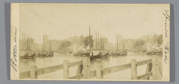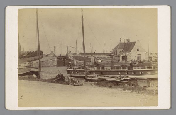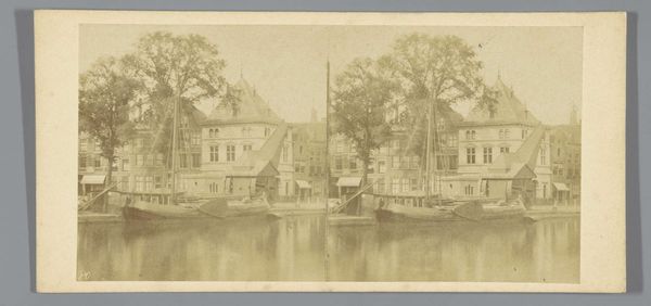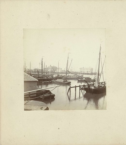
1859 - 1870
Jachthaven aan de Amstel, Amsterdam
Pieter Oosterhuis
1816 - 1885Location
RijksmuseumListen to curator's interpretation
Curatorial notes
Curator: Good morning, everyone. Welcome. Today, we are examining Pieter Oosterhuis' gelatin silver print, “Jachthaven aan de Amstel, Amsterdam," which dates approximately to 1859-1870. Editor: Immediately, I'm struck by the subdued tone of this photograph. It possesses a stillness; the sepia wash imbues a tranquil yet almost ghostly presence. Curator: The brilliance of Oosterhuis' approach is evident in the calculated structure of the photograph, especially concerning the perspectival construction. The arrangement leads the eye deliberately into the serene depths. It’s not merely documentation but pictorial architecture. Editor: Precisely, I wonder about the means to arrive at this aesthetic decision. Gelatin silver prints from this era involved a detailed labor division: someone had to mix the emulsion, prepare the glass plates, expose and develop the print… Who were those invisible hands, what was their pay and labor conditions, I want to know everything. Curator: It speaks of his comprehension of visual rhetoric. Observe, for example, the interplay of dark and light regions as tools for constructing form. Every reflection, and shaded space creates structure which builds toward narrative and aesthetic equilibrium. Editor: Those reflections also reveal a fascinating dance between craft and industry, Curator. Photography in that moment straddled a line, and consider what new class dynamics shaped photographic studios at the time, and how did photographers begin thinking of themselves as artists or skilled laborers? Curator: Such inquiry broadens the frame but let’s not dilute Oosterhuis’ mastery with the chemistry—he was working meticulously within technological boundaries and still achieved a harmonious configuration of tonality, creating emotional depth. The picture becomes less about what's captured than how. Editor: Fair, it certainly compels me to question who gets included or excluded through this technological lens. Where can we place this within discussions of class representation, how does it help sustain our social relationships with work and leisure in Dutch society. Curator: Interesting point—and it reminds us there are always further visual languages embedded, only to be unearthed through study. Editor: Exactly, every viewing reveals more dimensions of this work for thought and continued material history and understanding.