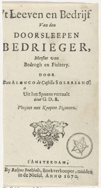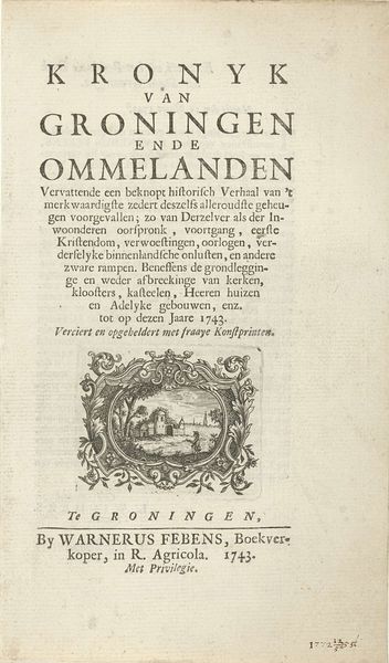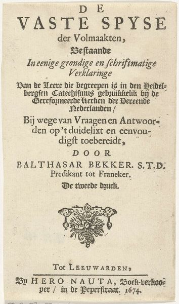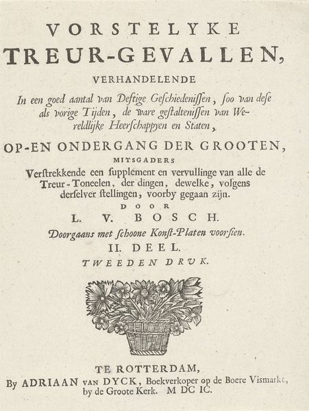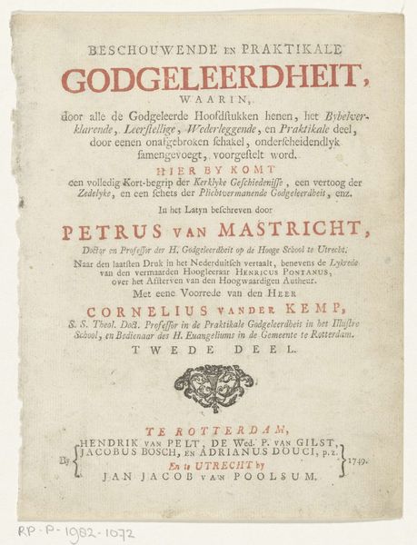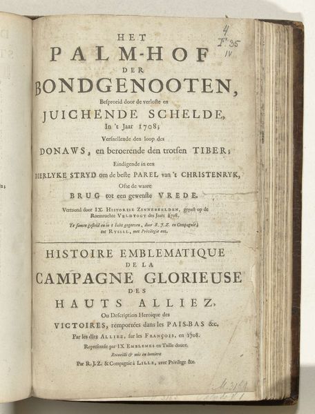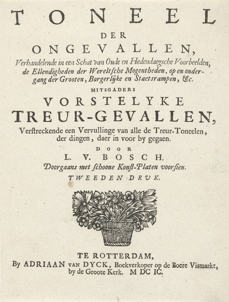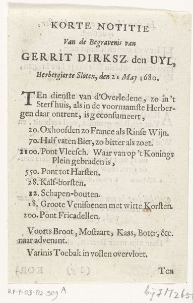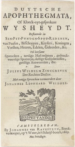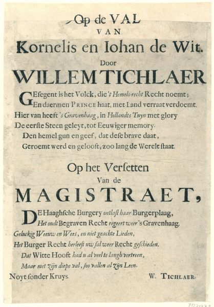
Titelpagina voor: J. d'Outrein, De ziels-opheffing, 1702-1703 1701 - 1703
0:00
0:00
arnoldhoubraken
Rijksmuseum
print, typography, engraving
#
hand-lettering
#
baroque
# print
#
hand drawn type
#
hand lettering
#
typography
#
hand-written
#
hand-drawn typeface
#
stylized text
#
thick font
#
handwritten font
#
engraving
#
historical font
#
small lettering
Dimensions: height 150 mm, width 89 mm
Copyright: Rijks Museum: Open Domain
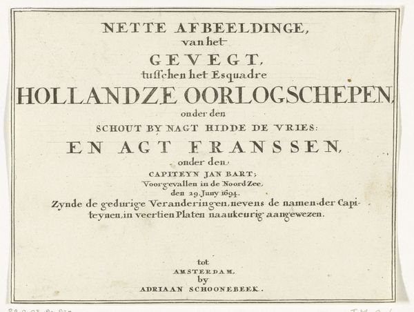
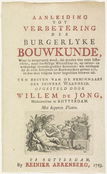
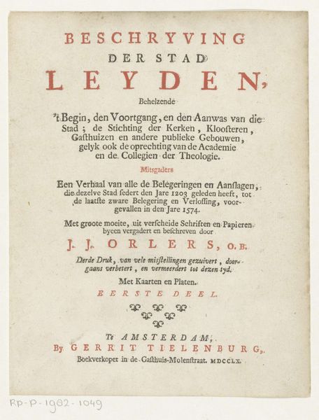
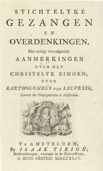
Curator: Here we have a title page, an engraving crafted between 1701 and 1703 by Arnold Houbraken. Editor: It looks rather humble, doesn’t it? I’m struck by its directness; text filling the page, a real emphasis on the manual craft. The rose motif grounds the page. Curator: Indeed. This is the title page for J. d’Outrein’s “De Ziels-Opheffing,” or “The Soul’s Lifting Up,” suggesting spiritual elevation through prayer. Notice how "BIDDER" and "DANKZEGGER" are printed in red, the colour has a certain passion that lends to this visual allegory of pious transformation. Editor: And look at the printing itself! The varied weight of the line, the pressure used to create such heavy letterforms, it screams labour and speaks volumes of the period's production methods. Typography as a crucial means of spreading ideas! Curator: Absolutely. The stylized text reinforces a baroque aesthetic, which, even on a title page like this, has cultural and psychological resonances that continue today, offering us a glimpse into the spiritual concerns and conventions of its time. It’s interesting to think how someone encountering this would view it; they would certainly respond to the spiritual dimensions, I think. Editor: Precisely! It is that intersection of social and material practice that makes it so compelling; book production aimed toward disseminating religious texts into the hands of worshippers, of course has a huge historical and social impact on how it would have been received and consumed! The slightly aged paper, the embossed letters and image. The materiality reminds me of it's cultural past and continuity into our present day. Curator: It really is an artifact rich with meaning; this artwork really embodies spiritual ascension through typography! Editor: Definitely. It's about how something as humble as a title page illuminates larger cultural and historical dialogues and materiality.
Comments
No comments
Be the first to comment and join the conversation on the ultimate creative platform.
