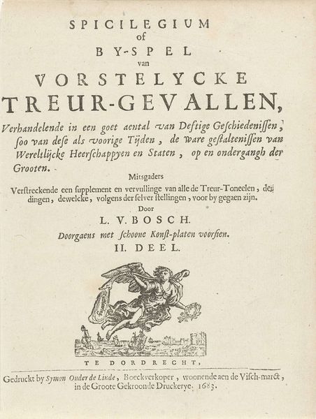
Titelpagina voor: L. van den Bos, Vorstelycke treur-gevallen; deel 2 van: Het toneel der ongevallen, 1699 1699
0:00
0:00
arnoldhoubraken
Rijksmuseum
graphic-art, print, typography, engraving
#
graphic-art
#
script typography
#
hand-lettering
#
baroque
# print
#
old engraving style
#
hand drawn type
#
hand lettering
#
flower
#
typography
#
hand-drawn typeface
#
stylized text
#
thick font
#
pen work
#
handwritten font
#
engraving
Dimensions: height 180 mm, width 137 mm
Copyright: Rijks Museum: Open Domain
Curator: This engraving, created by Arnold Houbraken in 1699, serves as the title page for the second part of L. van den Bos’s “Vorstelycke treur-gevallen; deel 2 van: Het toneel der ongevallen,” which translates to "Princely Tragedies; part 2 of: The scene of accidents." It’s held at the Rijksmuseum. Editor: My initial impression is one of austerity, almost starkness, despite the small floral detail at the bottom. The composition feels very top-heavy due to the dense lettering. What can you tell me about the historical context influencing such design choices? Curator: Well, in the late 17th century, title pages weren’t just labels. They served a critical role in marketing and establishing the book's seriousness, especially a work dealing with tragedies. The sheer density of the text – packed with key phrases and names – signals the wealth of knowledge and moral lessons contained within. The inclusion of the publisher's details and the mention of “schoone Konst-Platen”, beautiful art plates, further add to the commercial and aspirational value. Editor: The heavy reliance on typography does speak volumes. The script itself looks almost…constructed, reflecting the deliberate labor of both the designer and the typesetters. Do you think the typography carries some weight, material weight, in constructing the “tragedy” that the book speaks of? Curator: I would say that's absolutely accurate. The careful arrangement and the chosen typeface underscore the gravity of the narratives inside, suggesting a certain monumental quality to human suffering as befits a moralizing work aimed at the elites. The engraving medium also plays a role, allowing for precise lines that reinforce this effect of somber control. Editor: Considering it is from Rotterdam, it makes me consider its making as a commercial item that involves manual work from someone who is highly specialized in the technique of carving these scripts. Also it shows off the beautiful flower decorations as embellishment to add “taste”. Curator: True. Even the inclusion of the floral arrangement – though a delicate touch – would be strategically placed to balance the density of text, while speaking to themes of fleeting beauty and life’s transience which are classic elements of Baroque sensibilities regarding death and mortality. Editor: Looking closer makes me realize the high skill necessary in that level of meticulous line work…it’s like witnessing history materially inscribed on a page. It reminds us how much effort it took to simply reproduce and disseminate texts at the time. Curator: Indeed, and hopefully we’ve shed a little light today on the role of this object in its historical setting. Editor: Agreed, the careful design and artisanal method really amplify the narratives this title page heralds, inviting deeper reflection on both art and society.
Comments
No comments
Be the first to comment and join the conversation on the ultimate creative platform.
More like this