drawing, paper, ink, pen
#
script typeface
#
drawing
#
script typography
#
hand-lettering
#
old engraving style
#
hand drawn type
#
hand lettering
#
paper
#
ink
#
hand-drawn typeface
#
thick font
#
pen
#
handwritten font
#
small lettering
Copyright: Rijks Museum: Open Domain
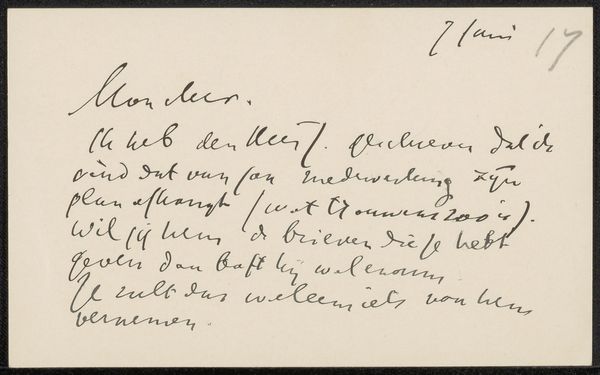
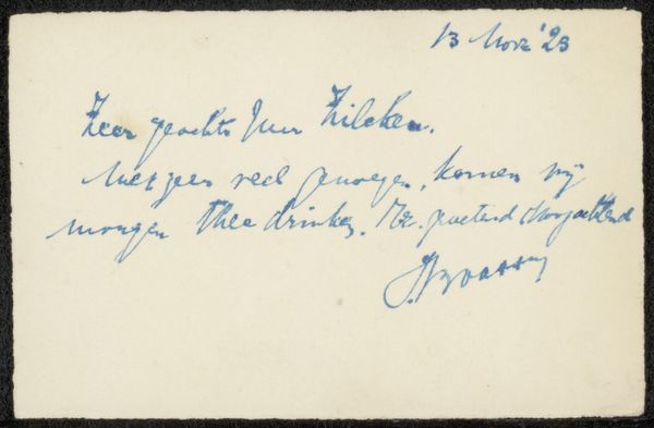
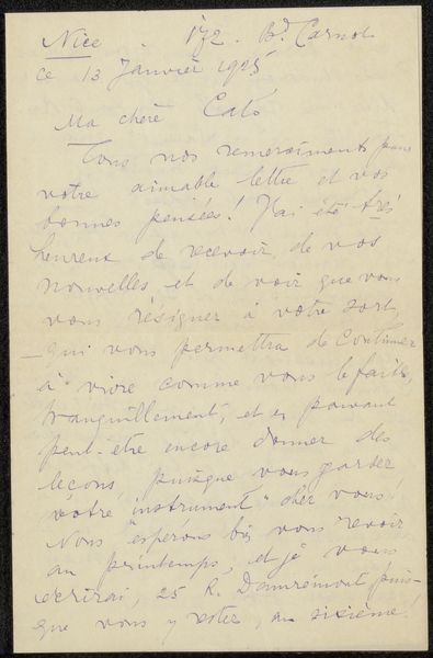
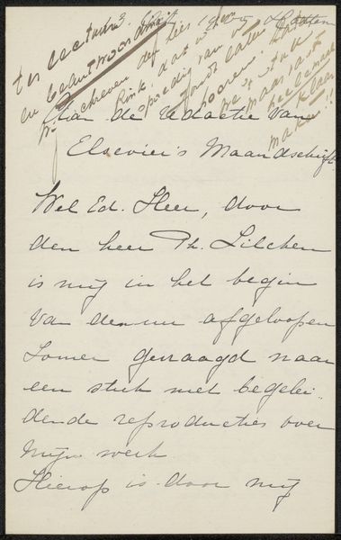
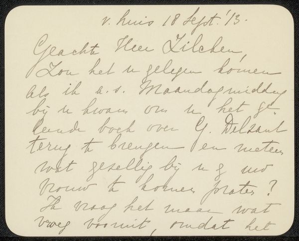
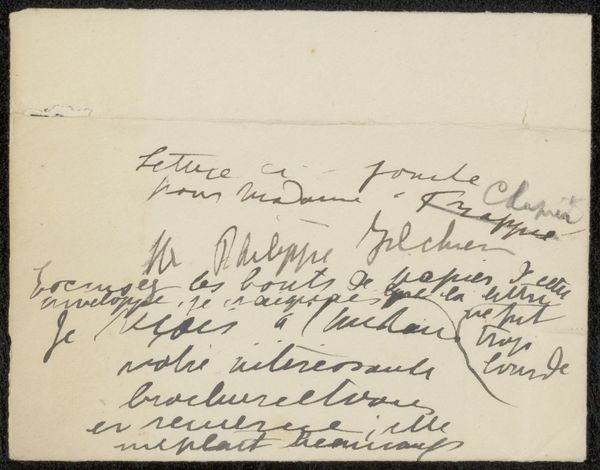
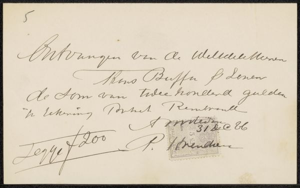
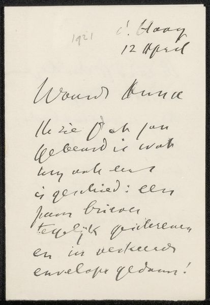
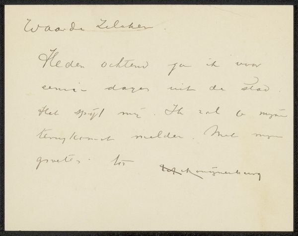
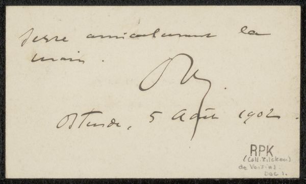
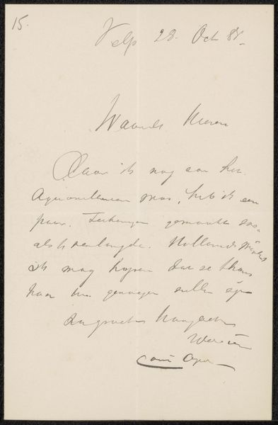
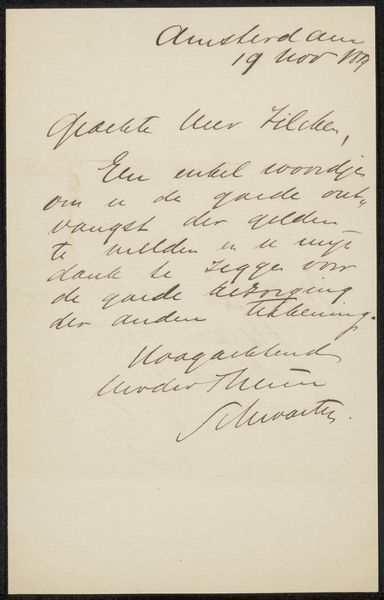
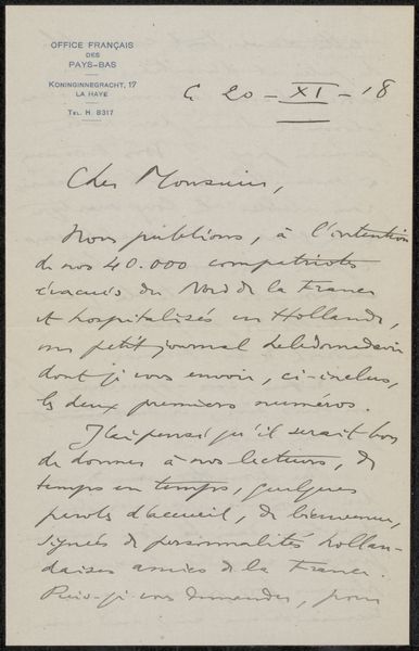
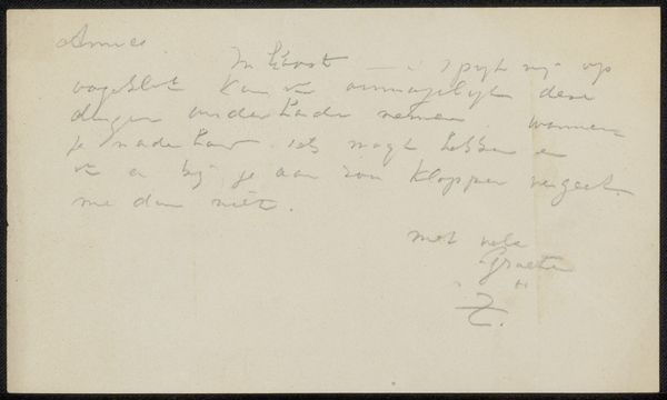
Editor: Here we have "Brief aan Jan Veth," which translates to "Letter to Jan Veth," created by Isaac Israels between 1875 and 1925, using ink on paper. The lettering, a fluid, almost cursive hand, lends an intimacy to the work. What compositional elements strike you the most? Curator: Primarily, the contrast between the white paper support and the varying thickness of the ink lines. The strokes demonstrate an assured hand, yet possess a nervous energy through their delicate fluctuations. Consider how the artist chose to position the text; observe the arrangement of forms and the subtle dance between positive and negative space. How does that asymmetry contribute to the work’s impact? Editor: It definitely feels immediate and personal. The words are not perfectly aligned, giving the impression of a quickly jotted-down note. Is that informality deliberate? Curator: I would argue that it is a conscious aesthetic choice. By disrupting formal regularity, Israels accentuates the gestural quality of writing itself, drawing attention to the act of inscription. The texture of the ink on the paper is crucial. Would you agree the essence of this work is purely the graphic interplay, almost divorced from the content of the note itself? Editor: I think I understand. It's not about *what* he's saying as much as *how* he's saying it—the visual rhythm and the texture of the handwriting. I didn't expect to analyze handwriting so abstractly. Curator: Precisely. The materiality of language becomes the primary subject. Recognizing these properties enhances appreciation and unlocks another dimension for us.
Comments
No comments
Be the first to comment and join the conversation on the ultimate creative platform.
