drawing, textile, paper, ink
#
drawing
#
hand-lettering
#
pen sketch
#
hand drawn type
#
hand lettering
#
textile
#
paper
#
personal sketchbook
#
ink
#
ink drawing experimentation
#
pen-ink sketch
#
pen work
#
sketchbook drawing
#
sketchbook art
Copyright: Rijks Museum: Open Domain
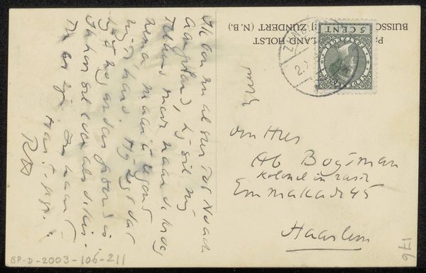
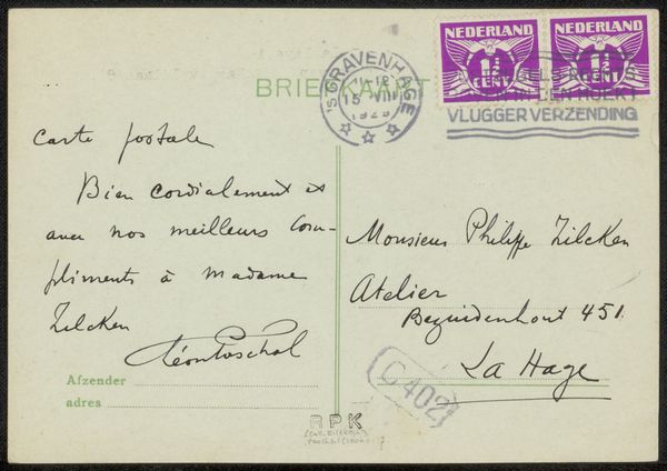
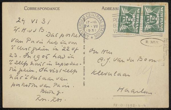
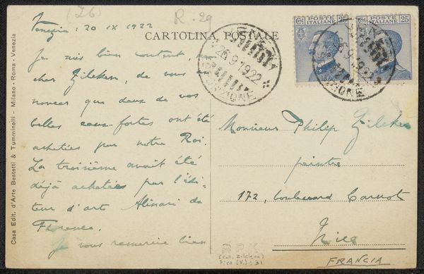
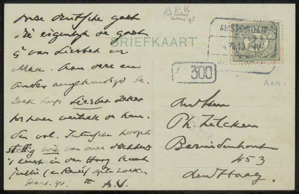
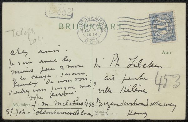
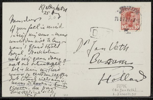
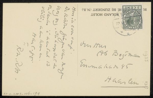
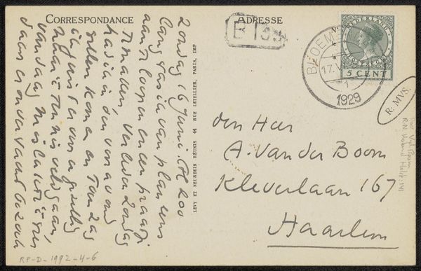
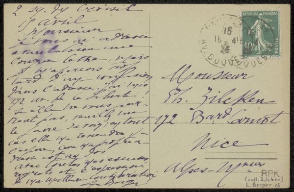
Curator: We are looking at "Prentbriefkaart aan Philip Zilcken", a piece possibly created around 1929 by Simonne Ratel, rendered in ink on paper. Its a kind of personal postal note, covered in handwritten text. Editor: The immediacy is compelling. There's a clear hierarchy established by the different type sizes. The layout has an off-the-cuff, almost chaotic charm to it. Curator: The casual style likely reflects its function. Postal notes were often quickly composed for friends or family, so that raw quality makes sense. Also, given its composition with personal touches and experimental type setting, wouldn’t you call it a kind of a miniature sketchbook? Editor: Definitely! And this reveals her attention to design, her handling of positive and negative space as deliberate expressive choices. Look at the variety in the line work – the bold strokes contrasting with the delicate script. Its far from casual in its artistry. Curator: Think about how letter writing in this era provided a key connection in social fabric, the cultural role that a carefully handwritten card played in maintaining connections. Do you see anything else there? Editor: Well, beyond its graphic quality, note the two postage stamps: The stamps create this interesting mirroring that balances text on the card. And together with the location inscription, its becomes like a historical document – the physical route its taking to its destination. Curator: The French stamps themselves have their own loaded iconography – Marianne representing France, for example. The act of physically mailing also adds a kind of ceremonial quality. What's more is its historical significance for gay artists to have queer relationships. Editor: That is so interesting. The composition really pulls us in though. It shows what you say. It connects someone back then to ourselves in our time now. I will never look at sending mail quite the same way now! Curator: And for me, it reminds me to keep alive an individual's mark on the historical memory. The emotional weight of a handwritten text is truly timeless.
Comments
No comments
Be the first to comment and join the conversation on the ultimate creative platform.
More like this