drawing, ink, pen
#
drawing
#
comic strip sketch
#
hand-lettering
#
hand drawn type
#
hand lettering
#
personal sketchbook
#
ink
#
hand-drawn typeface
#
pen work
#
sketchbook drawing
#
pen
#
storyboard and sketchbook work
#
sketchbook art
#
calligraphy
Copyright: Rijks Museum: Open Domain
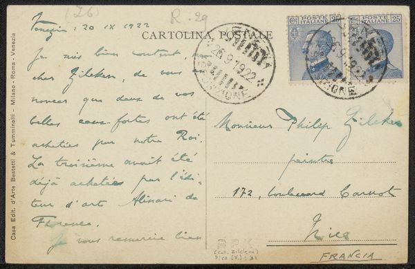
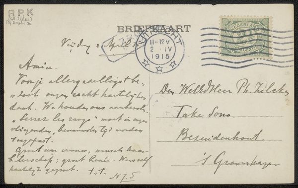
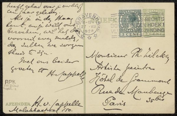
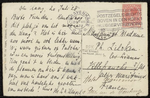
Editor: Here we have Léon Paschal's "Briefkaart aan Philip Zilcken," likely from 1929, executed in pen and ink. It’s fascinating how such a mundane object—a postcard—can become a compelling piece of art. The varying penmanship and the graphic quality of the stamps create an interesting texture. What do you see in this piece, focusing on its artistic merits? Curator: The core interest lies in Paschal’s deployment of line and form. Observe how the deliberate weight of the strokes varies to articulate space, effectively dividing the composition into distinct textual zones. Note the contrast between the cursive script, with its fluid, dynamic quality, and the more rigid, block-like printing of the stamps and postmark. This tension elevates what would otherwise be simple utilitarian text to a level of visual engagement. Editor: I see what you mean about the tension. It’s almost like the postcard is having a conversation with itself. What about the stamps? Do they play a formal role, or are they simply part of the postal process? Curator: Their formal function is undeniable. The identical stamps, placed symmetrically, act as visual anchors. Their purple hue establishes a chromatic rhythm that harmonizes with the overall composition. Disregard their utilitarian purpose; they become integrated elements within Paschal's carefully conceived arrangement. It's the interplay of textures, the density of the ink, and the contrasting styles of lettering that render this object more than just a postcard. Editor: That’s a great way to think about it. I initially saw it just as an old postcard, but now I see how Paschal's manipulation of these elements transforms it into a study of texture and form. Curator: Indeed. Hopefully, it illuminates the inherent artistic potential found in the everyday. The postcard transcends its primary function and enters the realm of aesthetic consideration.
Comments
No comments
Be the first to comment and join the conversation on the ultimate creative platform.
More like this