About this artwork
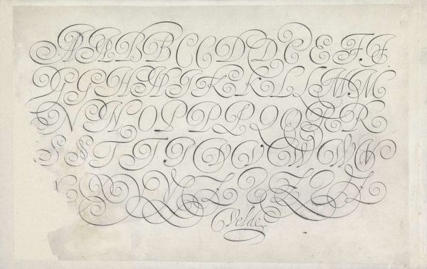
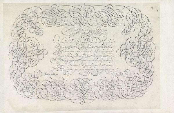
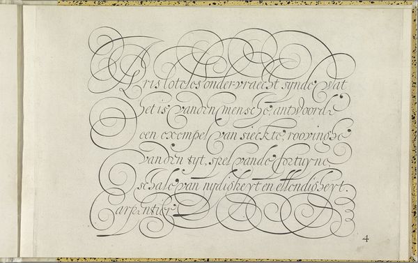
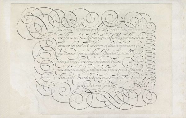
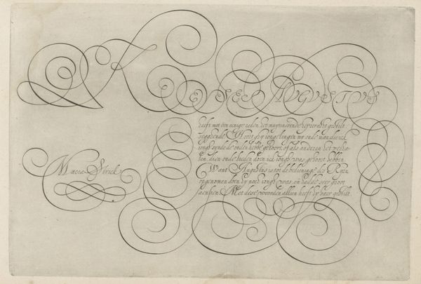
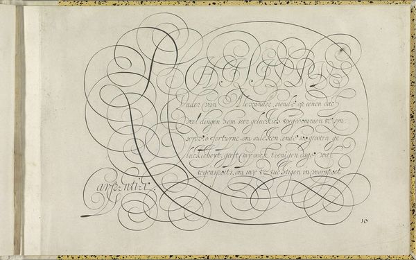
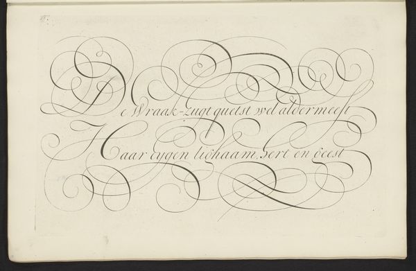
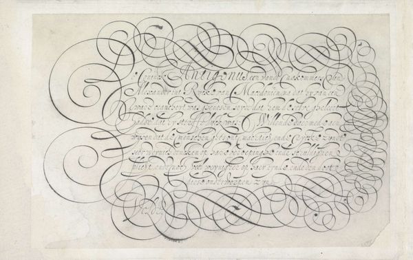
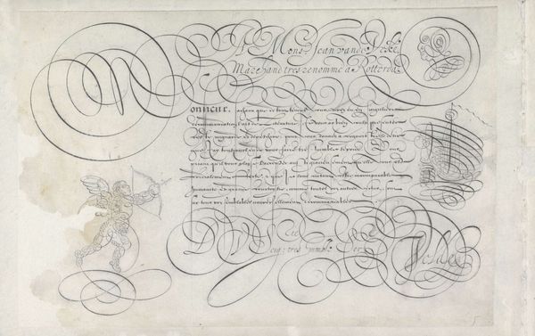
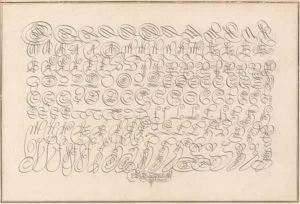
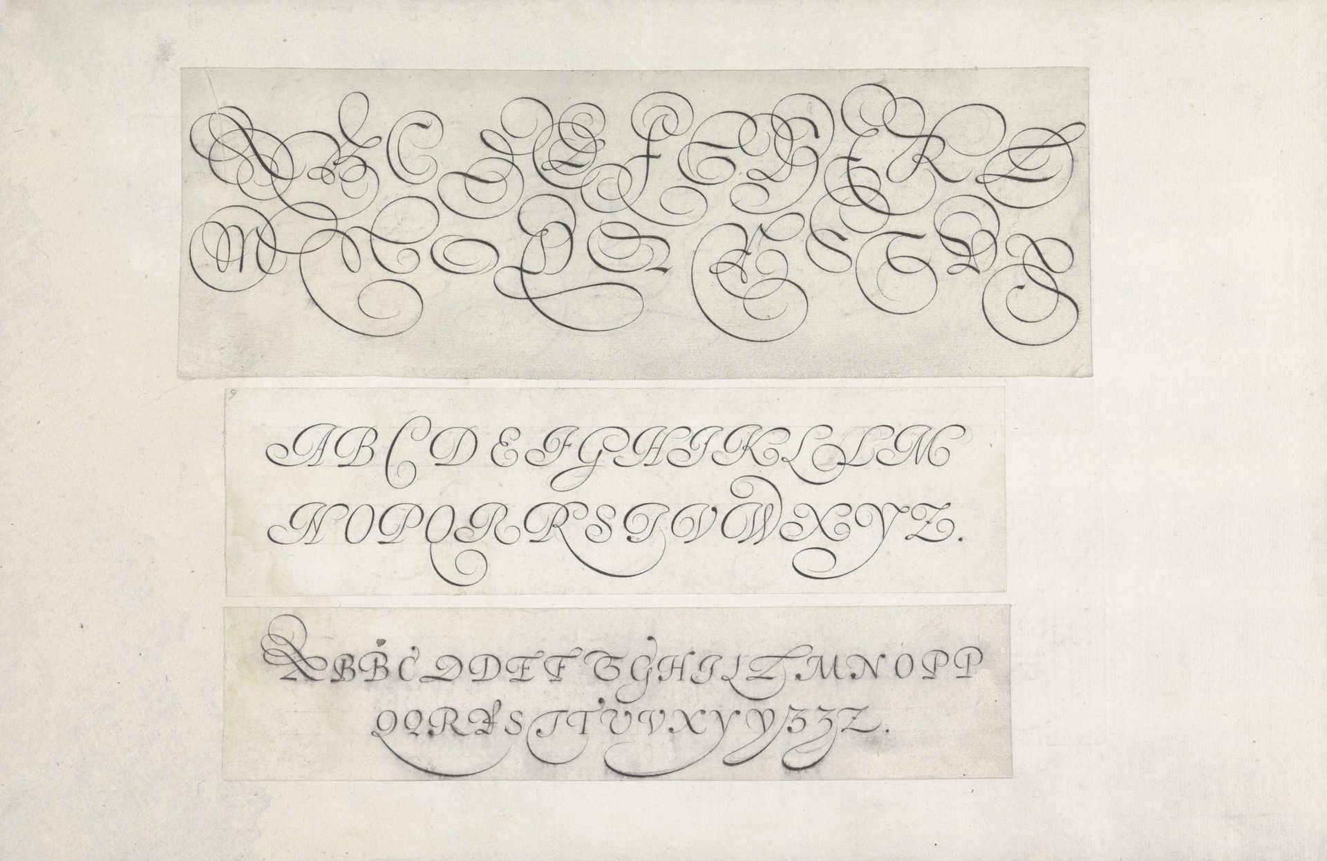
Editor: Here we have "Three Designs of Writing Samples: the Alphabet in Capitals," created in 1605 by Jan van de Velde I. It’s a pen and ink drawing featuring three different styles of elegant, flowing lettering. I’m immediately struck by how each letter feels almost like a miniature, self-contained work of art. What stands out to you in this piece? Curator: The evolution of the alphabet into art is quite remarkable. It tells us much about the values of that period. We see how important script was, and how each letter served as a marker of status, taste and sophistication. Note the symbolic flourish; how the artist has emphasized line and curve. Where do you think those exaggerated lines and shapes originate? Editor: Possibly from calligraphy, which was obviously a highly valued skill at the time. The almost theatrical loops and swirls give the letters a performative quality, like they’re dancing across the page. Is there any indication of what purpose such decorative lettering served? Curator: Indeed. In the Dutch Golden Age, handwriting manuals like this one weren’t merely instructional, they provided aspirational examples of ideal forms. Think of the script as a kind of social and intellectual emblem. In that sense, the careful design and practice signified education, elegance, and social grace, communicating an individual's standing. Do you notice any symbols that give a particular meaning to any of the rows or letterforms? Editor: Not that I immediately recognize. But, understanding their social weight really enhances my appreciation of the artwork and artist. Thanks for sharing your perspective. Curator: The pleasure is all mine. By recognizing the symbolic function, we are allowed entry into the mindset of the Golden Age; which might invite the viewer to seek similar symbolic weight in today's image-driven society.
Drie ontwerpen van schrijfvoorbeelden: het alfabet in kapitalen 1605
Jan van de Velde I
1568 - 1623Location
RijksmuseumArtwork details
- Medium
- drawing, typography, ink, pen
- Dimensions
- height 77 mm, width 227 mm, height 51 mm, width 194 mm, height 43 mm, width 196 mm
- Location
- Rijksmuseum
- Copyright
- Rijks Museum: Open Domain
Tags
drawing
script typography
hand-lettering
dutch-golden-age
lettering
hand drawn type
hand lettering
typography
ink
hand-drawn typeface
fading type
stylized text
typography style
pen
calligraphy
small lettering
Comments
No comments
About this artwork
Editor: Here we have "Three Designs of Writing Samples: the Alphabet in Capitals," created in 1605 by Jan van de Velde I. It’s a pen and ink drawing featuring three different styles of elegant, flowing lettering. I’m immediately struck by how each letter feels almost like a miniature, self-contained work of art. What stands out to you in this piece? Curator: The evolution of the alphabet into art is quite remarkable. It tells us much about the values of that period. We see how important script was, and how each letter served as a marker of status, taste and sophistication. Note the symbolic flourish; how the artist has emphasized line and curve. Where do you think those exaggerated lines and shapes originate? Editor: Possibly from calligraphy, which was obviously a highly valued skill at the time. The almost theatrical loops and swirls give the letters a performative quality, like they’re dancing across the page. Is there any indication of what purpose such decorative lettering served? Curator: Indeed. In the Dutch Golden Age, handwriting manuals like this one weren’t merely instructional, they provided aspirational examples of ideal forms. Think of the script as a kind of social and intellectual emblem. In that sense, the careful design and practice signified education, elegance, and social grace, communicating an individual's standing. Do you notice any symbols that give a particular meaning to any of the rows or letterforms? Editor: Not that I immediately recognize. But, understanding their social weight really enhances my appreciation of the artwork and artist. Thanks for sharing your perspective. Curator: The pleasure is all mine. By recognizing the symbolic function, we are allowed entry into the mindset of the Golden Age; which might invite the viewer to seek similar symbolic weight in today's image-driven society.
Comments
No comments