Copyright: Robert Indiana,Fair Use
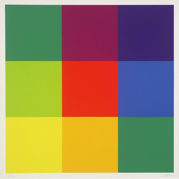
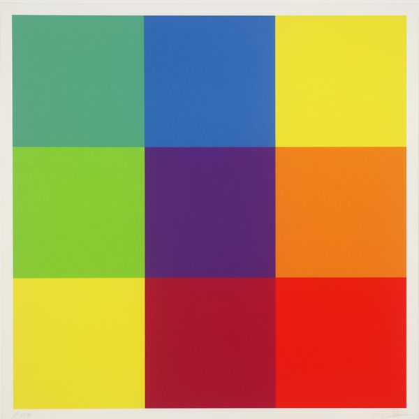
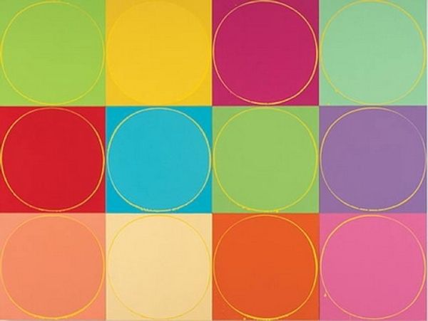
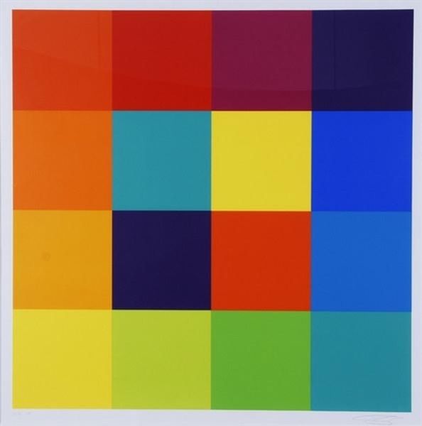
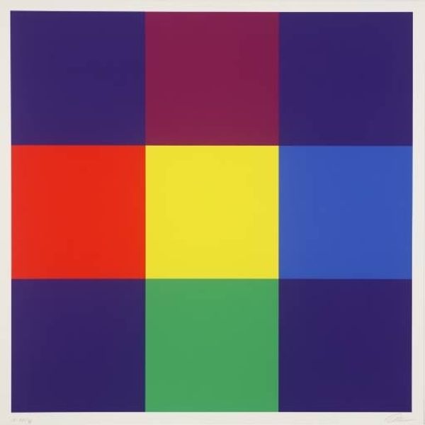
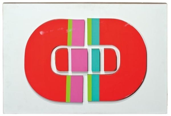
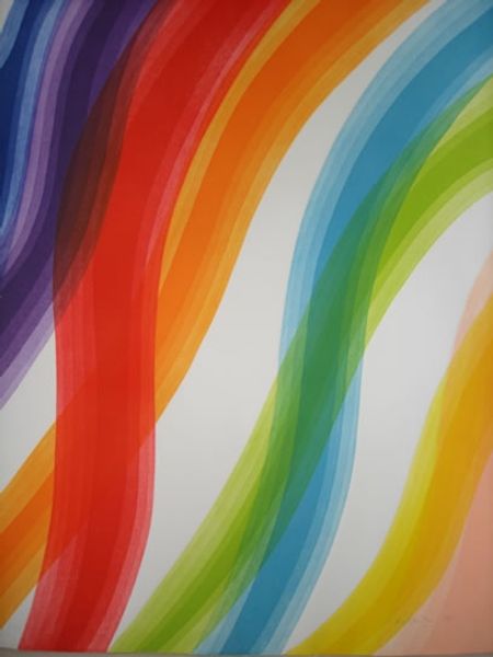
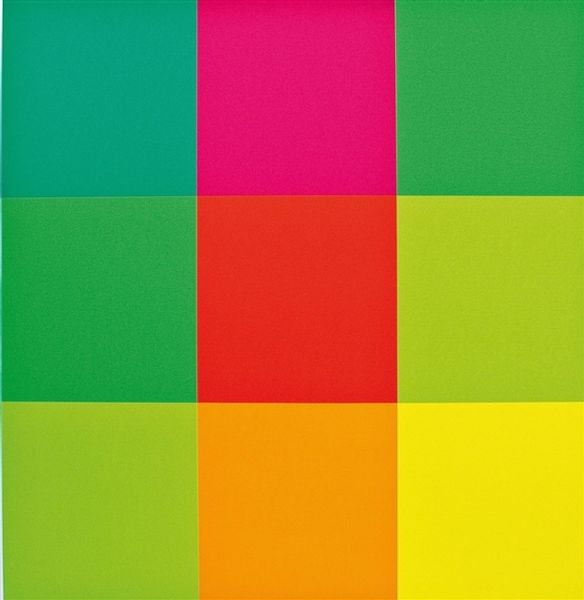
Curator: The way these panels pulsate, demanding your attention...it feels almost dizzying at first. And yet, they're also oddly soothing, like a set of color-therapy cards. Editor: You know, that's a very astute observation. These silk-screened prints form what Robert Indiana calls "The Garden of Love" from 1982, playing with the theme of love that was central to his work. Each of the six panels features the word LOVE stacked in that instantly recognizable format, rendered in vibrant color combinations. Curator: It is interesting, isn't it? The word love rendered in a format that’s anything but gentle. It’s bold, it’s insistent, even confrontational. The tilted ‘O’—always makes me wonder why it couldn’t just stand up straight! Editor: The tilted "O" is crucial! It's the crack in the edifice, isn't it? It injects dynamism and tension, preventing it from being saccharine. The "O," perpetually falling or perhaps leaping, becomes a potent symbol in itself. It hints at vulnerability and imperfection at play within an idealistic emotion. Curator: Yes! Because what is love anyway, but perpetual falling? Each panel feels like a slightly different emotion; different shade, different mood. Editor: Indeed. The hard-edged typography also reminds us of commercial logos and signage, speaking to how society often packages and sells sentiments back to us. We buy into the notion of "love" while grappling with its true meaning, which remains slippery and subjective. And what do these colours remind you of? Curator: Definitely vintage board games... Candy Land meets corporate America! The work really hits you. What's striking is the repetition combined with the colour changes; it has this kind of meditative mantra quality mixed with a slightly manic energy. It’s sort of…conflicting, isn't it? The ultimate tightrope walk of pop. Editor: Precisely. The Pop Art movement often juxtaposed the banal and the profound. Robert Indiana used "LOVE" as a mantra but also as a commentary. He turned the abstract idea into a sign, imbued it with color and emotion, and let the observer navigate its layered significance. Curator: So next time you are wrestling to grasp this complex work, stop trying! This work speaks to the multiple sides of a feeling. Simply find the panel that vibrates closest to your truth and feel the complexities resonate inside you. Editor: A lovely reflection. The art serves not as a conclusion but rather as a beginning—a visual pathway prompting viewers to bring their individual journeys, yearnings, and memories of love into the artwork.
Comments
No comments
Be the first to comment and join the conversation on the ultimate creative platform.
