collage, print, watercolor
#
abstract-expressionism
#
collage
#
water colours
# print
#
pop art
#
watercolor
#
geometric
#
abstraction
#
pop-art
#
modernism
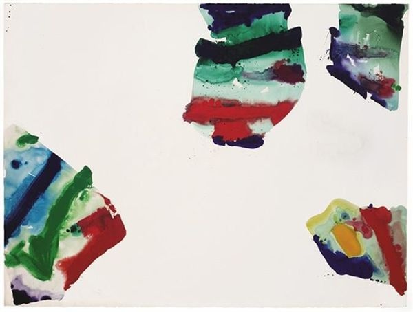
Dimensions: sheet: 41.8 x 50.8 cm (16 7/16 x 20 in.)
Copyright: National Gallery of Art: CC0 1.0
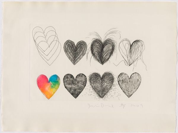
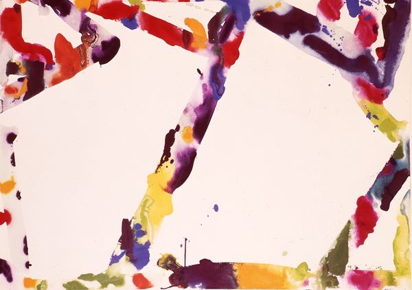
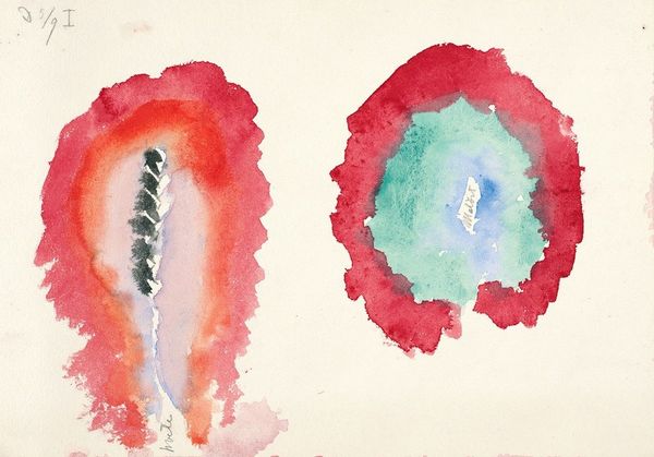
Curator: Jim Dine's "Two Dutch Hearts," created in 1970, is a piece that immediately strikes me with its raw simplicity. Made with watercolor and collage on paper, it's surprisingly minimal for Dine. Editor: It's understated, almost hesitant. The two hearts floating on that speckled, grainy ground, creates a really ambiguous atmosphere. There's something vulnerable about the pastel washes. Curator: Dine, as we know, frequently used the heart motif. We could consider the reoccurrence of the symbol in the context of his broader practice and its place in popular culture. Consider its associations with love, sentimentality, and even commercialism, which Dine often engages with. Editor: And these aren’t just hearts; they’re "Dutch Hearts," a very specific label. I can't help but think about national identity, a theme that becomes incredibly charged around this time given the political climate and its effect on visual language. Why "Dutch?" Is it a reference to the Netherlands, known for its liberal politics or the formal techniques of Dutch Masters? Is Dine, therefore, inserting ideas of a culture identity into a well-established global symbol? Curator: The "Dutch" qualification may reference his history of using readymade items and found materials, similar to pop art aesthetics where the meaning of cultural items, signs and systems of display, shift between high art, mass media and the culture industries. He creates something universally recognisable that then takes on another form. Editor: It's this ambiguity, this openness to interpretation that makes Dine's work so compelling. But I’m pushed to thinking what identity it is claiming or trying to find here with an absence of figurative reality in such an identifiable symbol. Is this Dine commenting on contemporary society? Curator: These paintings push us to consider the power dynamics at play, particularly within the institutional context of art. Who decides which objects, which stories, get the platform, and how those decisions impact our understanding of the artwork itself. It's a question of whose voice gets amplified. Editor: Absolutely. This little watercolour insists on further investigation. Its vulnerability pushes me to think more openly about its placement and its themes, and its contribution to social representation.
Comments
No comments
Be the first to comment and join the conversation on the ultimate creative platform.
More like this