#
word art style
#
hand-lettering
#
bold typography
#
lettering
#
small typography
#
hand lettering
#
word art
#
eye-catchy type
#
typography style
#
small lettering
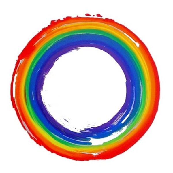
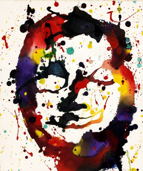
Copyright: Corita Kent,Fair Use
Editor: This is Corita Kent’s “Love Stamp,” created in 1985. I find its design so optimistic, even with just simple lettering and colorful strokes. It is like a joyful burst! What do you see in this piece from a formal perspective? Curator: I find the composition particularly compelling. Note the careful arrangement of the rainbow brushstrokes above the word "LOVE". It leads your eye downwards, a strategic decision on Kent’s part. Editor: Can you explain that a bit more? I wouldn't have considered it to be strategic, exactly. Curator: Consider the weight and directionality of each stroke. How the saturation creates a gradient. Kent used horizontal bars, balanced, to create a sense of visual stability which supports the text. It’s an underlying structural harmony in her work that enhances the piece. Even if we aren't supposed to send letters anymore! Editor: I suppose the bars could be seen as underlining the importance of Love, too. Curator: Perhaps, but it is the formal relationships – line, colour, shape and form - that communicate those associations and create the impact. Does considering this change your initial interpretation? Editor: Yes, a lot. The formal structures support a visual understanding and the balance in the work highlights its meaning, perhaps even more clearly than through symbolic interpretations. Curator: Precisely! The visual elements working together as the medium and message.
Comments
No comments
Be the first to comment and join the conversation on the ultimate creative platform.
More like this