1680 - 1701
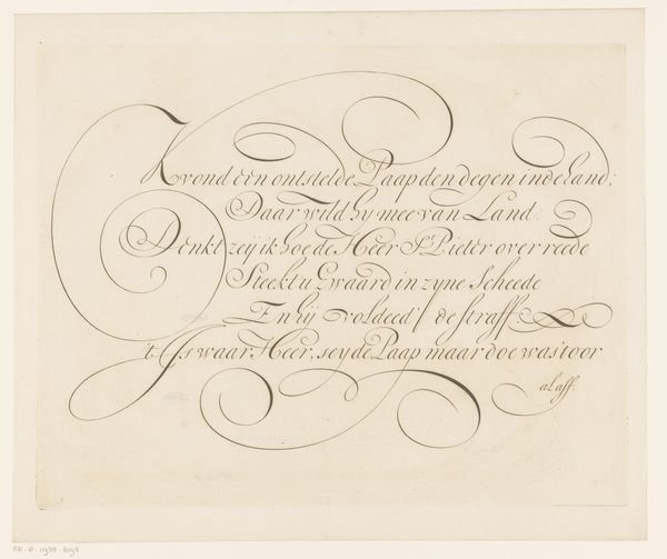
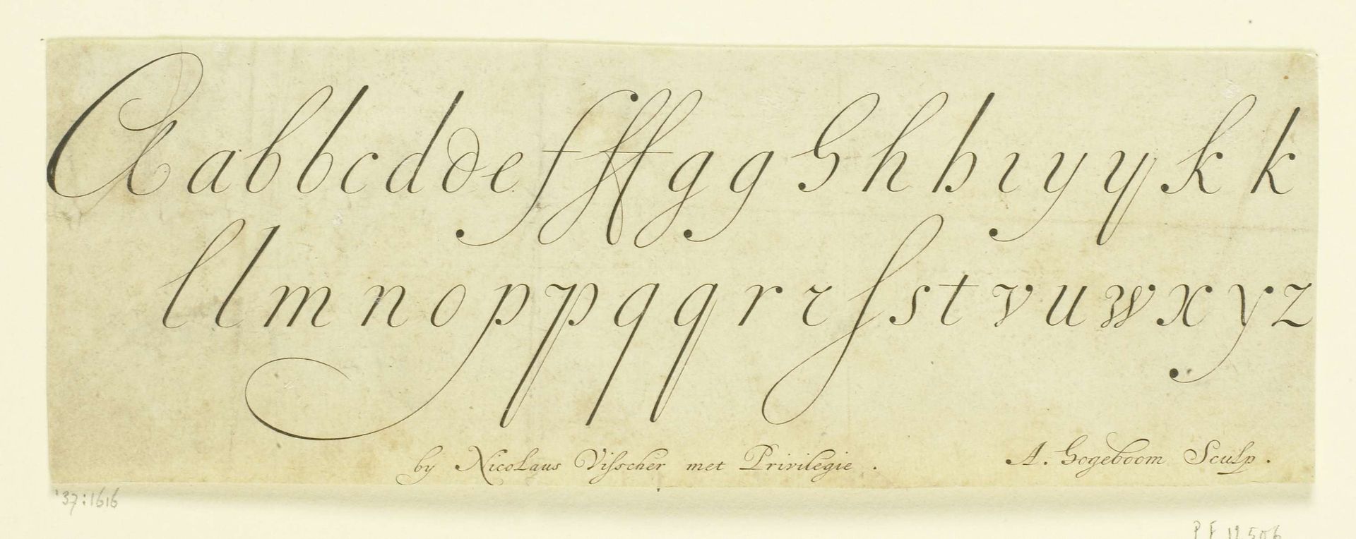
Gekalligrafeerd alfabet
Listen to curator's interpretation
Curatorial notes
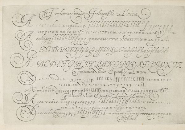
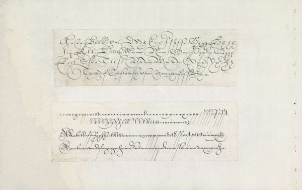
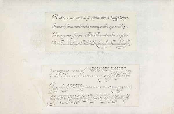
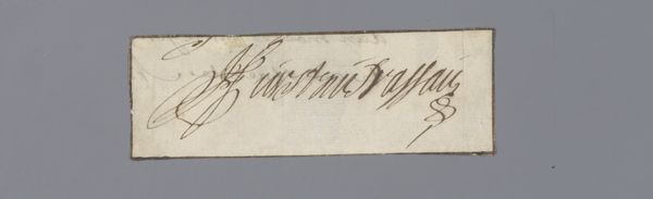
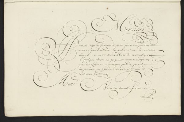
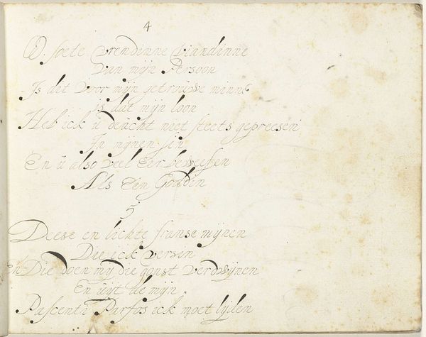
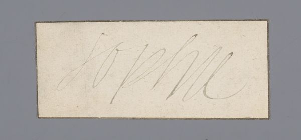
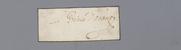
This alphabet, or Gekalligrafeerd alfabet, was created by Andries Hogeboom, with pen and ink on paper. The alphabet is presented across two lines of calligraphy. Look closely at the line variations; the elegant thicks and thins created with each stroke of the pen. The script presents a semiotic system reduced to its most fundamental components: the alphabet itself. But it is Hogeboom’s visual construction, not the letters, that catches our attention. Notice the contrasting weight of the letterforms against the stark negative space of the paper. The delicate balance between the positive and negative shapes establishes a sense of equilibrium, creating a visual rhythm that is meditative in its repetition. Ultimately, the alphabet can be deconstructed as an aesthetic exercise, revealing the beautiful potential of the written word as pure form. Each letter becomes a study in shape and structure, inviting us to consider the alphabet as a system of abstract symbols.