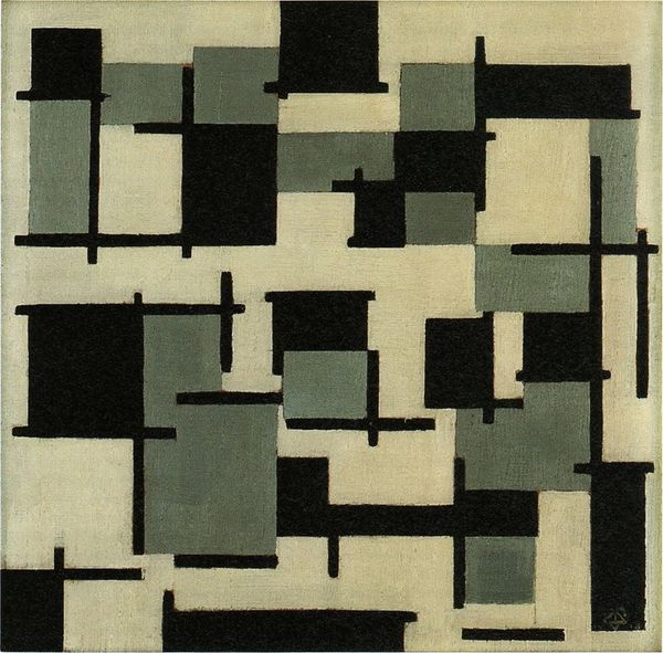
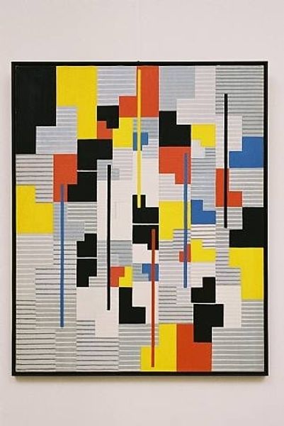
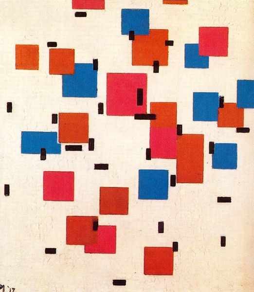
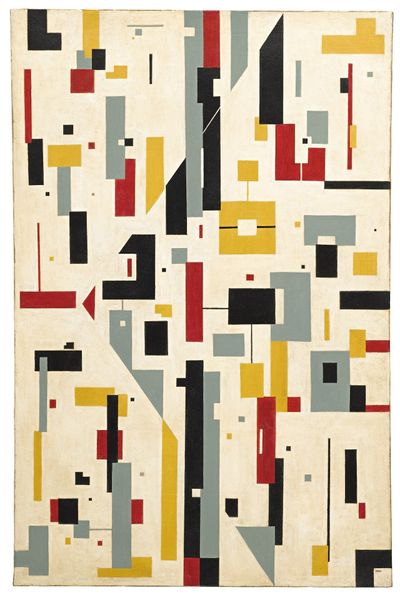
Composition IX, opus 18, 1917 1917
0:00
0:00
theovandoesburg
Gemeentemuseum den Haag, Hague, Netherlands
painting, acrylic-paint
#
de-stijl
#
neo-plasticism
#
non-objective-art
#
painting
#
pattern
#
op art
#
acrylic-paint
#
geometric pattern
#
abstract pattern
#
rectangle
#
geometric
#
geometric-abstraction
#
abstraction
#
line
#
modernism
Dimensions: 106 x 116 cm
Copyright: Public domain
Editor: So, this is Theo van Doesburg’s *Composition IX, opus 18* from 1917. It's an acrylic on canvas, and when I first look at it, I feel this chaotic, almost overwhelming sense of…urbanization? There are geometric shapes spread everywhere, but what else do you see in this piece? Curator: I see a radical proposition. Doesburg's non-objective language is an act of rebellion. Think about the socio-political context in 1917. World War I was raging. Traditional artistic forms felt inadequate to express the turmoil, the destruction, the shifting paradigms. How might we interpret the seeming chaos in *Composition IX* as a response to the chaos of war? Editor: That makes sense. So the shapes, the lines… they're not just abstract, they're…political? Curator: Precisely! Doesburg was part of De Stijl, a movement that sought a universal visual language, a utopian ideal of harmony through pure abstraction. He believed art could reflect and shape a more rational and balanced society. Can we consider those austere rectangles and stark colors as a deliberate move against representational art that he considered complicit in the nationalistic fervour tearing Europe apart? Editor: I never thought about abstraction as being inherently political before. It seemed so… removed. Curator: And that’s the point. By purging the artwork of narrative and identifiable forms, Doesburg attempts to create a tabula rasa, inviting the viewer to experience a purely visual harmony, divorced from the messy realities of the world, even as it engages with it on a deeper, more subversive level. What do you make of the limited color palette? Editor: It almost feels restrictive, but I guess it contributes to the sense of order they were going for. Curator: Restrictive, perhaps, but also deliberate. Limiting the color palette – focusing on primary colors and non-colors – eliminates subjective, emotional associations, driving toward a more objective, universal visual experience. So, is this an attempt at neutrality or rather a powerful statement through extreme formal reduction? Editor: Wow, I’m going to look at abstract art so differently now. Thanks! Curator: My pleasure! It’s all about seeing art as a reflection of its time, but also a potential force for change.
Comments
No comments
Be the first to comment and join the conversation on the ultimate creative platform.
More like this