About this artwork
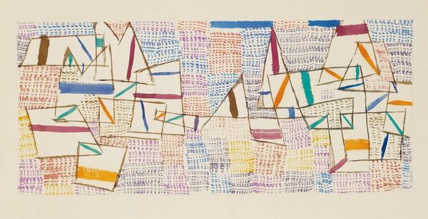
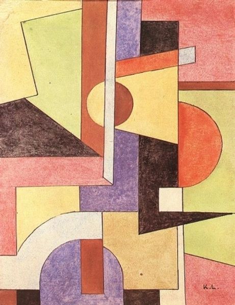
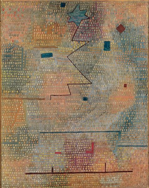
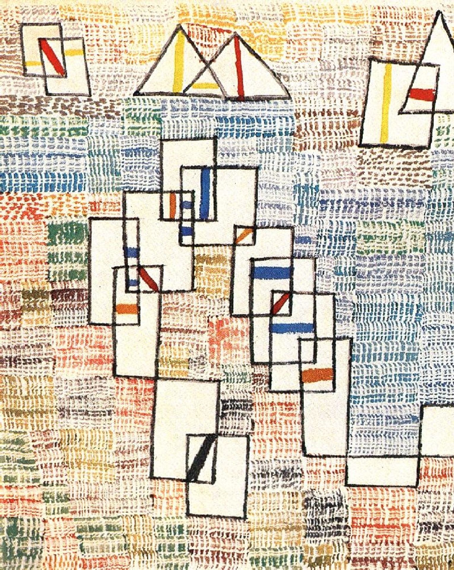
Paul Klee made this painting called ‘Cote de Provence’ with oil on canvas. The whole thing is underpinned by this grid, and it's painted in thin layers, one on top of another, kind of like watercolour. The colours are broken and layered, like he’s building up a feeling, a sense of light and space and the colours in the South of France. But then there are these geometric shapes hovering on top. They're not quite part of the landscape, are they? They're floating a little bit above it. There's a red mark in one of those open squares. It looks like he’s pinned the composition down, somehow. Klee and Kandinsky knew each other, they taught at the Bauhaus at the same time, and you can see them working through some of the same ideas about abstraction and colour and geometry. But with Klee there is always something a little bit off-kilter, playful, and almost childlike. His paintings are like visual poems, inviting you to get lost in their world of colour and form.
Artwork details
- Medium
- painting, watercolor
- Copyright
- Public domain
Tags
cubism
painting
watercolor
geometric
expressionism
abstraction
line
modernism
Comments
Be the first to share your thoughts about this work.
About this artwork
Paul Klee made this painting called ‘Cote de Provence’ with oil on canvas. The whole thing is underpinned by this grid, and it's painted in thin layers, one on top of another, kind of like watercolour. The colours are broken and layered, like he’s building up a feeling, a sense of light and space and the colours in the South of France. But then there are these geometric shapes hovering on top. They're not quite part of the landscape, are they? They're floating a little bit above it. There's a red mark in one of those open squares. It looks like he’s pinned the composition down, somehow. Klee and Kandinsky knew each other, they taught at the Bauhaus at the same time, and you can see them working through some of the same ideas about abstraction and colour and geometry. But with Klee there is always something a little bit off-kilter, playful, and almost childlike. His paintings are like visual poems, inviting you to get lost in their world of colour and form.
Comments
Be the first to share your thoughts about this work.