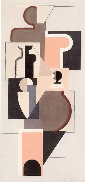
painting, acrylic-paint
#
de-stijl
#
painting
#
acrylic-paint
#
abstract
#
form
#
geometric pattern
#
abstract pattern
#
geometric-abstraction
#
abstraction
#
line
Copyright: Public Domain: Artvee
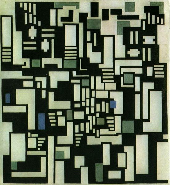
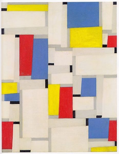
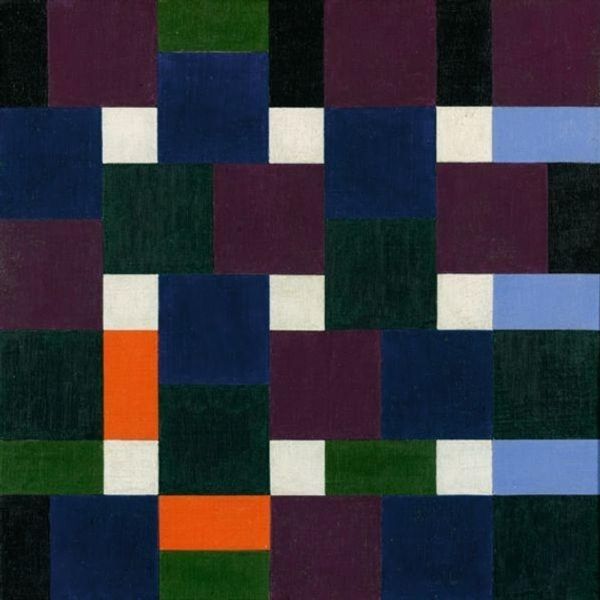
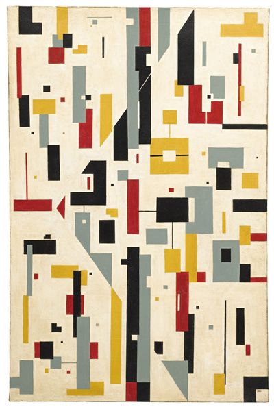
Theo van Doesburg made Composition XIII with oil on canvas using squares, rectangles, and lines to create a city-like grid. You know, the funny thing about geometric abstraction is, it's not really abstract, is it? More like, re-arranged. It's like Doesburg took a city and just chopped it up, stacked it, and called it a painting. The colour palette is restrained, muted; the black feels grounded, the green and the off-white create just enough contrast. It's like he’s building a world, brick by brick. Look closely, you can see the texture of the canvas and the brushwork. He hasn't tried to hide it at all. The rectangles hover, they don't sit completely flat, there's a rhythm here that has something in common with a musical score, a syncopated beat, all these forms bumping up against one another. It reminds me a little of Piet Mondrian, but with a bit more swagger. Both were exploring the possibilities of pure form, but Doesburg isn't as dogmatic. It's like he's saying, "Let's see what happens if we mess with the rules a little."
Comments
No comments
Be the first to comment and join the conversation on the ultimate creative platform.
More like this