drawing, paper, ink, pen
#
portrait
#
drawing
#
pen sketch
#
sketch book
#
hand drawn type
#
paper
#
personal sketchbook
#
ink
#
hand-drawn typeface
#
pen-ink sketch
#
pen work
#
sketchbook drawing
#
pen
#
storyboard and sketchbook work
#
sketchbook art
#
calligraphy
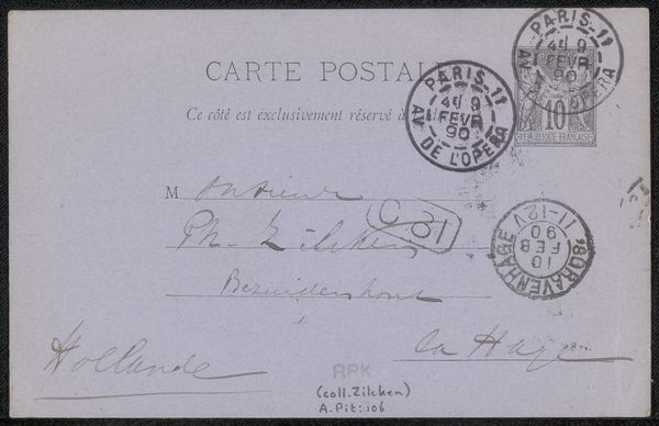
Copyright: Rijks Museum: Open Domain
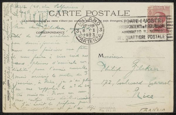
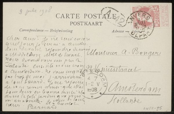
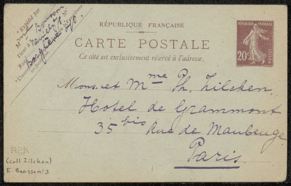
Curator: Before us we have “Prentbriefkaart aan Philip Zilcken,” a postcard sent before 1921. It's an ink drawing on paper. Editor: It's got that cozy feel, doesn't it? Like stumbling upon a sweet little note tucked away in an old book. The penmanship dances across the paper. Curator: Indeed. Note the considered composition. The sender uses the space effectively. Observe how the scripted message counterbalances the address, both framing the central void of the postcard. Editor: Void? I see potential. It feels open. All that empty space screams potential for daydreams, maybe for imagining a reply from Philip. It almost begs to be touched and smudged with stories! Curator: Your point is valid but a reading based on materiality could consider paper and ink as significant compositional factors that highlight its inherent qualities and textures in the artistic whole. Note the contrast between thick and thin lines to convey tonal depth. Editor: You're right, that attention to texture does give it a real tactile feel. Imagine holding it in your hands and how the ink might subtly resist. And the choice of ink evokes something so timeless. It makes the handwritten sentiments feel incredibly precious, somehow. Curator: This connects to the artist’s use of calligraphy, with letterforms executed with purpose. Each curve and stroke embodies cultural meanings. Editor: Exactly! And those swooping loops practically beg for interpretation—it is so human and heartfelt. Curator: Agreed. While I examined the sender's deliberate pen strokes as a study in script, your perspective has prompted an acknowledgement of the emotional qualities inherent in this "Prentbriefkaart aan Philip Zilcken”. Editor: And you reminded me to appreciate the pure elegance in a single line drawn with purpose. A lovely meeting of perspectives.
Comments
No comments
Be the first to comment and join the conversation on the ultimate creative platform.
More like this