Copyright: Rijks Museum: Open Domain
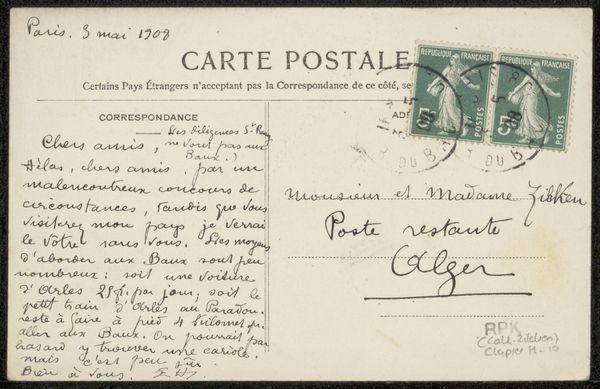
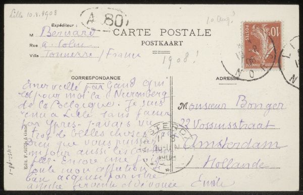
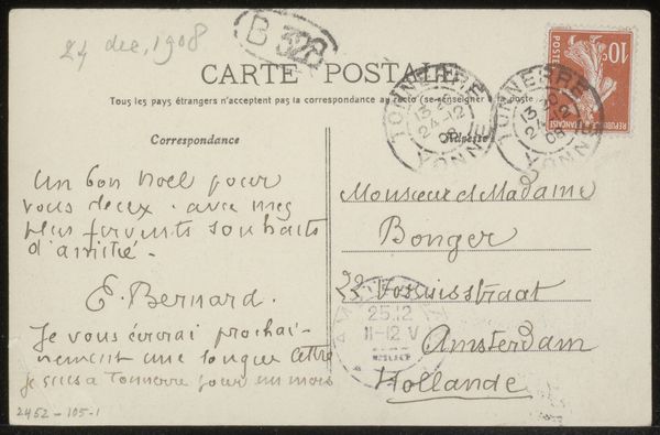
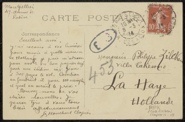
Curator: Today, we are looking at a postcard to Andries Bonger by Emile Bernard, made before 1908. The media used is ink on paper, specifically a drawing, incorporating elements of a personal sketchbook. It feels very intimate, like we're intruding on private correspondence. What is your impression of this piece? Editor: My eye is drawn to the contrasting dark ink against the cream paper, especially in the way Bernard renders script typography. The marks, while functional as a means of communication, create an engaging composition on their own. There’s a visual density on the left, which then thins out towards the right, almost mirroring the flow of reading. The stamps add to the geometric appeal. Curator: Precisely. Notice how Bernard uses line weight to delineate different zones on the card. The written message employs a denser, more frantic line, whereas the address maintains a disciplined structure. What effect do you think the two different methods create? Editor: It suggests the personal thoughts are allowed a certain freedom compared to the rigid structure of official postal information. The composition highlights the act of writing itself. Does this then reveal something of Bernard’s mindset, the contrast between inner thoughts and outward presentation? Curator: That is a strong reading. Moreover, the visual balance relies less on conventional symmetry, favoring the inherent qualities of mark-making and textual distribution to create a unique compositional rhythm. Editor: It’s fascinating how breaking it down reveals layers beyond just the information. Curator: Absolutely, focusing on the interplay of the formal qualities elevates our understanding and experience of the piece.
Comments
No comments
Be the first to comment and join the conversation on the ultimate creative platform.
More like this