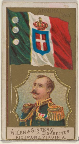
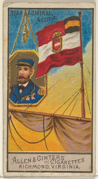
Admiral, Denmark, from the Naval Flags series (N17) for Allen & Ginter Cigarettes Brands 1886 - 1891
0:00
0:00
drawing, print
#
portrait
#
drawing
# print
#
caricature
#
caricature
Dimensions: Sheet: 2 3/4 x 1 1/2 in. (7 x 3.8 cm)
Copyright: Public Domain
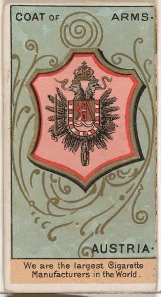
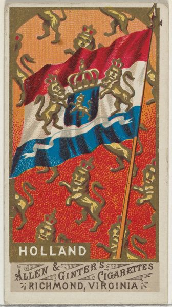
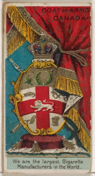
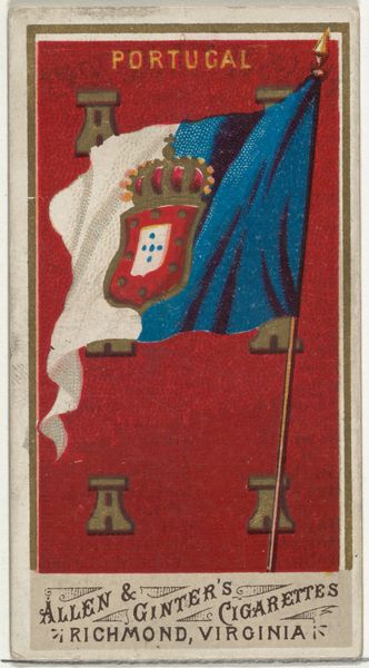
Curator: Ah, another from Allen & Ginter. This is “Admiral, Denmark,” part of the Naval Flags series they produced between 1886 and 1891 for their cigarette brands. Editor: My initial response is that the color palette feels rather limited, predominantly consisting of golds, reds, whites, and blues. How are we meant to parse that? Curator: Consider the context in which these were made: cheap cigarette cards intended to boost sales. They aimed for a romantic exoticism. Note the Danish flag emblazoned above a portrait, connecting to burgeoning nationalisms. What image of Denmark does this sell, and to whom? Editor: Indeed, the flatness, lack of atmospheric perspective—it almost creates a deliberate distancing effect, rendering it less an invitation and more an assertion of something fixed and perhaps distant. What is your sense of the intent of the flag being placed so much larger? Curator: Flags function to signify the modern idea of a unified nation-state; its strategic position above the man suggests an inherent symbolic value. This piece would play on themes of power and national pride; ideas central to the colonizing mindset Allen & Ginter sought to sell in relation to their brand. Editor: And it seems he's almost reduced to a stylized component within a gilded frame. His importance comes across as secondary. The composition privileges nationalistic ideals of military power rather than the individual; the subject seems like a signifier. Curator: Yes! The framing of the admiral can also evoke class and gender. Who is seen to be an Admiral, or even an emblem of Danish imperial power? Likely not the women and people of color most impacted by colonialism, who would likely have never been depicted. Editor: Interesting. Focusing on a micro-level the ornamental gilding feels excessively busy around the rather severe profile—does that contribute a sense of visual cacophony, underscoring that disconnect of imperialism with the realities it creates? Curator: I’d suggest that Allen & Ginter's artistic strategy lies in selling palatable fictions of colonialism in simplified terms, aimed at the ordinary consumer’s aspirational fantasy rather than offering authentic representations of individuals. Editor: I find myself reconsidering the rigid application of color to convey something much more subtly calculated about 19th-century notions of control. Curator: And understanding art and social narratives in conjunction creates broader frameworks to address cultural realities within and beyond the image itself.
Comments
No comments
Be the first to comment and join the conversation on the ultimate creative platform.
More like this