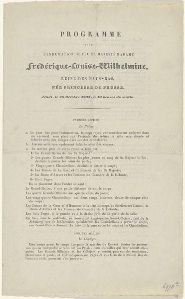
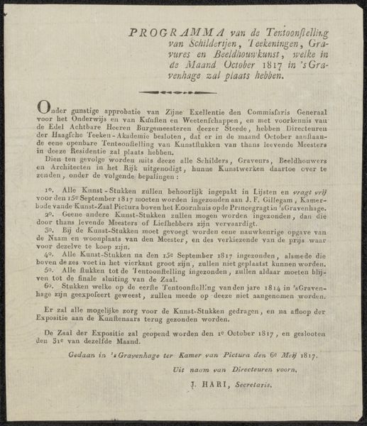
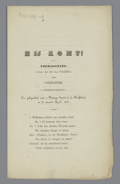
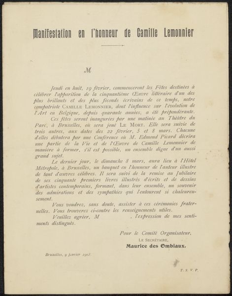
Uitnodiging voor de inauguratie van de stele ter ere van Théodore Rousseau en Jean-François Millet before 1884
0:00
0:00
graphic-art, print, paper, typography
#
graphic-art
#
art-nouveau
# print
#
paper
#
typography
#
historical font
Dimensions: height 220 mm, width 175 mm
Copyright: Rijks Museum: Open Domain
Editor: So, this is an invitation— "Uitnodiging voor de inauguratie van de stele ter ere van Théodore Rousseau en Jean-François Millet"—created sometime before 1884. It's a print on paper with typography. I'm struck by how decorative and almost fragile it looks. What do you see when you look at it? Curator: Primarily, I notice the interplay between positive and negative space. The arrangement of text blocks and the ornamental flourishes create a visual rhythm. Note the use of varied fonts and how they contribute to the overall composition. Is it not fascinating how each typeface has its own character, its own distinct geometry? Editor: Yes, definitely! The contrast between the red and black lettering draws the eye. And the way the ornamental design at the top echoes elements in the initial capital further down is interesting. Curator: Precisely. Consider also the texture of the paper itself. The imperfections and the slight yellowing contribute to its aged appearance. It adds a certain…gravitas, wouldn't you say? We have line, color, shape and form – how they arrange gives the whole a structured visual language, beyond the mere message. How does the interplay of these components create a sense of order? Editor: I think it makes it feel very formal and considered. Everything feels deliberately placed to guide the reader’s eye, from the top flourish, all the way down to the departure times. Curator: Exactly! And consider how that sense of order, of deliberate placement, elevates what could have been a simple announcement into something…more. Something considered artistic, perhaps? Editor: I see what you mean. Thinking about the relationships between these elements rather than just reading the words completely changes how you experience the invitation. Curator: Indeed, hopefully, thinking beyond context reveals more insight into design choices.
Comments
No comments
Be the first to comment and join the conversation on the ultimate creative platform.
More like this