graphic-art, print, typography, poster
#
graphic-art
#
dutch-golden-age
# print
#
typography
#
decorative-art
#
poster
Dimensions: height 329 mm, width 250 mm
Copyright: Rijks Museum: Open Domain
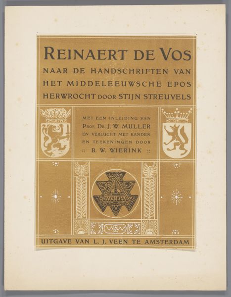
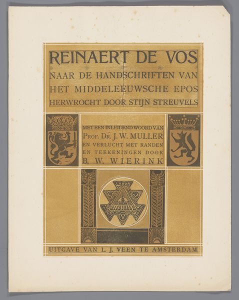
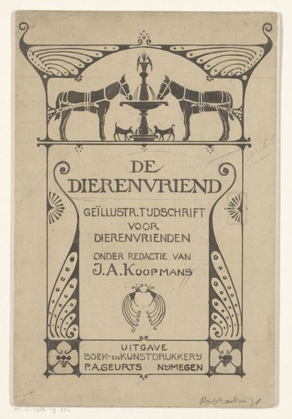
This advertisement for Reinaert de Vos was made with a lithograph stone, so the whole thing comes from a kind of drawing. The color palette is limited, almost monochromatic, giving it a timeless feel. What strikes me is the texture and surface of the print. It's hard to tell exactly what tools Wierink used, but you can see the marks, the kind of granular effect of the stone coming through in the golden brown ink. This is not like a smooth, seamless reproduction; there's a real physicality to it. Look at the animal figures above and below the text. They remind me of folk art and medieval tapestries, but with a touch of Art Nouveau flair. They create a border, framing the text and adding a sense of movement and energy. Wierink's work makes me think of Aubrey Beardsley, who also had a knack for bold, decorative designs. But while Beardsley's work can be a bit decadent, Wierink's has a more grounded, earthy quality. It's a reminder that art is always in conversation, with artists borrowing and riffing off each other's ideas across time.
Comments
No comments
Be the first to comment and join the conversation on the ultimate creative platform.
More like this