drawing, paper, ink
#
portrait
#
drawing
#
pen sketch
#
hand drawn type
#
paper
#
personal sketchbook
#
ink
#
hand-drawn typeface
#
ink drawing experimentation
#
pen-ink sketch
#
pen work
#
sketchbook drawing
#
storyboard and sketchbook work
#
sketchbook art
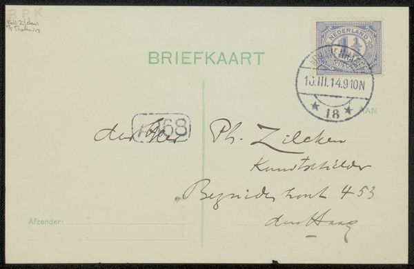
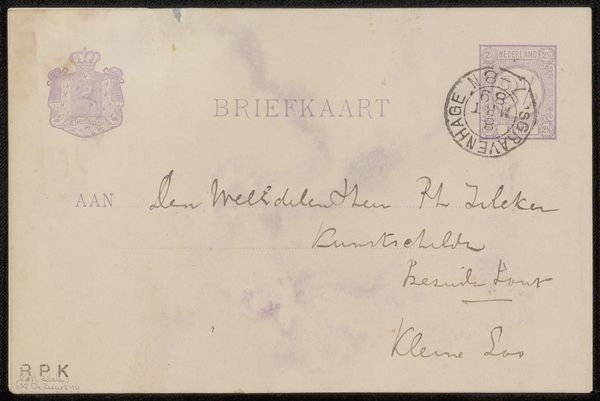
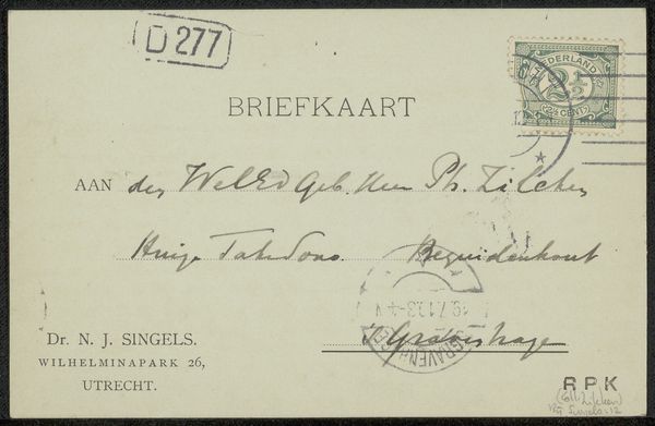
Copyright: Rijks Museum: Open Domain
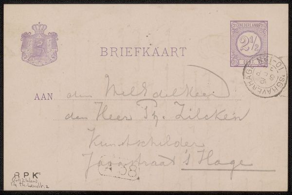
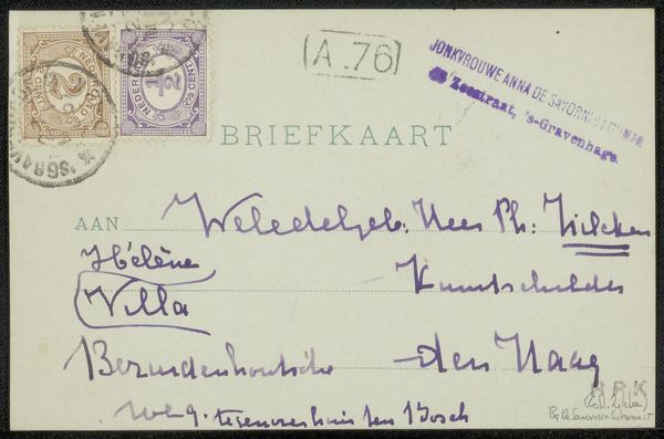
Editor: This is a postcard to Philip Zilcken by Henri Teixeira de Mattos, created before 1914 using ink on paper. The looping cursive script is really striking – it feels like a direct glimpse into the past. What stands out to you when you look at this piece? Curator: The visual language here carries so much cultural memory. Look at the specific formations of the letters, like the ‘H’ in ‘Hague’, they evoke a particular time, yes, but more subtly the weight of social convention governing handwriting itself. Have you considered the sender-recipient relationship? Editor: I hadn’t thought of that. Is there a story in the handwriting itself? Curator: Possibly. The flourishes suggest a degree of formality, but also familiarity, especially contrasted against the stark typography. We see a tension between individuality and societal expectation, embedded within each stroke. It acts as a miniature social portrait. What emotions do those handwritten characters provoke for you? Editor: Curiosity, I think. It makes me want to decode every curve and line and maybe imagine their relationship. Do you think the simple form of a postcard impacts that feeling? Curator: Absolutely. The postcard format itself – a quick, intimate message exposed to the world – adds another layer of meaning. Public and private merging, and the symbolism within it. Editor: That’s fascinating, how much meaning can be packed into something seemingly simple. I’ll definitely look at handwriting differently now. Curator: And consider how our own methods of communication might be studied someday for similar cultural information.
Comments
No comments
Be the first to comment and join the conversation on the ultimate creative platform.
More like this