drawing, paper, ink, pen
#
drawing
#
old engraving style
#
hand drawn type
#
paper
#
personal sketchbook
#
ink
#
hand-drawn typeface
#
ink drawing experimentation
#
pen-ink sketch
#
ink colored
#
pen work
#
sketchbook drawing
#
pen
#
sketchbook art
#
calligraphy
Copyright: Rijks Museum: Open Domain
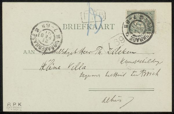
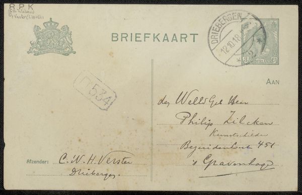
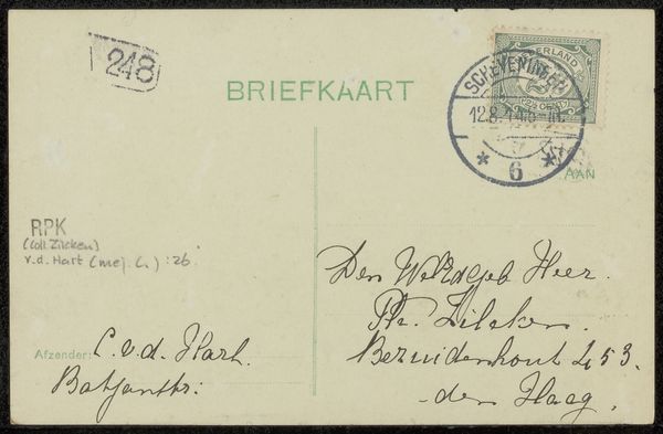
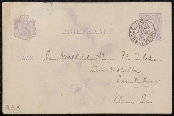
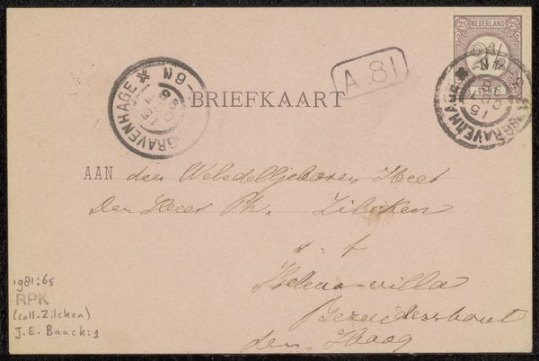
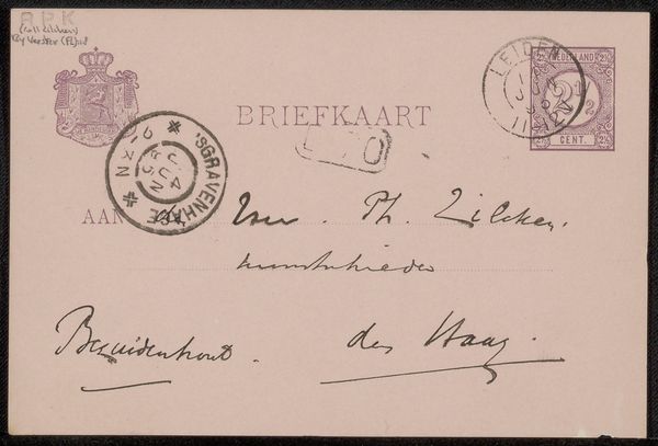
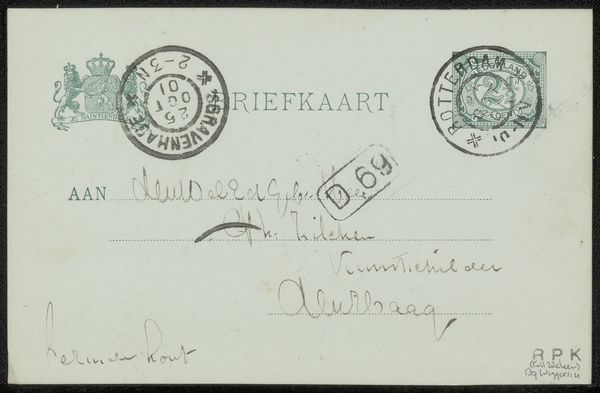
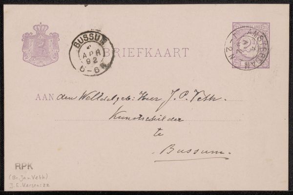
This postcard to Philip Zilcken was made by Karel Sluijterman at some point, we don't have the exact date, but we know it's from around the turn of the last century. What's so compelling about this piece is the faded quality and the various stamps; time has certainly left its mark here. The ink looks like it was applied with a worn nib pen, creating a line that varies in thickness and tone. You can almost feel the hand of the sender, the pressure they applied as they formed each letter. Look at the smudges and blurs around the edges of the stamps. These imperfections add to the sense of history and human touch. The overall effect is almost ghostly, like a message from another era. It reminds me of work by Cy Twombly, with his loose scribbles and faded pallete, a kind of abstract narrative hinting at stories and memories just beyond our reach. Isn't it funny how something so ephemeral can feel so grounded in our experience of the world?
Comments
No comments
Be the first to comment and join the conversation on the ultimate creative platform.
More like this