drawing, print, paper, ink
#
drawing
#
still-life-photography
# print
#
paper
#
personal sketchbook
#
ink
#
calligraphy
Copyright: Rijks Museum: Open Domain
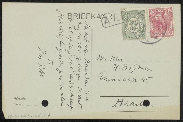
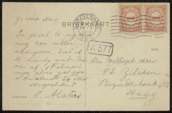
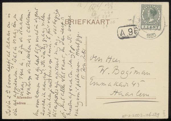
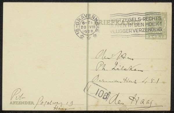
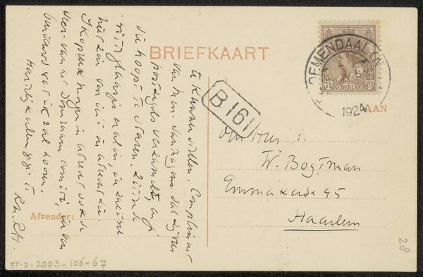
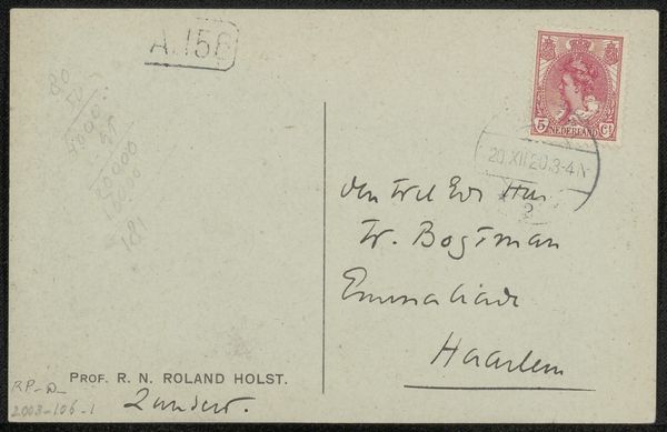
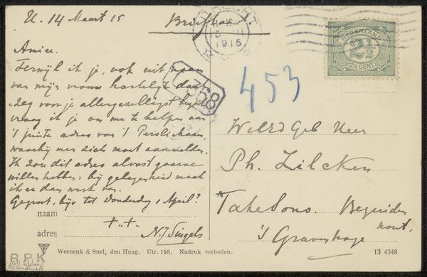
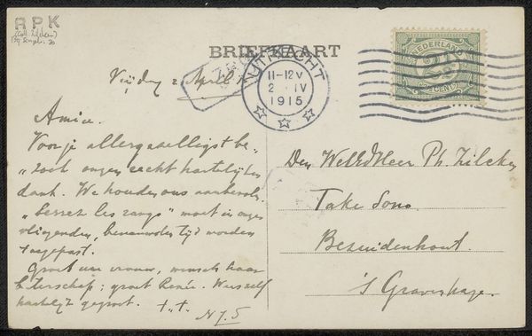
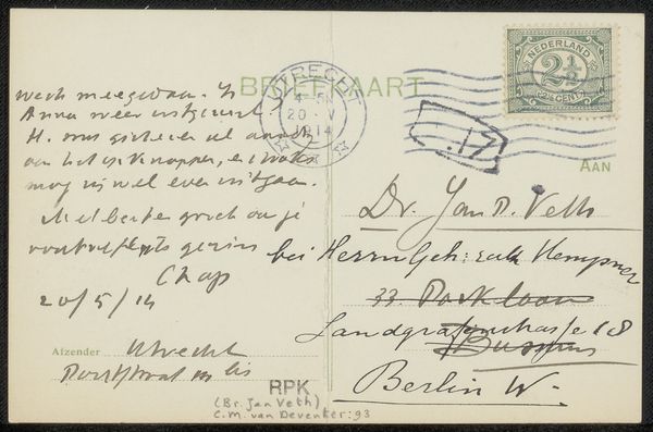
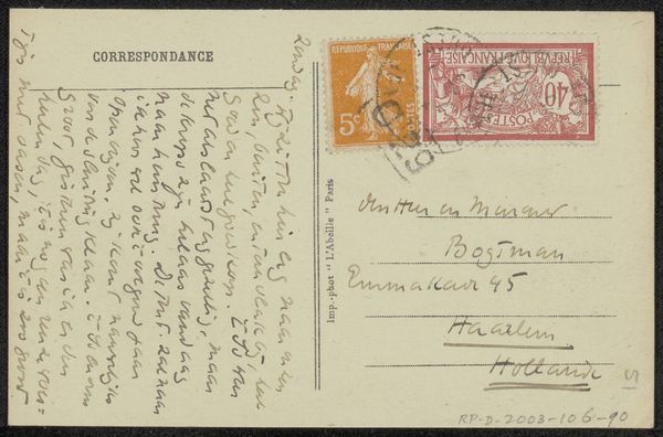
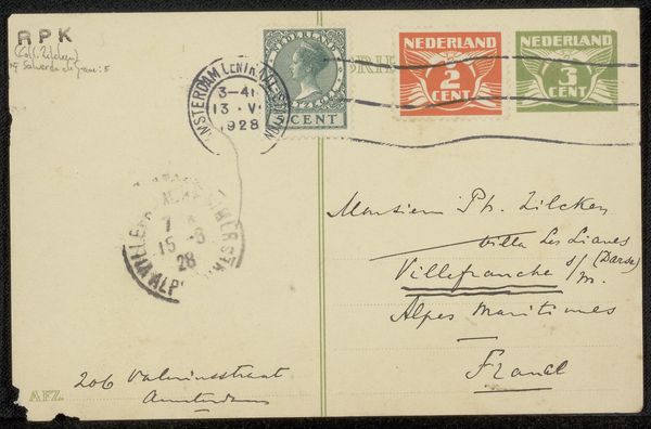
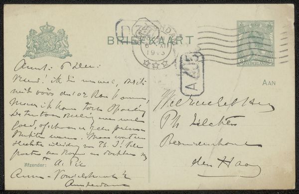
This postcard was addressed to Frans ter Gast by Albert Roelofs. The pale green of the card is overlaid with information, handwriting and stamps. The stamps in the upper right corner, two identical squares, each feature a bold, centered numeral ‘1.’ I find myself drawn to the casual, slightly hurried script. The ink varies in darkness, suggesting pauses, changes in pressure. See how the letters sometimes loop elegantly and other times are cut short? The way the ink bleeds slightly into the paper gives it a tactile quality. You can almost feel the nib of the pen pressing into the surface. Look at the word ‘Belg. Park’ in the lower left corner, the letters are packed closely together, almost touching, as if the writer was running out of room, or maybe just felt like squeezing them in. There’s a kind of awkward beauty in that. The whole thing feels immediate and human. It makes me think of Cy Twombly, who was a kindred spirit, finding poetry in the everyday, elevating the humble gesture to something profound. Art really is just an ongoing conversation.
Comments
No comments
Be the first to comment and join the conversation on the ultimate creative platform.
