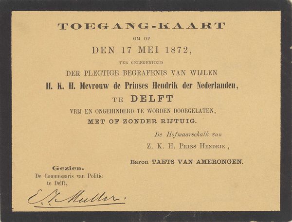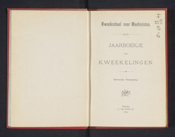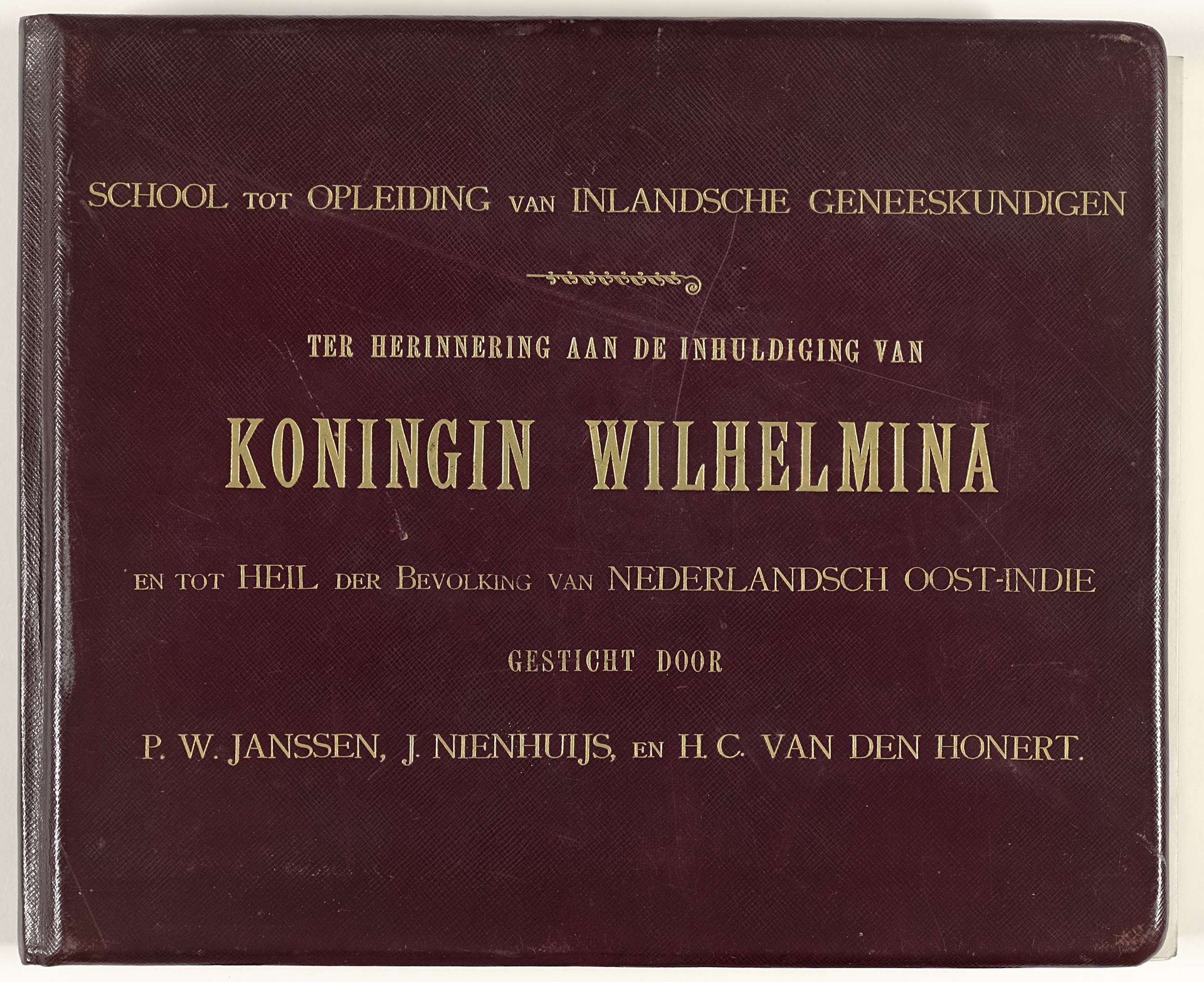
c. 1902
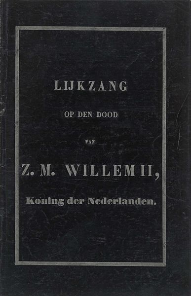
School tot Opleiding van Inlandsche Geneeskundigen / Ter Herinnering aan de Inhuldiging van Koningin Wilhelmina en tot Heil der Bevolking van Nederlandsch Oost-Indie / Gesticht door P.W. Janssen, J. Nienhuijs, en H.C. van den Honert
Tan Tjie Lan
@tantjielanLocation
RijksmuseumListen to curator's interpretation
Curatorial notes
Editor: This is an interesting poster, circa 1902, whose full title is rather a mouthful! "School tot Opleiding van Inlandsche Geneeskundigen / Ter Herinnering aan de Inhuldiging van Koningin Wilhelmina en tot Heil der Bevolking van Nederlandsch Oost-Indie / Gesticht door P.W. Janssen, J. Nienhuijs, en H.C. van den Honert." It feels very formal and old-fashioned with the script typeface, aged paper, and historical font. What are your initial thoughts about the composition and layout? Curator: The work presents a fascinating study in typography and hierarchical arrangement. Observe how the bold, golden font used for "Koningin Wilhelmina" immediately seizes visual prominence. Its centrality reinforces its symbolic weight. Further, note the contrast between this and the more delicate script used for surrounding text. How does this contrast contribute to the poster’s overall effect? Editor: It creates a strong focal point, immediately drawing your eye to the queen’s name while the smaller text provides context and detail. The use of different typefaces helps separate the memorial and dedication from the list of founders, right? Curator: Precisely. Moreover, the arrangement of text blocks contributes to the visual rhythm. Consider the top line versus the bottom. This creates a structured, almost architectural, feel. It emphasizes balance and order, which speaks to the values perhaps considered important during that historical context. What more does the poster communicate? Editor: Well, it really highlights the relationship between Dutch royalty, colonial administration, and this initiative to create a medical school, right? I see what you mean about balance, now. I originally missed how carefully it seems designed just focusing on the large title text. Curator: Indeed. We can thus recognize the degree to which graphic design choices contribute to establishing this image’s power of presence as a commemorative piece. The formal structure amplifies the message.