drawing, paper, ink
#
drawing
#
paper
#
ink
#
post-impressionism
Copyright: Rijks Museum: Open Domain
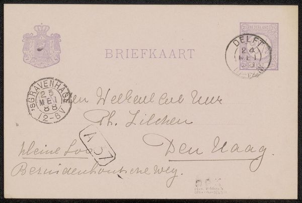
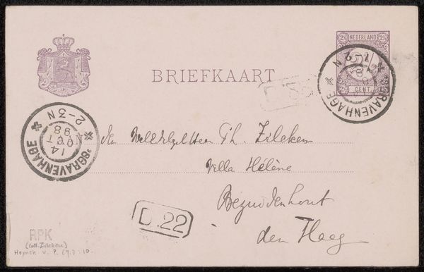
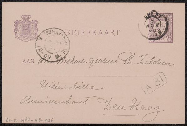
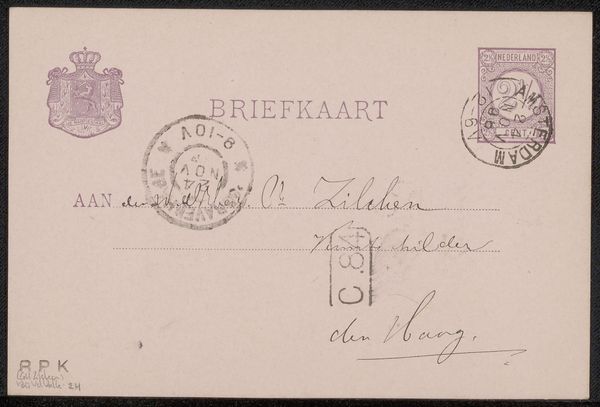
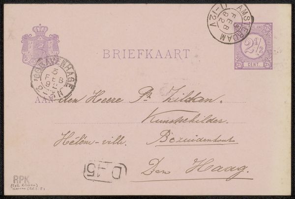
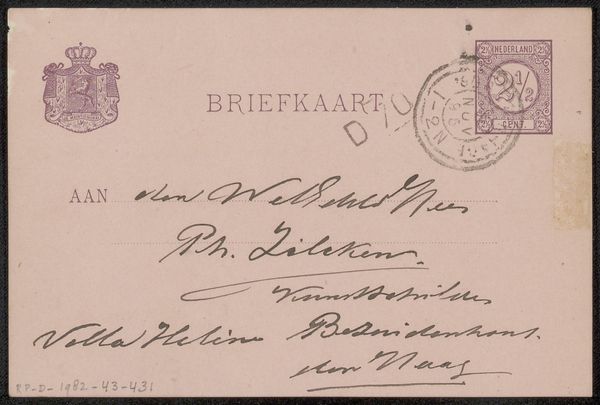
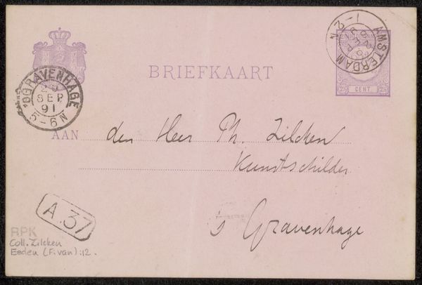
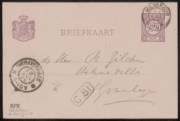
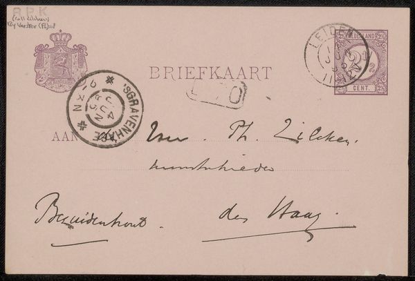
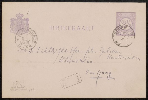
This is a vintage 'Briefkaart aan Philip Zilcken' by Jac van Looij. The card presents a fascinating interplay of text and image that invites a semiotic analysis. The pale pink background serves as a canvas for an arrangement of typographic elements. The word "BRIEFKAART" dominates the upper register, its block letters creating a strong horizontal line. Below, handwritten script adds a personal, intimate touch, contrasting with the official tone of the printed text above. Stamps punctuate the composition, their circular and square forms introducing a graphic disruption. The placement of these elements isn't arbitrary. Van Looij uses the grid-like structure of the address format to create a visual hierarchy. The overlapping seals and fragmented postal marks on the card create a sense of depth and texture, destabilizing the flat surface and hinting at the passage of time and the journey of communication. Here, Van Looij challenges conventional notions of communication by layering textual and graphic elements.
Comments
No comments
Be the first to comment and join the conversation on the ultimate creative platform.
More like this