painting, acrylic-paint
#
abstract-expressionism
#
st-ives-school
#
colourful
#
contemporary
#
painting
#
op art
#
colour-field-painting
#
acrylic-paint
#
form
#
abstract pattern
#
geometric-abstraction
#
abstraction
#
colorful
#
modernism
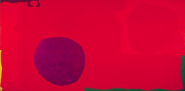
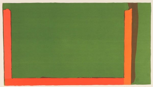
Copyright: Patrick Heron,Fair Use
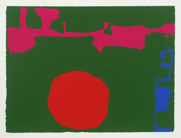
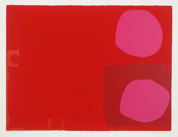
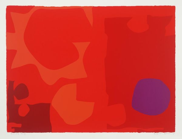
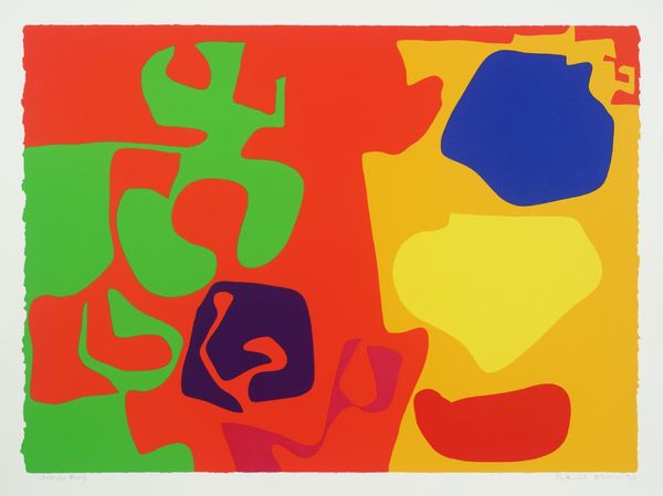
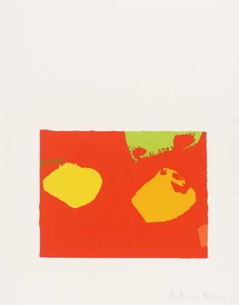
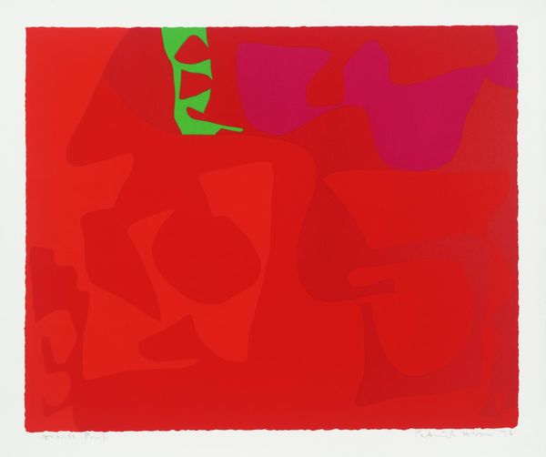
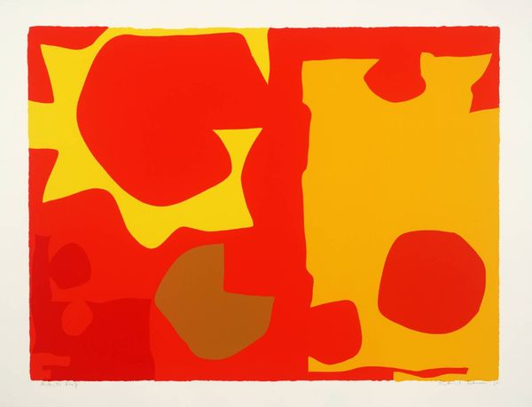
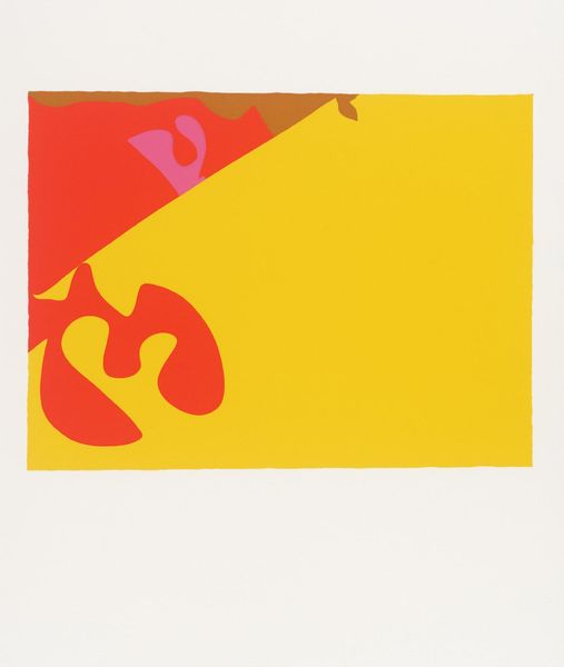
Curator: So striking, isn't it? This is Patrick Heron's "Cadmium with Violet, Scarlet, Emerald, Lemon and Venetian," painted in 1969. It's currently residing here at the Tate Modern. Editor: It does immediately grab you. The colors are so bold, and the composition, though abstract, feels very balanced. The size gives it a real presence too. What medium did he use? Curator: Heron worked with acrylic on canvas for this piece. This allows for those incredibly vivid and flat areas of colour, characteristic of the Colour Field painting movement. It also reflects his interest in challenging traditional artistic hierarchies and creating art accessible to everyone. Editor: It's interesting how the flat planes of color create an optical effect almost. Was that intentional? Thinking of its context, Op Art was certainly influential. Curator: Absolutely. Heron explored the visual sensations created by the interaction of colors, aiming for what he called "optical freedom." He was really interested in how colors affected each other. Look at how the violet pops against that dominant Cadmium red! He sought a democratic painting, he wanted colour itself to become the subject, free from symbolic meaning. Editor: While I understand Heron's intentions regarding pure abstraction, I still find it difficult to separate a piece from its cultural moment. A painting saturated in such unapologetic colors – made in 1969 – resists all notions of neutrality to me. Colour carries the emotion here, not absent of context, not ‘purely’ abstract, but actively creating it. Curator: Yes, art's reception and meaning definitely changes over time! I see your point on context and social implications of such an emphasis on color during that time. It is worth discussing, given what it means today. Editor: Indeed. The choice of such bold, artificial-feeling colors has a power to start a conversation. Curator: So much to unpack even in what may appear simple at first glance! Thank you for helping us dissect the deeper dimensions to Heron's colourful creation here! Editor: My pleasure. It highlights, yet again, the crucial point that there really are no neutral works of art. Every color choice communicates something.
Comments
No comments
Be the first to comment and join the conversation on the ultimate creative platform.
More like this