Dimensions: image: 592 x 795 mm
Copyright: © Estate of Patrick Heron. All Rights Reserved, DACS 2014 | CC-BY-NC-ND 4.0 DEED, Photo: Tate
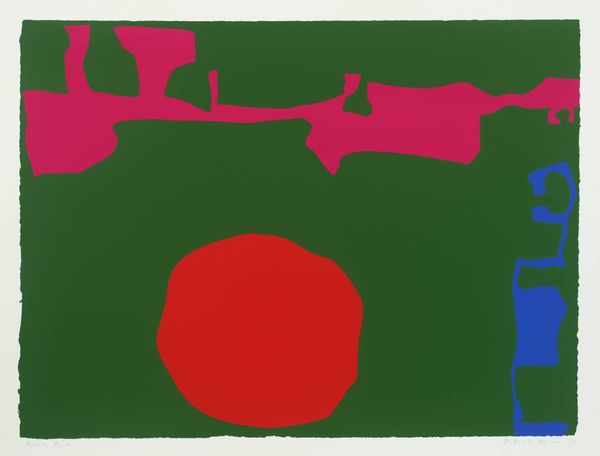
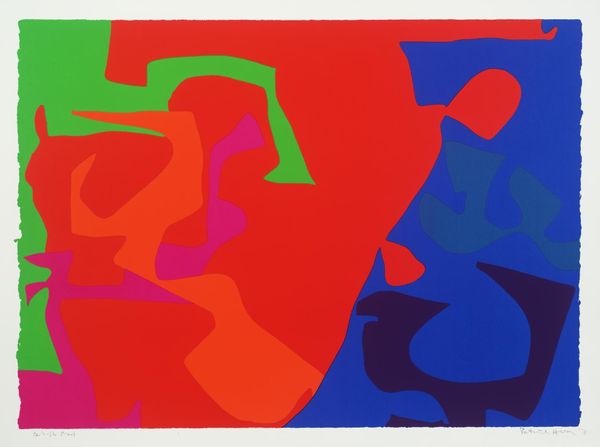
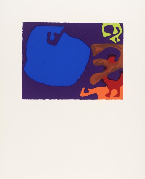
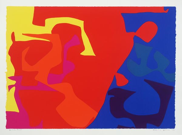
Curator: Patrick Heron’s vibrant screenprint, January 1973: 13, explodes with colour. What’s your immediate take? Editor: The sheer boldness is striking, almost overwhelming. The interplay of those intensely saturated hues—red, blue, pink, green—creates a visual tension that's hard to ignore. Curator: The colours are indeed crucial. Heron’s from a generation steeped in colour theory, using these combinations to evoke particular emotional responses. Editor: It's less about emotion for me and more about the compositional strategy. Note how the irregular shapes interact with the flat background, creating dynamic negative spaces. Curator: I see echoes of Matisse's cut-outs here, where shapes become signifiers, perhaps even memories, floating within the picture plane. Heron uses colour to unlock those memories. Editor: Perhaps, but I think the starkness rejects easy symbolic interpretation. It’s the formal relations—the push and pull of colour and shape—that truly command our attention. Curator: I concede the interplay is powerful, but the simplicity also allows cultural memory to seep in. Editor: I find that line of reasoning a stretch, but I admire your commitment to symbolic readings. Curator: And I appreciate your keen eye for form. It is, after all, a visual experience first and foremost.
More like this