painting, acrylic-paint
#
abstract-expressionism
#
st-ives-school
#
contemporary
#
painting
#
op art
#
pop art
#
colour-field-painting
#
acrylic-paint
#
text
#
geometric-abstraction
#
abstraction
#
pop-art
#
pattern repetition
#
modernism
#
orange
Copyright: Patrick Heron,Fair Use
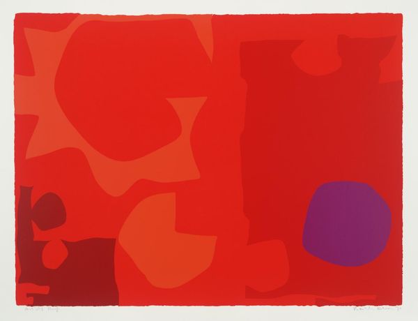
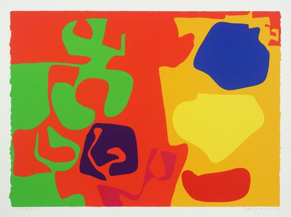
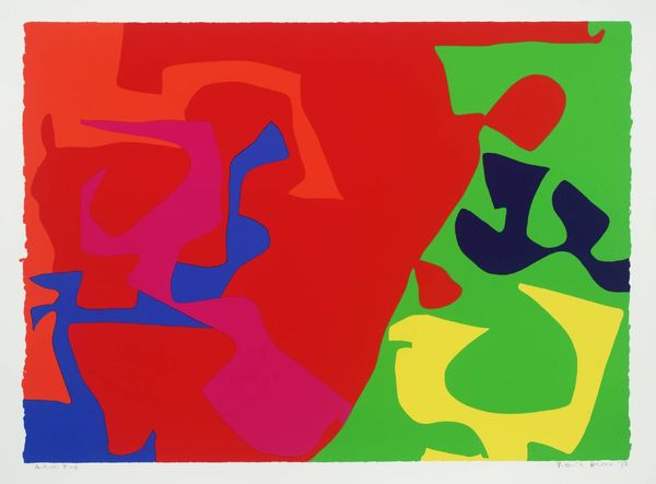
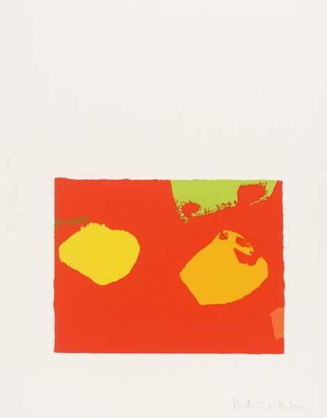
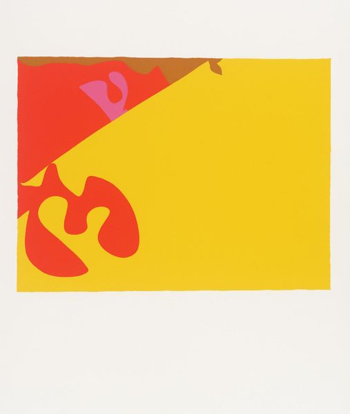
Patrick Heron made this print, *Six in Light Orange with Red in Yellow*, using screenprinting, a process that really lends itself to flat, vibrant colours. He wasn’t messing around, was he? I mean, look at the texture here, or rather, the lack of it – these aren’t shapes built up through layers, they’re solid, like someone’s cut them straight out of coloured paper. The effect is playful, immediate, and bold, making each shape feel super intentional. Take that brown blob hanging out in the bottom left corner – it's a total outlier, isn't it? Its curved edges soften all those sharp angles, and that muted tone keeps all that red and yellow from screaming too loud. It brings your eye into the image, giving the whole thing a depth it wouldn’t otherwise have. You know, looking at Heron’s use of shape and colour, I can’t help but think of Matisse, especially his cut-outs. Both artists aren't afraid to let colour do the talking, proving that sometimes, less really is more.
Comments
No comments
Be the first to comment and join the conversation on the ultimate creative platform.
More like this