drawing, print, ink
#
drawing
# print
#
landscape
#
ink
#
cityscape
#
history-painting
Dimensions: height 148 mm, width 228 mm
Copyright: Rijks Museum: Open Domain
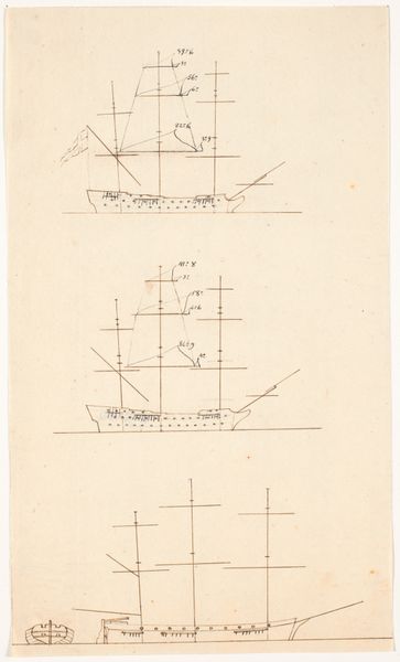
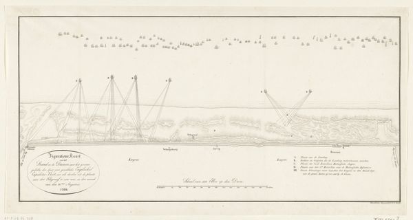
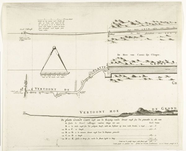
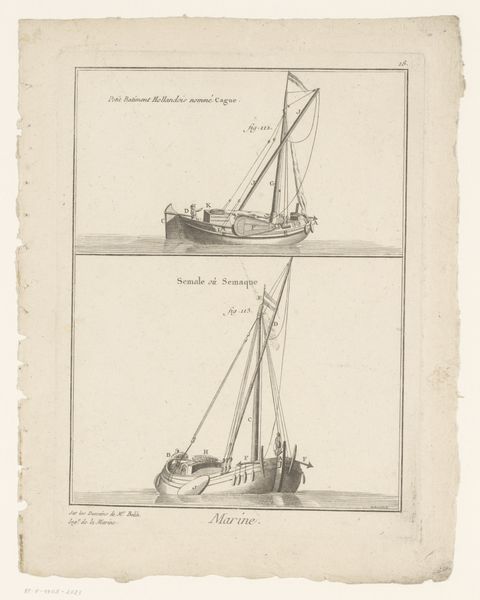
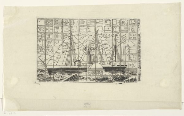
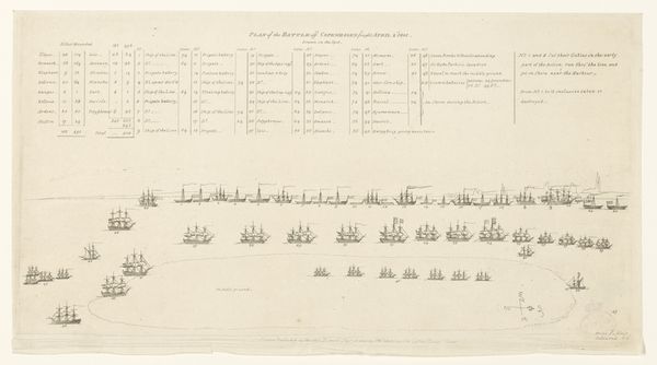
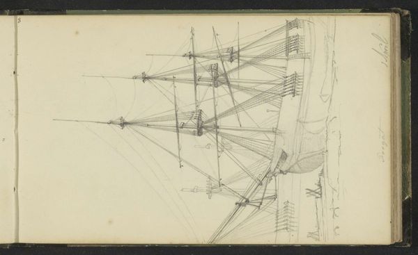
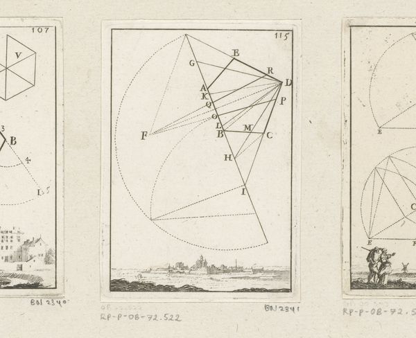
Editor: This ink drawing, "Sleutel bij de prent van de beschieting van Antwerpen, 1830," made around 1830, depicts a cityscape with ships. It's quite sparse, almost diagrammatic. The lines are so delicate and it’s pretty monochrome. What elements stand out to you in its formal composition? Curator: The diagrammatic nature is indeed key. Note how line predominates. The artist meticulously renders ships, buildings, and architectural features, emphasizing structure and form. Observe the systematic arrangement; each element is numbered and correlated with a legend. How does this structural clarity influence the work's aesthetic impact? Editor: I see. So the lack of shading and the numbered elements remove a sense of drama or artistry, in favor of… what? Objectivity? Curator: Precisely! Consider the horizon line, its unwavering flatness reinforces the impression of control. There's a flattening of space, de-emphasizing depth. Now, contemplate the negative space: how does it impact your perception of the delineated objects? Editor: The negative space is so large, so blank; it almost equalizes the city elements with the empty water, emphasizing their isolation from one another within the frame. Curator: The isolation is interesting; notice the lines creating visual separations, yet the equal visual weight flattens the entire conflict between ships and buildings. What theoretical perspective might further illuminate this artistic choice? Editor: Perhaps semiotics? To read the arrangement and sparse rendering not as an effort at capturing “realism” but a formalized set of relationships or structures. Curator: Yes, a fitting way to approach the relationship between the buildings, ships and text as units with specific coded value in relation to one another. By stripping away visual complexity and focusing on the fundamentals, the artist achieves an affect of precision. What’s your impression now? Editor: Thinking about it as a network of coded units gives a sense of deliberate order, which almost transforms historical rendering into something closer to structural commentary. Thanks for showing that!
Comments
No comments
Be the first to comment and join the conversation on the ultimate creative platform.
