drawing, paper, ink
#
drawing
#
baroque
#
dutch-golden-age
#
landscape
#
paper
#
ink
#
cityscape
#
genre-painting
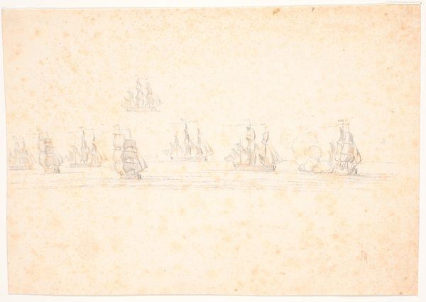
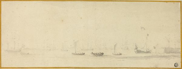
Dimensions: height 120 mm, width 170 mm
Copyright: Rijks Museum: Open Domain
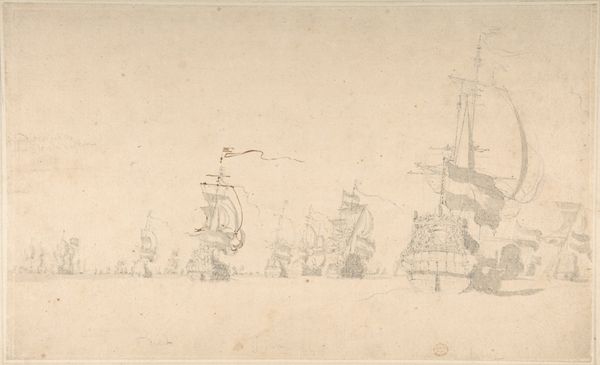
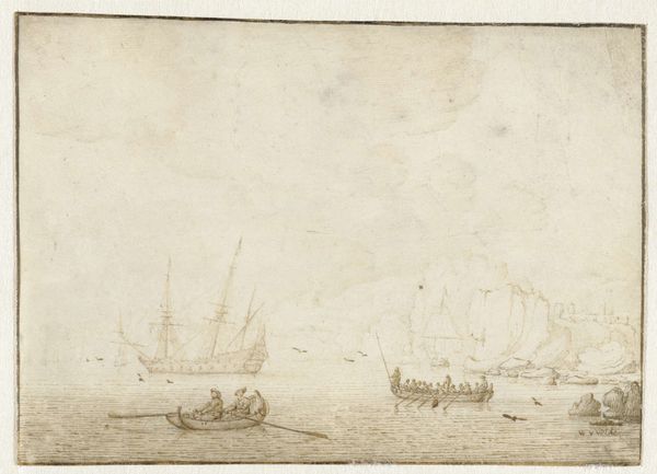
Editor: Here we have Willem van de Velde the Elder’s drawing, "Captured English Ships at Hellevoetsluis," likely from 1666, made with pen and ink on paper. The scene feels calm, almost serene, despite depicting captured warships. I am drawn to the artist's technique. How do you interpret this work? Curator: Notice first the linear quality—the economy of line used to describe complex forms. Van de Velde isn't attempting illusionism. Instead, the power resides in the clear articulation of each vessel's structure and the spatial relationships between them. Observe how the artist uses varying line weights to suggest depth, thinner lines for distant ships, and bolder strokes for those in the foreground. Do you see how this interplay of line and space creates a rhythm across the composition? Editor: I do see that now. The subtle shading, achieved through hatching, adds a layer of dimension as well. It's quite a sophisticated rendering with minimal means. Curator: Precisely. Focus on how the negative space functions. The artist employs a significant portion of the paper for sky, a conscious decision to frame the ships. Note, too, how each mast establishes a vertical accent. This balances the horizontal spread of the captured vessels. It's a carefully orchestrated balance of forms. The result evokes more than just factual representation, doesn’t it? Editor: Absolutely. Thinking about just line, form, and space, I get a new appreciation for the intentionality behind such an understated drawing. Curator: Indeed. By examining these formal elements, we can discern the artistic decisions which give the work its evocative power, irrespective of its historical context.
Comments
No comments
Be the first to comment and join the conversation on the ultimate creative platform.
More like this