drawing, graphic-art, print, paper, typography, ink
#
drawing
#
graphic-art
#
medieval
#
hand-lettering
#
narrative-art
#
pen drawing
# print
#
old engraving style
#
hand drawn type
#
hand lettering
#
paper
#
form
#
typography
#
ink
#
hand-drawn typeface
#
geometric
#
pen-ink sketch
#
line
#
pen work
#
coloring book page
#
doodle art
#
calligraphy
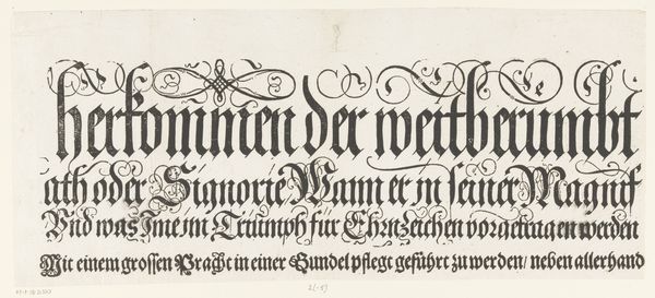
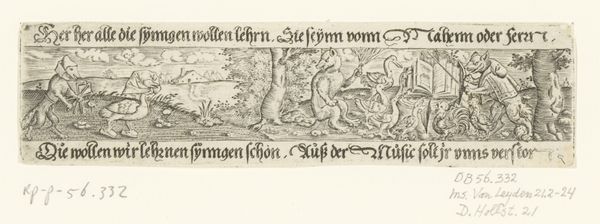
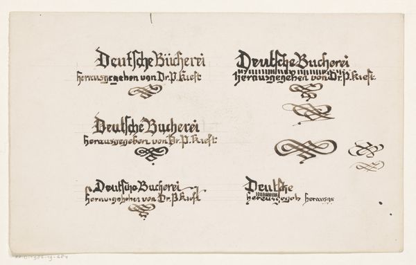
Dimensions: height 147 mm, width 382 mm
Copyright: Rijks Museum: Open Domain
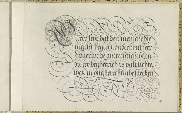
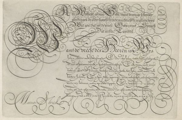
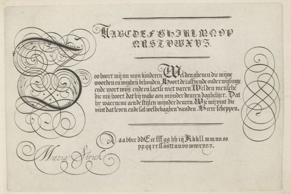
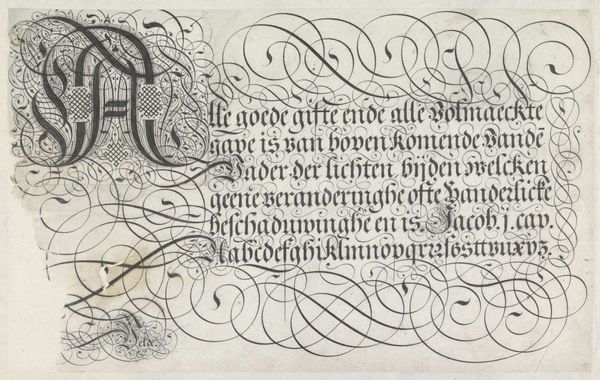
This is a section of a title, "Titel van de Festa della Sensa", made by Jost Amman, around the late 16th century. Its visual power lies in its manipulation of form. The rigid block lettering evokes a sense of formality, yet the flowing calligraphic flourishes soften its effect, almost animating the solid forms. Note how Amman plays with scale; the larger first line contrasts with the smaller, denser text below, creating a visual hierarchy that guides our eye across the page. This contrast also speaks to a structural complexity. The larger letters command authority, while the supporting text grounds the composition, creating an interplay between prominence and subordination. The design destabilizes the idea of simple communication. The complex, decorative lettering suggests a deeper symbolic function. It asks us to consider how typography itself can become an expressive medium, reflecting the cultural values and aesthetic sensibilities of its time. Notice how the very act of writing transforms into an art object, challenging our understanding of language.
Comments
No comments
Be the first to comment and join the conversation on the ultimate creative platform.
More like this