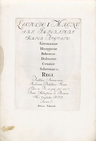
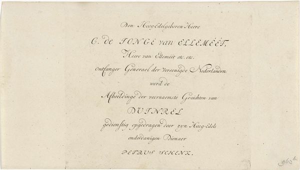
Titelpagina voor: Johannes Hazen Corneliszoon, Mijn laatste werk op aarde, 1835 1835
0:00
0:00
anonymous
Rijksmuseum
graphic-art, print, typography
#
script typeface
#
graphic-art
#
hand-lettering
# print
#
old engraving style
#
hand drawn type
#
hand lettering
#
typography
#
hand-drawn typeface
#
romanticism
#
ink colored
#
handwritten font
#
golden font
#
word imagery
Dimensions: height 210 mm, width 128 mm
Copyright: Rijks Museum: Open Domain
Editor: This is the title page for *Mijn laatste werk op aarde*, or *My Last Work on Earth*, from 1835. It's an etching that just features typography, and I find the ornate lettering gives it such a melancholic feel. What do you see in this piece? Curator: It's fascinating how typography itself can be so evocative. Considering the historical context, this piece speaks volumes about authorship and legacy in a society grappling with rapid change. What does it mean to declare something "my last work?" Editor: Almost like a challenge to time itself! Curator: Precisely. It also invites a deeper examination of the publishing industry in the 19th century. Who was Johannes Hazen Corneliszoon, and what were the socio-political implications of A. Hazeu, identified here as a preacher, publishing his writings posthumously? Whose voices were privileged? And conversely, whose were silenced or appropriated? Consider how Romanticism, with its emphasis on individualism and emotion, intersects with the patriarchal structures of the time. Editor: So you're saying the personal declaration clashes with the historical system behind the production of the work? Curator: Exactly. We see a seemingly personal statement caught in a complex web of societal powers. And remember, “last works” by artists are often fetishized and reconsidered as being of higher value than those that came before. Is there perhaps something inherently capitalist in that construct? Editor: That gives me a lot to think about. I had never really considered that typography could have so many social implications. Curator: It's a potent reminder that every artwork, even something seemingly as simple as a title page, carries echoes of the society that produced it.
Comments
No comments
Be the first to comment and join the conversation on the ultimate creative platform.
More like this