drawing, print, paper, ink, pen
#
drawing
#
script typography
#
hand-lettering
# print
#
hand drawn type
#
hand lettering
#
paper
#
personal sketchbook
#
ink
#
hand-drawn typeface
#
pen work
#
sketchbook drawing
#
pen
#
northern-renaissance
#
sketchbook art
#
calligraphy
#
small lettering
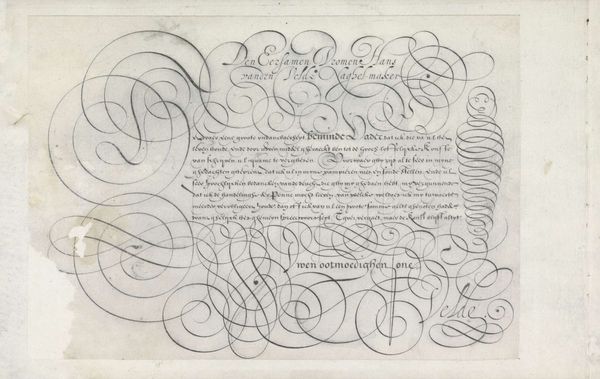
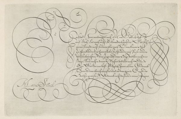
Dimensions: height 203 mm, width 304 mm
Copyright: Rijks Museum: Open Domain
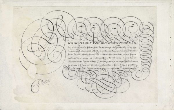
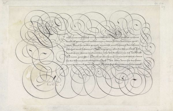
Curator: Immediately, I’m struck by its mesmerizing effect. It’s intricate, and although simple in palette, the visual layering has an almost dizzying effect. Editor: Indeed! What you are describing can be seen in this work from 1605 titled “Ontwerp van een schrijfvoorbeeld: Beter is Wijsheyt (...)" by Jan van de Velde I. We’re looking at a drawing executed with pen and ink on paper. Consider the social context here: calligraphy during this era served not merely as functional writing but also as a highly respected art form that could denote sophistication and status. Curator: And it's clear when examining this closely how skill could influence societal perception, especially among the literate classes. Each flourish, each carefully weighted line seems a testament to both the mastery and privilege associated with literacy. One can imagine this artwork being quite powerful as a marker of one’s learned identity. Editor: I appreciate your interpretation. Formally, it presents an incredible study in rhythm and repetition. Note the curves of the embellished script interacting with the strict lines of the smaller, legible text. There's a dynamic interplay here. Curator: Absolutely, but beyond its aesthetic merit, it also presents the prevailing social ideals through scriptural references. The chosen verse emphasizes the virtues of wisdom over material wealth – echoing familiar patriarchal scripts about piety and the prudent use of resources during that period. The construction of morality is interwoven with class and gendered expectations here. Editor: Agreed, but let's also observe the sheer virtuosity in the execution of this piece. How each stroke contributes to the overall harmony. One cannot deny its artistry irrespective of any ideological leanings we ascribe to it today. Curator: It’s undeniable, truly. Analyzing this today, with insights from feminist theory or critical race studies adds dimensions about the artwork’s initial construction and how it circulated through very particular social structures. Editor: A compelling analysis, it also seems clear that our combined attention enriches our engagement with the work!
Comments
No comments
Be the first to comment and join the conversation on the ultimate creative platform.
More like this