Dimensions: height 115 mm, width 294 mm
Copyright: Rijks Museum: Open Domain
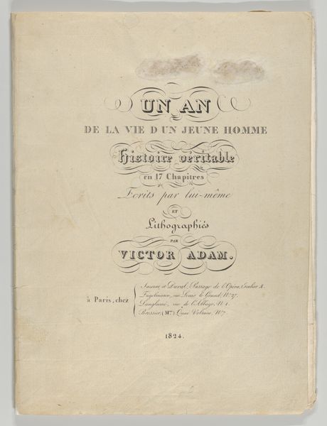
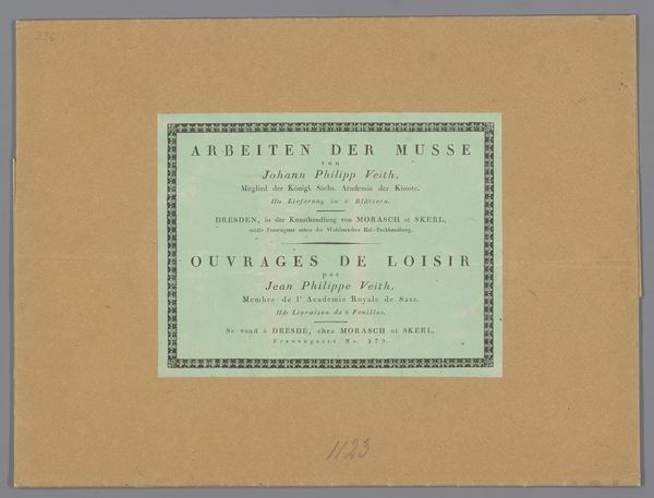
This title page, or ‘Omslag’, was made by Johann Friedrich Gottlieb Unger in Germany at the turn of the 19th century. It advertises a set of twenty-five figures cut in wood. Unger’s typeface, known as ‘Unger-Fraktur’, reflects the cultural context of the Enlightenment. His choice of the ‘Fraktur’ typeface is a clear demonstration of his self-consciously conservative attitude. Although he embraced modernization in printing techniques, Unger’s aesthetic rooted him in a longer tradition. This typeface became associated with German nationalism and cultural identity, especially during the 19th century. It's use reflected a desire to preserve and promote German language and culture at a time when there was a growing sense of national identity. To fully appreciate the role of this print, one might look at publishing history, the development of printing technologies, and the rise of nationalism in the German-speaking lands. Looking at art in its social context helps us better understand its meaning and impact.
Comments
No comments
Be the first to comment and join the conversation on the ultimate creative platform.
More like this