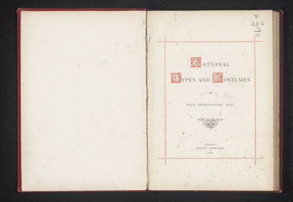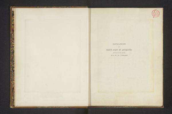
Dimensions: height 145 mm, width 101 mm, thickness 25 mm
Copyright: Rijks Museum: Open Domain
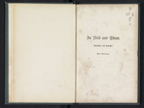
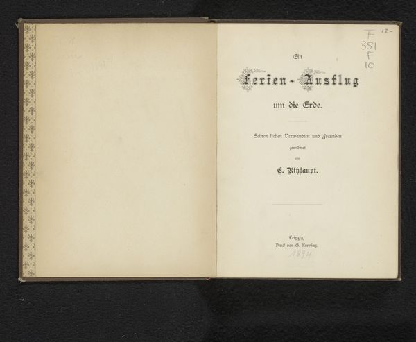
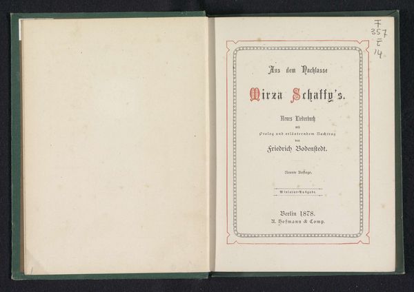
This is the cover of ‘Sang og Sagn, samt haandtegninger’, or ‘Songs and Legends, as well as Drawings’, printed in Copenhagen in 1866. The title employs a Fraktur typeface; these broken letterforms evoke a sense of cultural memory and the deep roots of language. Consider how such typography, prevalent in Northern Europe, was intentionally chosen to conjure a sense of history and Germanic identity. Even today, this script stirs emotions, linking us to an era of nationalism and romanticism. In a world of rapidly evolving communication, the choice of such a script serves not merely as a design element, but as a deliberate invocation of the past—a past that continues to shape our cultural subconscious. The cyclical nature of symbols means that even as times change, echoes of older meanings still resonate.
Comments
No comments
Be the first to comment and join the conversation on the ultimate creative platform.
