![Zu Bild und Tönen : Novellen und Gedichte zu Wilh. v. Kaulbach, F. Mendelssohn-B[artholdy] : erste Sammlung by Otto Schröder](/_next/image?url=https%3A%2F%2Fd2w8kbdekdi1gv.cloudfront.net%2FeyJidWNrZXQiOiAiYXJ0ZXJhLWltYWdlcy1idWNrZXQiLCAia2V5IjogImFydHdvcmtzLzI2MTkwMzVlLWU1ZDUtNDE3Yy05YzhmLTE1MTM3Mjk5YzRkMS8yNjE5MDM1ZS1lNWQ1LTQxN2MtOWM4Zi0xNTEzNzI5OWM0ZDFfZnVsbC5qcGciLCAiZWRpdHMiOiB7InJlc2l6ZSI6IHsid2lkdGgiOiAxOTIwLCAiaGVpZ2h0IjogMTkyMCwgImZpdCI6ICJpbnNpZGUifX19&w=3840&q=75)
Zu Bild und Tönen : Novellen und Gedichte zu Wilh. v. Kaulbach, F. Mendelssohn-B[artholdy] : erste Sammlung 1862
0:00
0:00
graphic-art, print, typography
#
graphic-art
#
aged paper
#
homemade paper
#
script typography
# print
#
hand drawn type
#
personal sketchbook
#
typography
#
hand-drawn typeface
#
fading type
#
thick font
#
sketchbook art
#
historical font
Dimensions: height 188 mm, width 126 mm, thickness 10 mm
Copyright: Rijks Museum: Open Domain
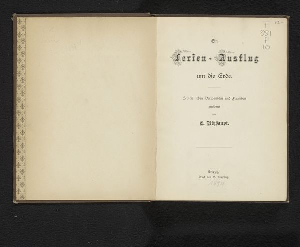
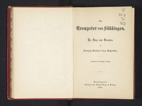
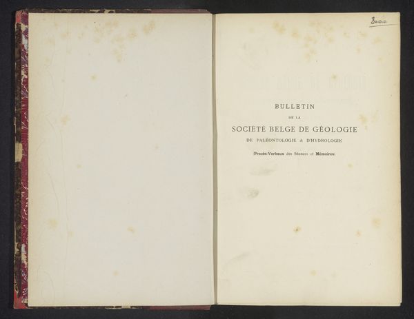
This is the open title page of *Zu Bild und Tönen*, or "To Image and Sounds", a collection by Otto Schröder. The stark, contrasting planes create a visual dialogue. The left page, a field of pale ivory, faces the title page on the right. Here, typography becomes the dominant form. Three lines of text, each in a progressively smaller font size, are set against the paper's mottled surface. The cover creates a frame, with its simple lines and deep tone. The design directs our attention not just to the content, but to the interplay between visual and textual elements. Schröder uses the book's physical structure to suggest a conversation between different modes of expression: the visual arts referenced in the title, and the poetic and narrative forms that fill its pages. It asks us to reflect on how we perceive meaning through different mediums.
Comments
No comments
Be the first to comment and join the conversation on the ultimate creative platform.
More like this