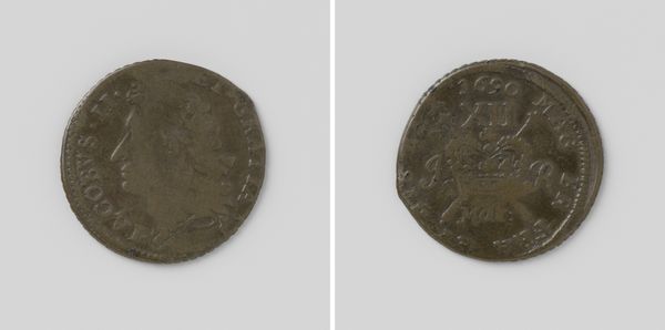
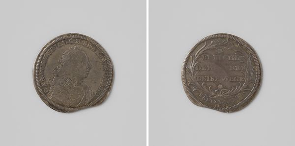
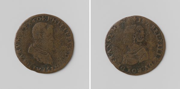
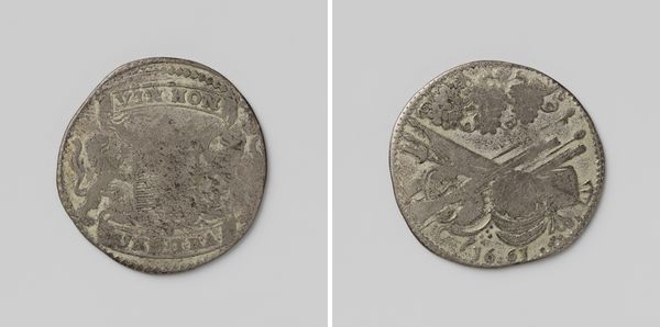
Halve crown, noodmunt van Jacobus II, koning van Engeland, uit juni 1690 1690 - 1696
anonymous
Rijksmuseum
metal, sculpture
portrait
baroque
metal
sculpture
sculpture
Dimensions: diameter 2.9 cm, weight 10.89 gr
Copyright: Rijks Museum: Open Domain
Editor: This object is a 'Halve crown, noodmunt van Jacobus II, koning van Engeland, uit juni 1690,' dating from between 1690 and 1696. It's currently held at the Rijksmuseum. It appears to be made of metal and looks like it might have been used as currency. I'm struck by the Baroque portrait style despite its diminutive scale. What design choices stand out to you? Curator: Its value rests precisely in those seemingly contradictory visual elements you pointed out. Look at the concave and convex relief of the surface of the coin. How does that relief contribute to the legibility of the forms on the small surface? Editor: It makes them pop, doesn’t it? Especially the lettering and the king's profile. Almost like a miniature sculpture. Curator: Precisely! And note the subtle treatment of light. Observe how the metal’s sheen and shadows play across the forms to enhance the sense of depth and volume. This interplay allows the artist to evoke not just a portrait but also an ideal of monarchy, an effect scaled for intimate circulation. What statement does its form communicate? Editor: Maybe about power in times of crisis? It’s been damaged at the top. Also, there's a tiny hole piercing through it, possibly used for suspension, which changes its context from legal tender to perhaps an adornment, jewelry almost? Curator: The hole presents an important question about our aesthetic experience and contextual value. The imperfection could challenge conventional appreciation for perfect execution and opens us to an intriguing reevaluation of this monetary artwork and the semiotics behind it. Editor: So, seeing the way the material itself has been manipulated and shaped really changes how you look at the image? Curator: It transforms how we comprehend its purpose. Close observation alters our perspective on what is important within a seemingly common artwork. Editor: That makes sense! Focusing on these physical aspects gave me a new insight. Thanks for pointing that out.
Comments
No comments
Be the first to comment and join the conversation on the ultimate creative platform.