Dimensions: height 378 mm, width 525 mm
Copyright: Rijks Museum: Open Domain
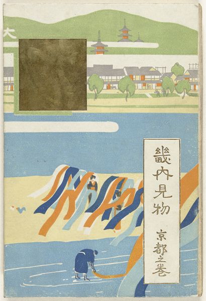
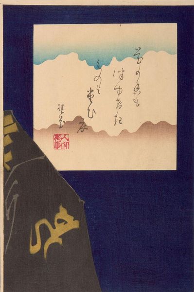
Editor: Here we have Shimomura Tamahiro's "The Four Seasons of the Capital," likely from 1907. It’s a woodblock print with ink and color on paper, currently at the Rijksmuseum. I’m immediately struck by the geometric composition and muted palette, the interplay of figures and shapes creating a very stylized effect. How do you approach an analysis of this particular print? Curator: A close visual reading reveals much. Observe the careful segmentation of the pictorial space, delineated by the prominent gray horizontal band bisecting the composition. This band, in turn, frames the procession of figures bearing what appear to be symbolic objects, each framed within individual, almost architectural compartments. Editor: So you see the architectural elements as deliberately compartmentalizing the narrative? Curator: Precisely. Notice how the artist employs a limited color palette, relying on the interaction of these muted tones to generate a sense of depth and rhythmic variation. What semiotic relationship do you observe between the figures' poses and the objects they carry? Editor: I hadn’t considered a semiotic relationship, but now that you mention it, their gestures seem to almost echo the geometric patterns of the dividers, creating a visual echo throughout the work. And is that tie on the right integrated on purpose? Curator: A keen observation. The material tie grounds this ethereal depiction with earthly realities. Did Tamahiro incorporate texture, or emphasize any material to catch our eye? Editor: The subtle variations in tone and the matte finish give it a very tactile quality. It’s quite striking how much texture he achieves with so few colors and clear constraints. Curator: Indeed. By isolating these formal elements – color, shape, composition, materiality – we can begin to unpack the work’s intricate visual language, beyond superficial representations of landscape. This artwork serves as an entrypoint to many visual aspects worth noticing and deconstructing further. Editor: This deeper focus on form has given me a fresh appreciation for Tamahiro’s approach! It shows that the artist controlled the overall affect of the woodblock by simplifying the color relationships, which is very helpful to notice.
Comments
No comments
Be the first to comment and join the conversation on the ultimate creative platform.
More like this