drawing, paper, ink
#
drawing
#
asian-art
#
paper
#
ink
#
geometric
#
calligraphy
Dimensions: height 250 mm, width 359 mm
Copyright: Rijks Museum: Open Domain
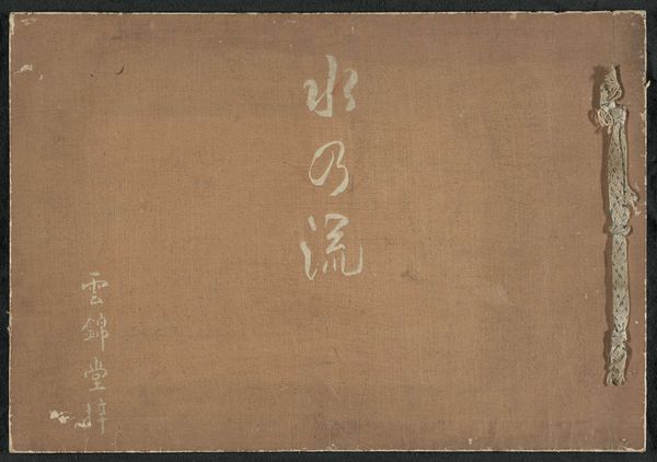
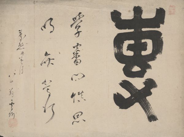
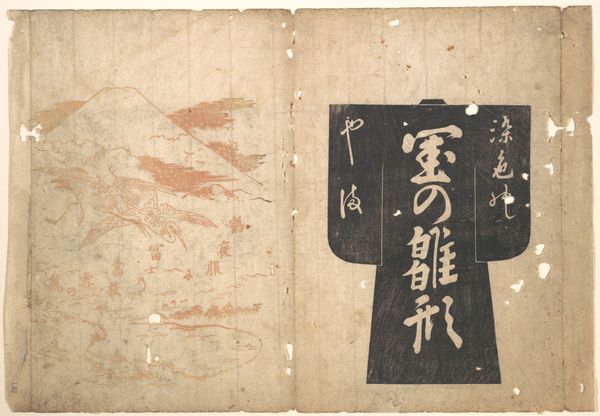
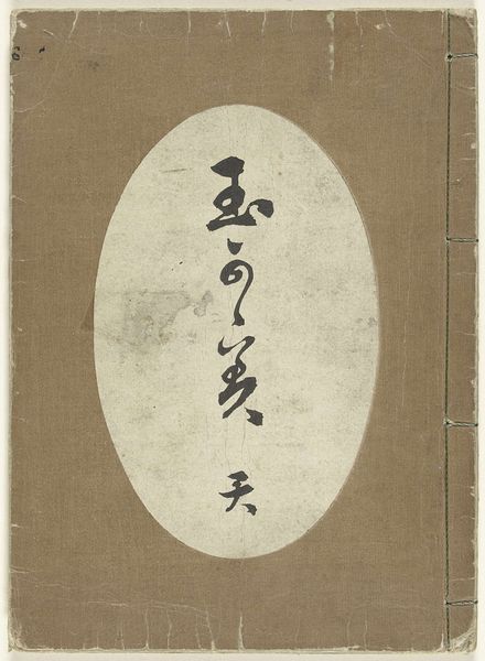
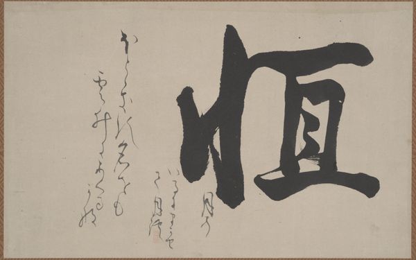
This is a book called 'Bloemenspiegel' by Kobayashi Gyokunen. With its cover, it’s all about the contrast between the stark black calligraphy and the subtle, aged grey of the paper. It’s like a dance between precision and chance, intention and accident. The texture of the paper itself is so tactile, so present, that you can almost feel the history embedded in its fibers. Look closely, and you'll see how the ink bleeds ever so slightly into the paper, creating a soft halo around each character. I love how this softens the edges and creates a sense of depth. The bold black shapes remind me of Franz Kline, but with an ancient twist. I think what really grabs me is the way this piece invites you to slow down, to contemplate the weight of each stroke. It's a reminder that art isn't just about what you see, but how you see it.
Comments
No comments
Be the first to comment and join the conversation on the ultimate creative platform.
More like this