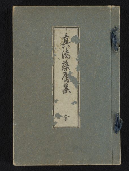
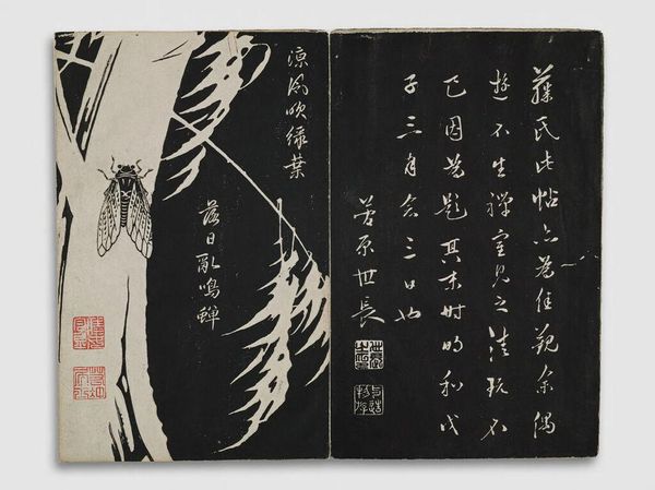
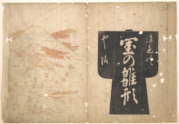
Prentenboek der natuur - deel twee - Koetsu`s ontwerpen 1901 - 1908
0:00
0:00
seizeikigyokuqiyu
Rijksmuseum
graphic-art, print, paper, typography, ink
#
graphic-art
# print
#
asian-art
#
paper
#
typography
#
ink
#
decorative-art
Dimensions: height 193 mm, width 263 mm
Copyright: Rijks Museum: Open Domain
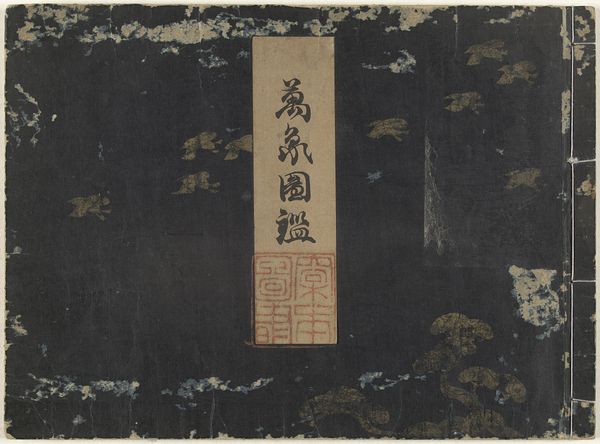
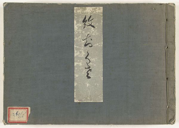
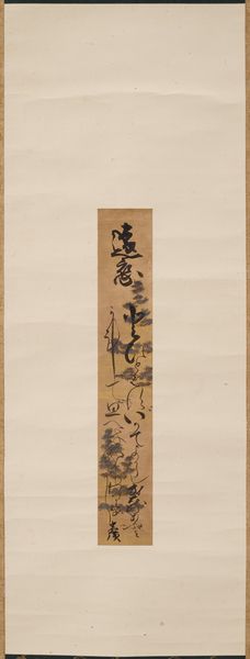
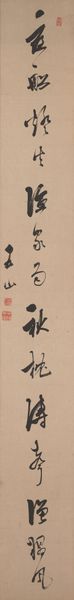
Curator: Here at the Rijksmuseum, we have "Prentenboek der Natuur - deel twee - Koetsu`s ontwerpen", a print from between 1901 and 1908 by Seitei Kigyoku. What are your first thoughts on this piece? Editor: It looks like an invitation to some very exclusive gathering. A somber but still visually pleasing cover design. I immediately notice the use of, what appears to be, basic ink on paper. Is it the covers of an ancient textbook, perhaps? Curator: You're close. "Prentenboek der Natuur" translates to "Nature's Picture Book," and it indeed seems to be an exquisite compilation of designs by Koetsu, rendered through graphic art using ink, paper, and typography. Editor: Graphic art from nature? So, what’s the raw material here? Weeds pressed between pages, leaf rubbings, handmade paper? My interest here really sits within the materiality itself: its components, how the piece was assembled… Curator: While Kigyoku pulls heavily from naturalistic motifs, these designs do seem to originate from his imagination, reflecting on nature more than documenting it directly. Editor: Hmm, well, these sweeping linear gestures do feel a little divorced from my understanding of nature. More like someone’s idea *of* nature. In other words, decoration... Curator: Decoration isn't a bad thing! What I see is Kigyoku embracing the essence of Japanese decorative arts, where stylization and suggestion often outweigh realistic depiction. The minimalism draws me into a space where I get to participate in completing the scene, to use my own imagination and memory. Editor: Yes, well, maybe there is power in that minimalist impulse, when materials are laid bare, forcing us to confront the act of art making itself. After all, nature becomes the raw material of the imagination itself. Curator: Precisely! It nudges us to appreciate the process. Beauty doesn't always need to be complex; sometimes, it is found in the simplest rendering, the ink, the paper, and the space it creates. Editor: It prompts us to consider how cultural ideals around aesthetics might influence production and labor processes too. Fascinating, really!
Comments
No comments
Be the first to comment and join the conversation on the ultimate creative platform.
More like this