drawing, ink, pencil
#
drawing
#
neoclacissism
#
landscape
#
ink
#
romanticism
#
pencil
#
cityscape
#
academic-art
#
realism
Dimensions: height 271 mm, width 399 mm
Copyright: Rijks Museum: Open Domain
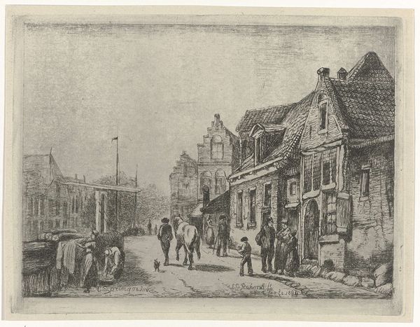
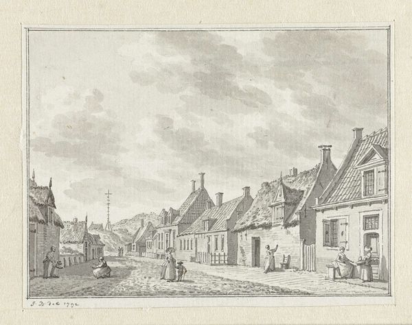
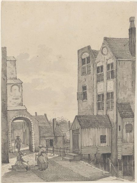
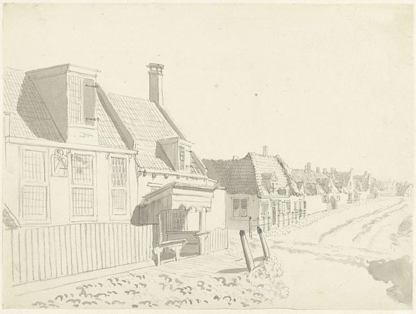
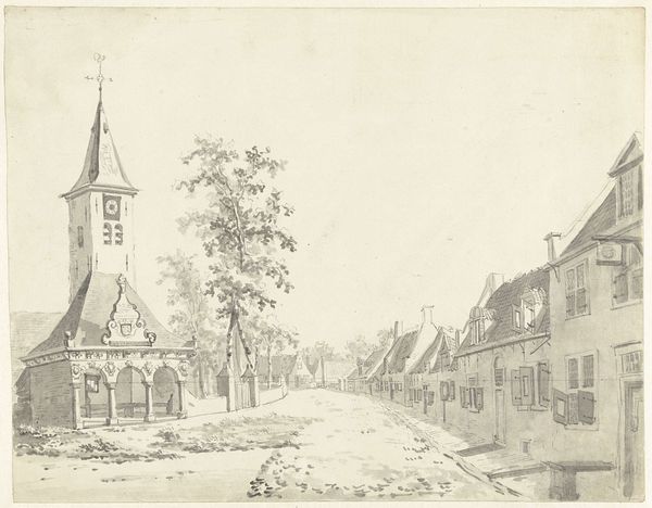
Editor: We're looking at "Bij de Koepoort te Delft," created in 1819 by Johannes Jelgerhuis, using pencil and ink. It has such a calm, ordered feel about it. What compositional elements stand out to you? Curator: Note the distinct, horizontal registers: sky, buildings, street, each afforded a measured portion of the pictorial field. How does this layering structure our perception? Editor: It almost feels like I'm looking at a stage set, with the buildings as backdrop. What about the muted palette? Curator: Precisely. Observe how the limited tonal range—predominantly grays and browns—functions. Does it unify the composition, or does it flatten the spatial recession, drawing attention to the surface? Note also the subtle gradations within those limited tones, and their effects. Editor: It does feel flattened, but I hadn't considered it was a deliberate effect. It seems so… unemotional, despite being labeled as Romantic. Curator: Romanticism, understood formally, often employed meticulous detail and observation to depict a scene objectively. The accuracy of line and form supplants overt emotionality. Where might we locate the romantic, if not in expressionism, in this particular artwork? Is it possible it inheres in the subject matter—the town itself, documented with loving accuracy? Editor: So, the *act* of recording the scene, its lines and structures, becomes the romantic element? It's less about feelings and more about precise visual language? Curator: Yes, perhaps the artwork whispers its romantic sentiment through structure, line, and the precision of its depiction of architectural form. Editor: I see that so differently now. The romantic element comes through in the careful detail and quiet precision, instead of some grand, emotional statement. Thank you!
Comments
No comments
Be the first to comment and join the conversation on the ultimate creative platform.
More like this