drawing, mixed-media, paper, typography, ink, pen
#
drawing
#
aged paper
#
mixed-media
#
paper
#
personal sketchbook
#
typography
#
ink
#
pen work
#
pen
#
sketchbook art
Dimensions: height 212 mm, width 166 mm
Copyright: Rijks Museum: Open Domain
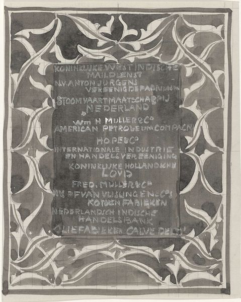
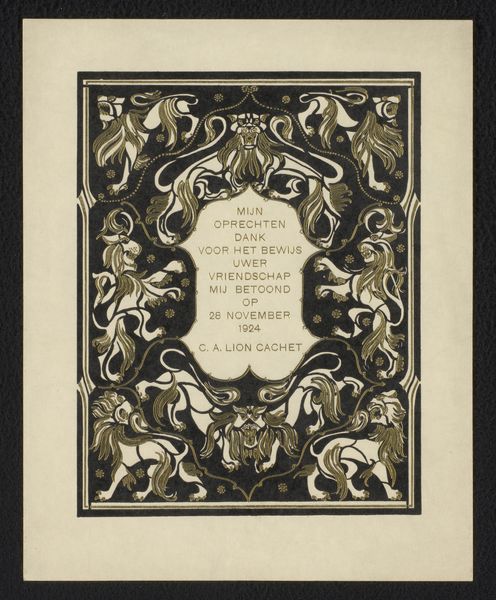
Curator: This interesting mixed-media work comes to us from Carel Adolph Lion Cachet. Called "Ornamental Design with Company Names," it likely dates from sometime between 1874 and 1945. Editor: It’s immediately striking, isn’t it? The names listed are all of businesses. They are rendered with ink and pen work, but they look embedded inside of a dark background, almost like a chalkboard. The architectural-floral shapes that frame them evoke bank notes. Curator: Absolutely, the ornamental border creates a sense of authority, doesn’t it? Cachet was a very successful designer and decorative artist in the Netherlands at the turn of the century, connected to many corporate identities through the applied arts. The company names and almost bureaucratic aesthetic evoke a sense of officialdom. Editor: But also a hierarchy of production. Consider what materials and labor are involved in extracting petroleum for the “Petroleum Bronnen in Nederland,” listed here, or brewing spirits, and transporting goods via "Java-China-Japan-Lijn" — all activities enabled by capital controlled, in part, by the banking firms mentioned. The artistry, even here in the initial design stage, obscures those material realities, as always. Curator: That’s a fair point. This work really highlights how design can play a role in legitimizing power structures. The very act of stylizing these company names lends them a certain permanence, almost an iconic status, as though they’re pillars of Dutch society. Editor: Even the medium emphasizes longevity – ink on paper gives this design a sense of authority compared to a fleeting sketch on a tablet. Plus, you can see that Cachet's design is overlaid on a pre-gridded paper, like technical drawings. Curator: Ultimately, it speaks to the powerful interplay between commerce and art in shaping national identity, while showcasing the labor relations hidden in industrial design. Editor: I think this work allows us to engage deeply with not just the history of commerce but also with design history and even the hidden and often abstracted sources of commercial goods in material ways.
Comments
No comments
Be the first to comment and join the conversation on the ultimate creative platform.
More like this