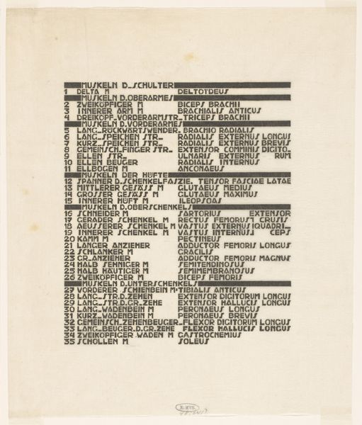
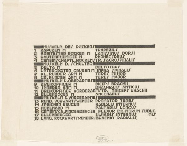
Lijst van hals-, buik- en bovenbeenspieren in Duits en Latijn 1906 - 1945
0:00
0:00
reijerstolk
Rijksmuseum
drawing, graphic-art, print, typography
#
portrait
#
photo of handprinted image
#
drawing
#
graphic-art
#
type repetition
#
aged paper
# print
#
old engraving style
#
hand drawn type
#
typography
#
hand-drawn typeface
#
fading type
#
thick font
#
golden font
#
academic-art
#
historical font
Dimensions: height 320 mm, width 266 mm
Copyright: Rijks Museum: Open Domain
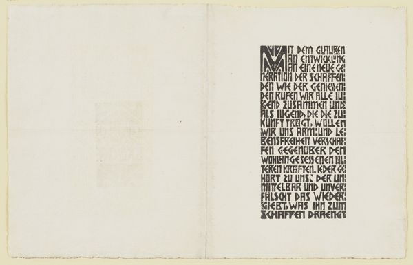
This is Reijer Stolk's 'List of muscles of the neck, abdomen, and upper leg in German and Latin', a text-based print of unknown date. I find the visual impact of pure language so interesting: the way the type sits on the page, dense and blocky like a minimalist grid painting or abstract concrete poetry. I love the simple physicality of the print: the way the ink sits slightly raised on the paper, leaving an impression like the letterpress prints of Ed Ruscha, or maybe even some of the dense text works of someone like Glenn Ligon. It reminds me that, even in the most conceptual art, there's always a fundamental physicality involved. Each letter is painstakingly rendered, creating a tangible, textural presence. It’s an unusual piece, and it makes me wonder about the interplay between art, science, and language. I’m reminded of Mel Bochner's text-based art, but with Stolk's, there’s a directness, a kind of unapologetic utility, that gives it a totally different feel. Art that reminds us to see the familiar in new ways - what's not to love?
Comments
No comments
Be the first to comment and join the conversation on the ultimate creative platform.
More like this