Copyright: CC0 1.0
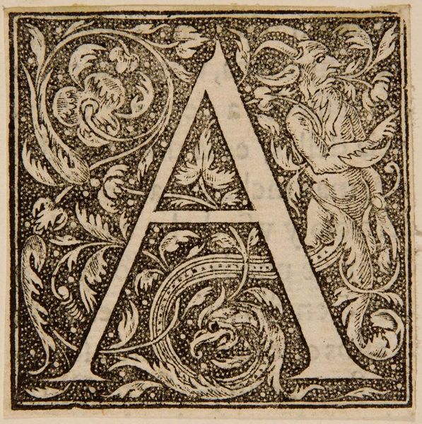
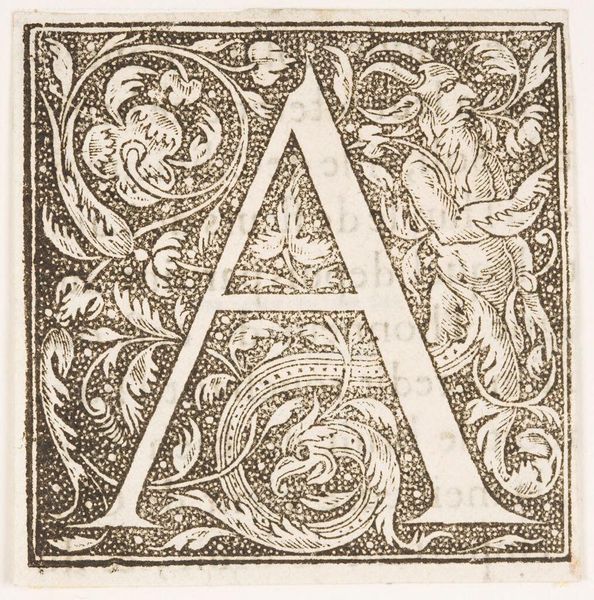
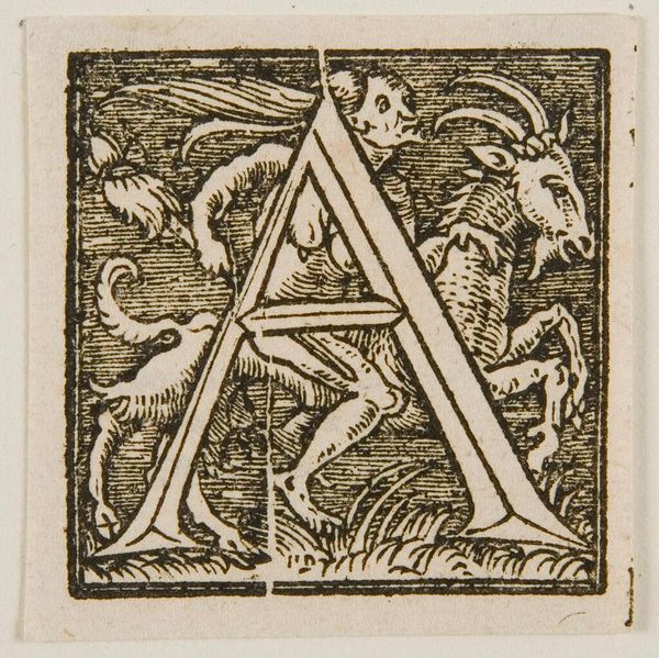
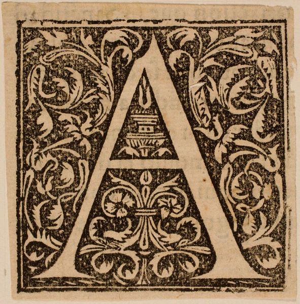
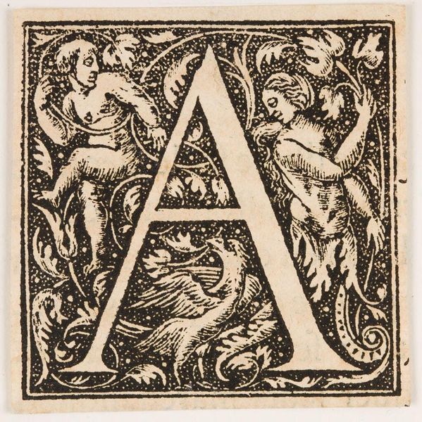
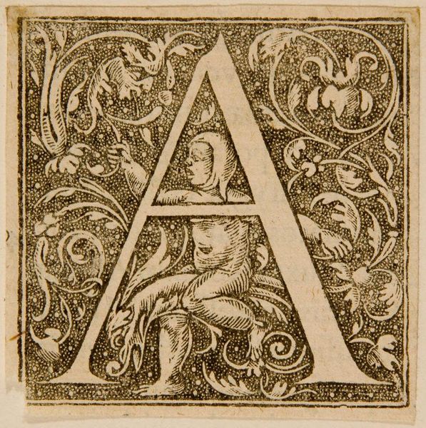
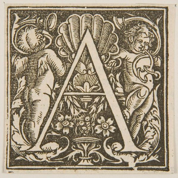
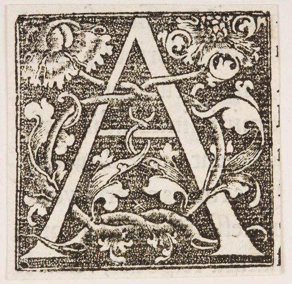
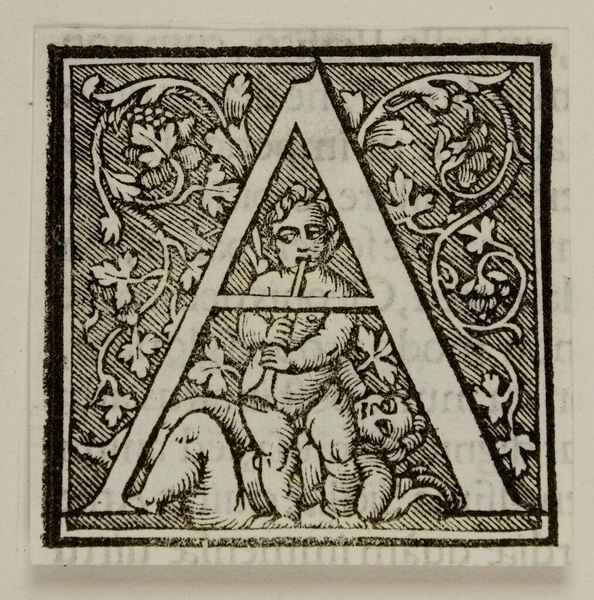
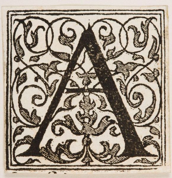
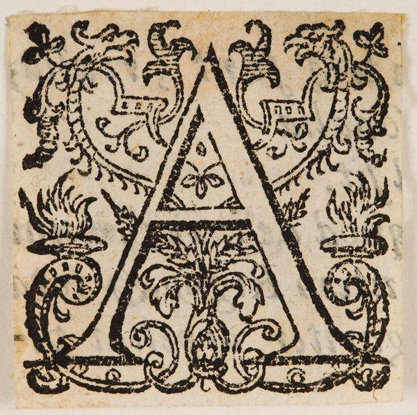
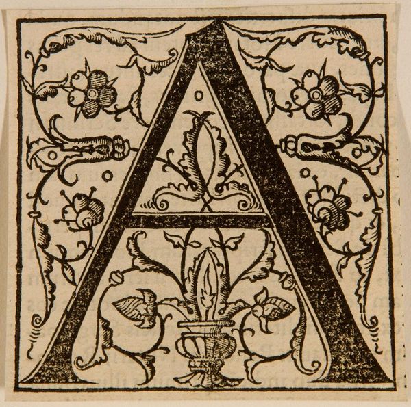
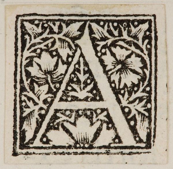
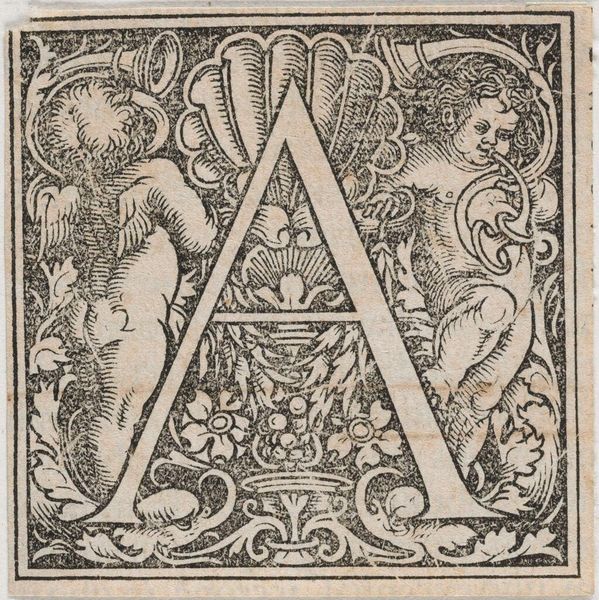
Curator: Before us is an intriguing initial, known as Letter C, from an unknown creator, held in the Harvard Art Museums. Editor: It feels almost like a coded message, doesn't it? The stark contrast amplifies the figures intertwined within the letterform. Curator: Notice how the crisp lines define the negative space, giving weight to the cherubic figures and foliage that decorate the 'C'. The composition is rigidly symmetrical, a fascinating balance. Editor: But who were these children meant to represent? Are they symbols of innocence, or perhaps something more allegorical, hinting at power structures through the guise of cherubs? Curator: The symmetry suggests a deliberate attempt to achieve harmony, focusing on the purely visual. Editor: Still, these visual choices have social implications; the cherubs, the adornment—all point to a specific ideology. I wonder how it was intended to function. Curator: Perhaps appreciating the aesthetic unity is enough. Editor: Perhaps not.
Comments
No comments
Be the first to comment and join the conversation on the ultimate creative platform.
