Copyright: CC0 1.0
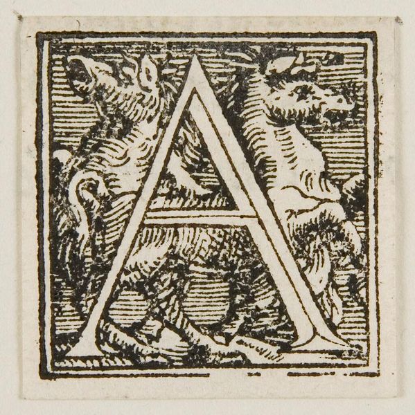
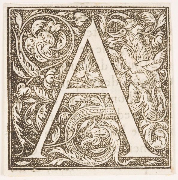
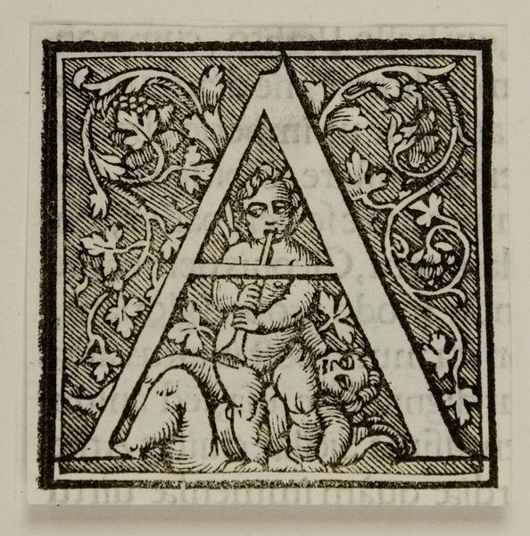
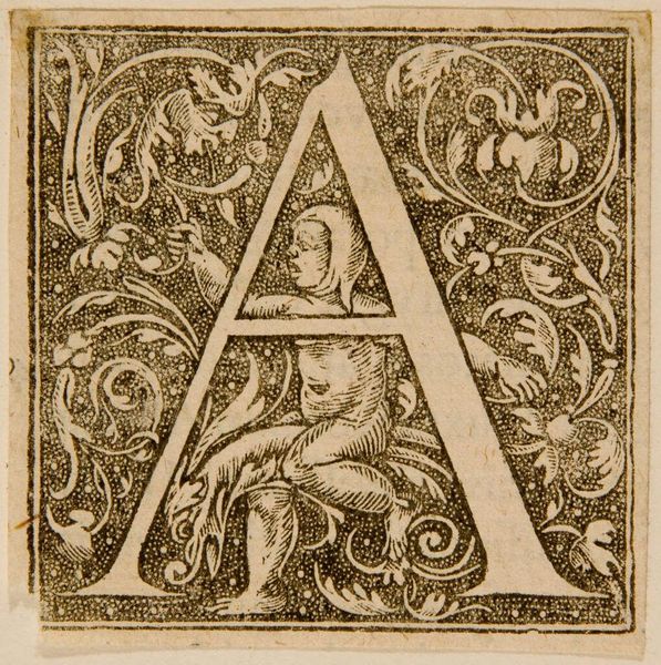
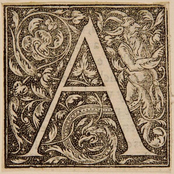
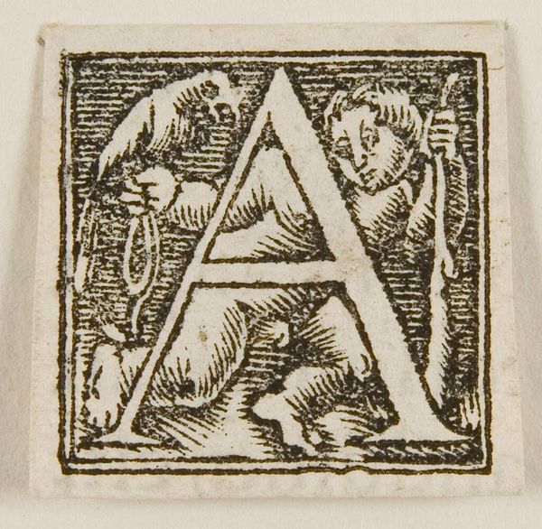
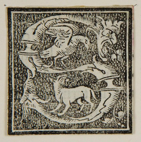
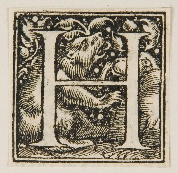
Editor: This is the initial "A" from an unknown date, artist, and material, residing here at Harvard. The detail is astounding; it feels like a miniature world contained within a letter. What compositional elements strike you most about this piece? Curator: The stark contrast between the black ink and the white paper immediately commands attention. Observe how the artist uses line to create depth and texture. Note the interplay of positive and negative space that defines the forms of the mythical creatures. Editor: It's fascinating how the artist uses such simple elements to create so much complexity. I hadn't really noticed the negative space before. Curator: Indeed. The negative space is not merely absence, but an active component shaping our perception of the letter and its inhabitants. It challenges us to see beyond the literal and engage with the underlying structure. Editor: Thank you! That's a great way to think about it. Curator: You're welcome. It is always rewarding to find new appreciation for form.
Comments
No comments
Be the first to comment and join the conversation on the ultimate creative platform.
More like this